This is part of a series of sample reports created by Oracle BI and HCM Product Management. You can copy the setup for this report and add it to your Oracle HCM Cloud Service environment.
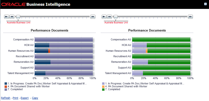
You may have noticed that when you create a chart, the colours shown depend on the number of values being displayed. So the first value is blue by default, the second red, the third lilac etc. That is fine if you only have one page on a graph, but if you add a slider or a drop down to create multiple “pages” of information, the same value may show as different colours on different “pages” because of its different relative position on that “page”. So, for example, a value may be blue on one page (where it is the first and perhaps only value) but lilac on another where it is the third value.
This default behaviour can make comparing results difficult but it can be overridden by hardcoding the colours based on the value being displayed so that a particular value will always show as the same colour.
The attached word document provides simple instructions on how to achieve this. I have also provided a sample report using this technique.
To add this report to your environment:
- Create a new analysis using Oracle Business Intelligence Answers.
- Copy and paste the XML from the attached txt document into the Advanced Tab.
- Click Apply XML.
Subject areas used: Workforce Performance - Performance Document Status Real Time (but technique works on any report)
5 minutes to copy into your environment.