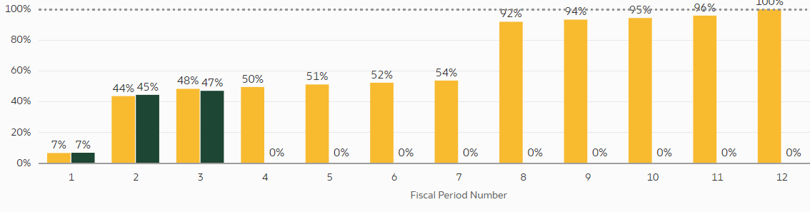
Sometimes, It would be nice to change what is shown on the x axis specifically for time based visualizations. For example, in the above visualization it would be great to change the 1, 2, 3 to June, July, August for example.
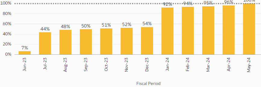
For this visual, maybe we could change the format to show a date or fully spell out the month for example.
This would give report creators the ability to create more readable and understandable reports without needing to create complex custom calculations.

