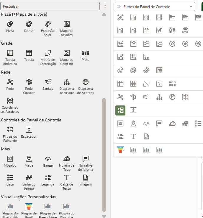
Categories
- All Categories
- Oracle Analytics and AI Learning Hub
- 44 Oracle Analytics and AI Sharing Center
- 20 Oracle Analytics and AI Lounge
- 278 Oracle Analytics and AI News
- 54 Oracle Analytics and AI Videos
- 16.2K Oracle Analytics and AI Forums
- 6.4K Oracle Analytics and AI Labs
- Oracle Analytics and AI User Groups
- 103 Oracle Analytics and AI Trainings
- 19 Oracle Analytics and AI Challenge
- Find Partners
- For Partners
New Gauge Chart Data Visualization available in Oracle Analytics
Comments
-
Vejo o ícone "Gauge" ao lado do ícone "Mapa". Você conseguiu! :)
0 -
por gentileza, você pode apontar onde estar esse icone que você acabou de falar ? @Benjamin Arnulf-Oracle
0 -
0
-
@Benjamin Arnulf-Oracle muito obrigado !
existe algum curso de fusion data analytics onde eu posso aprimorar meus conhecimentos ?
1 -
Hi @User_CAF6Z,
You can find our March Learning Resource Guide here. Please reach out with any additional questions.1 -
Hi Team,
Thanks for bringing this under default visuals as plugins had many issues. Much appreciated.
One suggestions from us, can we add third option of staightline as well, instead only semicircular and circular. This will help fit in summary page with space for additional visuals. Hope to see this soon.
Thank you!0 -
This is so awesome! Gets the point across effectively.
1 -
@User_04ZYJ Linear (horizontal, vertical) gauges will come in May 2025 update.
1


