Categories
- All Categories
- Oracle Analytics and AI Learning Hub
- 43 Oracle Analytics and AI Sharing Center
- 19 Oracle Analytics and AI Lounge
- 283 Oracle Analytics and AI News
- 60 Oracle Analytics and AI Videos
- 16.3K Oracle Analytics and AI Forums
- 6.4K Oracle Analytics and AI Labs
- Oracle Analytics and AI User Groups
- 108 Oracle Analytics and AI Trainings
- 20 Oracle Analytics and AI Challenge
- Find Partners
- For Partners
Uber Ride Operations and Performance
1. Which dataset did you use?
Uber Database available at Kaggle.
2. How did you analyze or prepare the data?
Based on my experience in Analytics field.
3. Who is the intended audience for your visualization?
Operations and Business Team.
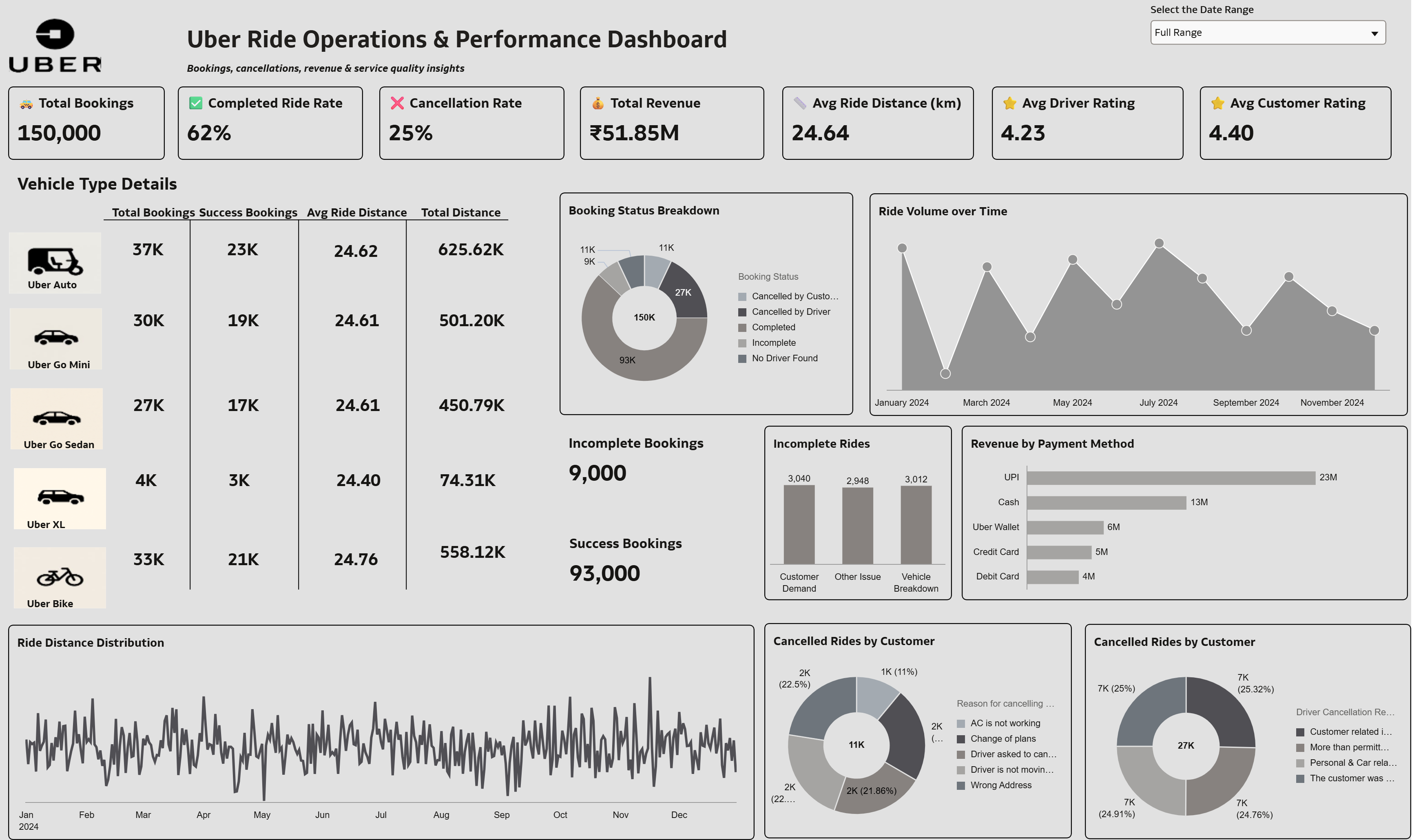
4. What is your visualization about, and what question or problem does it address?
This dashboard provides a comprehensive view of ride demand, operational efficiency, revenue performance, and customer experience.
It combines booking trends, cancellations, service time, ratings, and revenue to help operations and business teams monitor and optimize city-level ride performance.
5. Did you use any Oracle Analytics AI features when building your visualization (ex. AI Assistant)? If so, please describe how they were used
No. it was not required this time to build the Visualization.
6. Did you upload your visualization image and dva file?
Completed.
(Entry #3 - Data Analytics Visualization Challenge 2026)
Comments
-
Good work, but for me, the grey background and muted colours for the charts makes it difficult to read.
2 -
Thank you for your feedback. I appreciate your suggestion and will work on enhancing the visual contrast and readability of the dashboard.
0 -
HI Manik, thanks for sharing. Would like to know the effort and methods used for Data Processing and Visualization. How much of AI was used and in which steps?
2 -
Thank you for your question. The dataset is publicly available on Kaggle as a csv file. Data processing was done using standard transformation/calculations from OAC. I had an idea of the look and feel I wanted for the workbook and used the visuals available in OAC to bring that idea to life. AI was not used extensively for this dashboard, other than generating the logos.
1 -
Great work, Manik! And great job of submitting three viz's, thanks for participating in the challenge 😎
1 -
Thanks a lot!
0 -
Great job on this dashboard @ManikSethi!
It provides a comprehensive and well-structured view of bookings, revenue, cancellations, and ride performance in one place. The KPI summary at the top is especially effective for quick insights.
A few minor enhancements - such as clearer labeling on trend charts, aligning the cancellation visuals, etc. - could make it even more impactful and actionable.
Overall, a strong and thoughtful analytics design. Very Well done! 👏
1 -
Thank you so much for the thoughtful feedback!
I’m glad the KPI summary and overall structure are working well for quick insights — that was exactly the intention behind the layout.
Your suggestions around clearer labeling on the trend charts and improving alignment on the cancellation visuals are very helpful. I’ll incorporate those refinements to make the dashboard even more intuitive and actionable.
1


