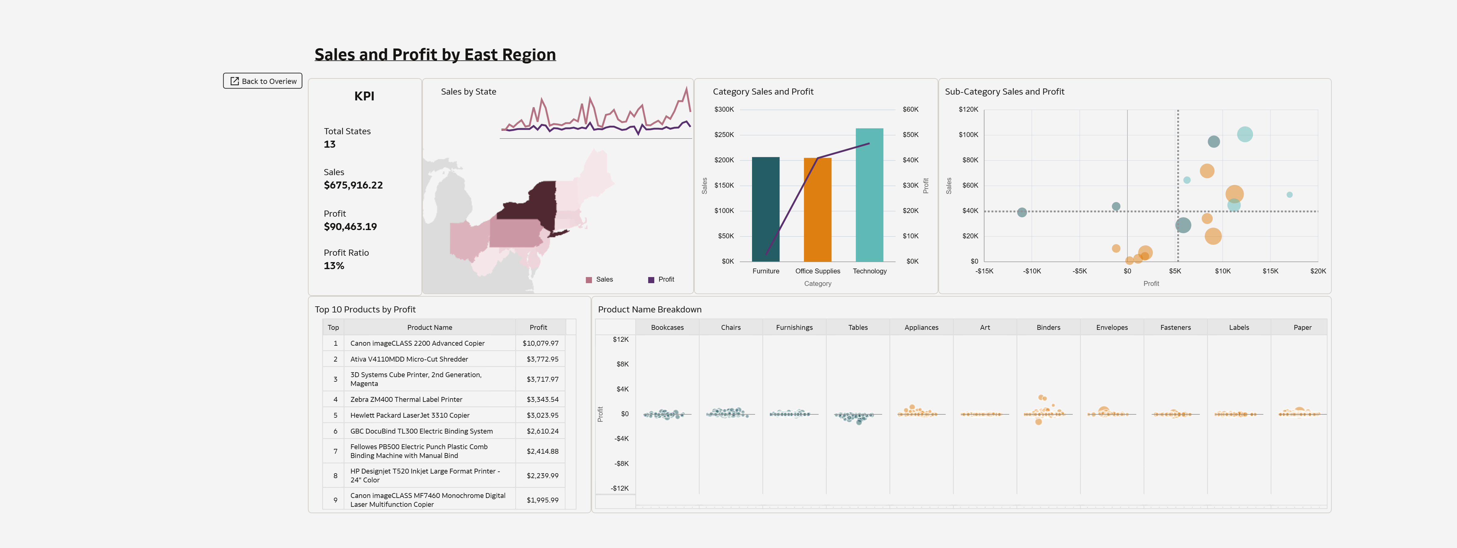
Sales and Profit by East Region (The user can explore any region but only showing one for demo)
1. Which dataset did you use?
Superstore Dataset provided by Oracle
2. How did you analyze or prepare the data?
I used OAC to explore the dataset
3. Who is the intended audience for your visualization?
Regional executive and sales manager
4. What is your visualization about, and what question or problem does it address?
The visualization allows a user to quickly gain insight, by Region, of sales and profit on a year over year basis. The user has the ability to choose the years to compare. Users can use this to further explore the individual Regions by using the Explore button to better understand what is driving the increase or decrease of sales and profit.
While exploring the individual Regions, the user is able to look at the Region as a whole or select a state or Category to filter the other visualizations down to the individual products. The jitter plot provides this granular look into products to quickly see any outliers. By using column swapping, the measure for the jitter plot can be viewed by Profit or Sales.
The tooltips for visualizations provide additional context.
5. Did you use any Oracle Analytics AI features when building your visualization (ex. AI Assistant)? If so, please describe how they were used
I did not use any AI features
6. Did you upload your visualization image and dva file?
Attached


