1. Which dataset did you use?
I used the two Public Dataset:
- Paris Events
- Work Road Closure that are happening in Paris
I have also uploaded 2 GeoJSON data map layer also from the public dataset:
- Streets where the road closure will happen
- Arrondissements of Paris
And one custom map layer created by analysis in Oracle Spatial Studio:
- Points of Events that are has a distance less or equal than 100 meters from the road closure (Red Points on the Map)
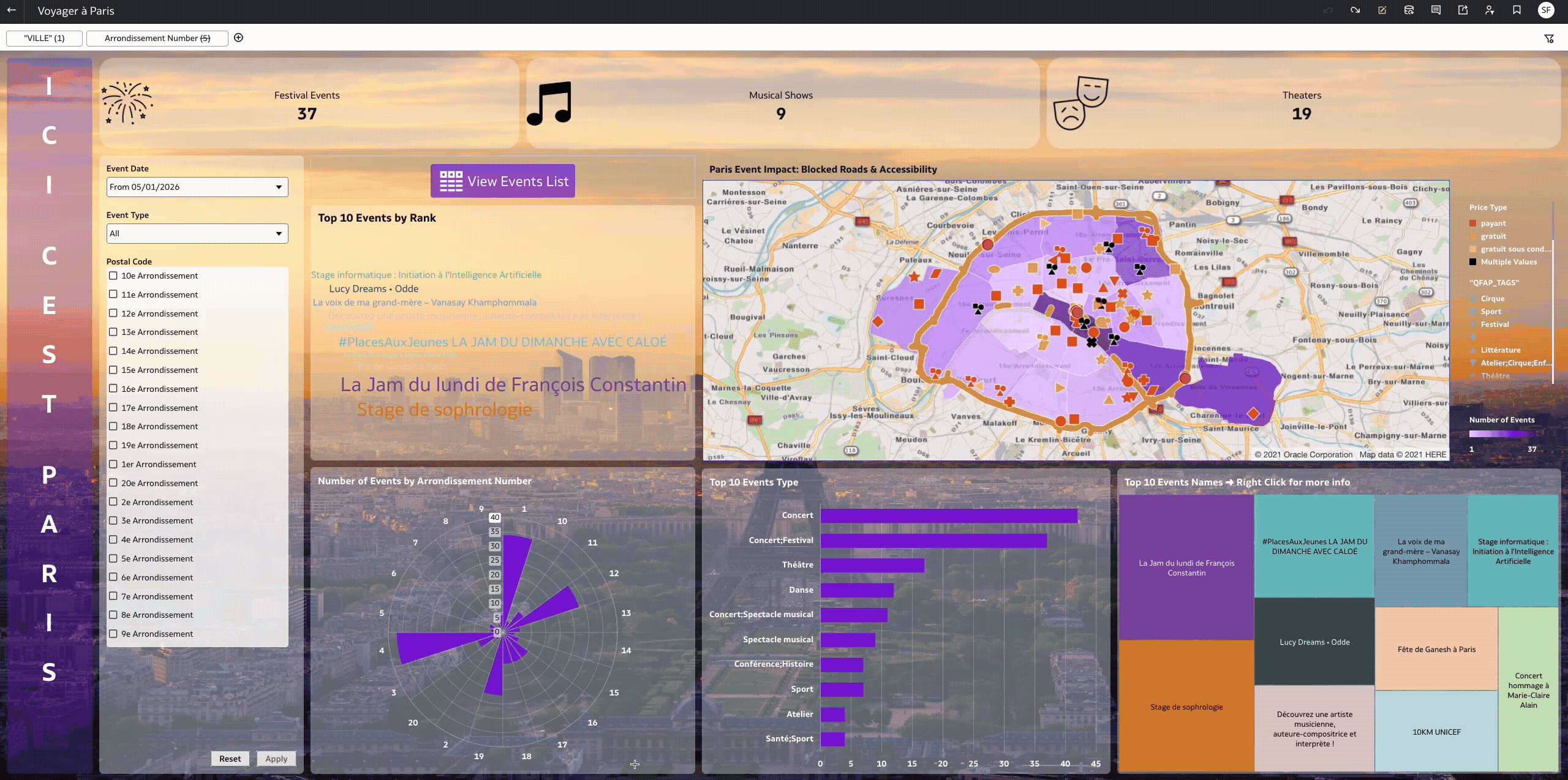
2. How did you analyze or prepare the data?
I have used some KPIs on the top, some interesting visuals that will highlight the most ranked events that will happen in Paris and also the map that helps identifying the events very close to road closure.
3. Who is the intended audience for your visualization?
This is intended to Tourists or Event attendees in Paris that prefers to take the Car to get around or attend any event, Showing them road work news and latest Events.
4. What is your visualization about, and what question or problem does it address?
The visual is like a guide for tourists in Paris and it helps identifying the following:
- Which Events are booming on a certain period and in a certain region in Paris (Price, email contact, Facebook link…)
- Which Road are closed due to Public Work and highlights the events close to these closure in case the tourist would like to attend by car or bus.
5. Did you use any Oracle Analytics AI features when building your visualization (ex. AI Assistant)? If so, please describe how they were used
I did not use any AI Assistant, but basically the AI assistant can be used to create these dashboards