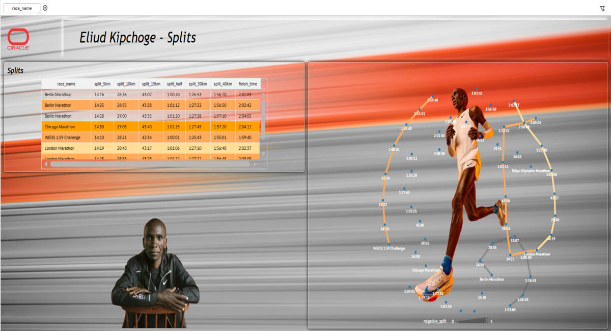
This dashboard presents a structured analytical study of elite marathon performance using detailed split-level race data from multiple international events. It provides both macro and micro-level insights into pacing strategy, endurance distribution, and performance consistency across major competitions.
The visualization integrates race summary metrics with granular checkpoint splits (5km, 10km, 15km, Half, 30km, 40km, Finish) to enable segment-wise performance evaluation. All time-based attributes were standardized and converted into numeric measures to ensure accurate comparison, aggregation, and variance analysis.
As a future enhancement, the dashboard is designed to incorporate AI-driven capabilities for personalized benchmarking and predictive analysis. By integrating individual runner data, AI features could compare amateur performance against elite standards such as Eliud Kipchoge, generate automated insights, identify pacing inefficiencies, and provide tailored improvement recommendations. This evolution would transform the dashboard from a performance analysis tool into an intelligent training support system.
Analytical Focus Areas
Pacing Intelligence
The dashboard evaluates how pace evolves throughout the race and whether performance remains consistent across early, middle, and final segments.
Split-Level Performance Decomposition
By breaking the marathon into structured checkpoints, the visualization enables identification of:
- Acceleration or deceleration phases
- Performance drop after 30km
- Second-half strength
Negative Split Detection
Calculated measures compare first-half and second-half timings to determine pacing efficiency and endurance management.
Cross-Race Benchmarking
Major events such as World Record races, Olympic marathons, and special performance events are analyzed comparatively to identify variation patterns.
Performance Stability Analysis
Race-to-race variance is evaluated to understand consistency at the elite level.
1. Which dataset did you use?
For this dashboard, I used publicly available marathon performance data curated from sports statistics platforms and race result archives, including:
- Official marathon race results (Berlin, London, Chicago, Tokyo Olympics)
- INEOS 1:59 Challenge performance data
- Historical split timings (5km, 10km, 15km, Half, 30km, 40km, Finish)
- World ranking and record information
2. How did you analyze or prepare the data?
I began by loading the datasets into Oracle Analytics Cloud and creating exploratory workbooks to understand the structure, relationships, and behavior of the data.
- Converted split and finish times into numeric values (seconds) to enable accurate calculations and comparisons
- Created calculated measures such as:
- Average pace (min/km)
- Split differences between checkpoints
- First-half vs second-half comparison
- Negative split indicator
- Aggregated race-level metrics for visualization
- Structured relationships between race summary data and split-level data
3. Who is the intended audience for your visualization?
The primary audience for this visualization includes athletics performance analysts, marathon coaches, and sports scientists who require detailed pacing and split-level insights to evaluate endurance performance. It is also relevant for professional runners and trainers who want to study elite race strategies and understand performance consistency across major events. Sports statisticians and data enthusiasts can use the dashboard to explore structured race comparisons and metric-driven benchmarking. Additionally, competition strategists may leverage these insights for tactical preparation and long-term performance planning. Finally, the dashboard is designed to remain accessible and visually engaging for marathon fans who are interested in understanding elite performance through data.
4. What is your visualization about, and what question or problem does it address?
This visualization analyzes the marathon performance patterns of Eliud Kipchoge by combining race results with detailed split timings. It focuses on understanding pacing strategy, negative splits, and performance consistency across major events rather than just final finish times. The dashboard answers key questions about where acceleration or fatigue occurs during a race and how elite endurance is structured. It also provides practical insights for beginners and non-professional runners to study elite methods and apply data-driven pacing strategies to their own training.
5. Did you use any Oracle Analytics AI features when building your visualization (ex. AI Assistant)? If so, please describe how they were used.
No.
However, in future enhancements, I plan to enable AI-driven features to compare elite marathon performance with individual runner data. This would allow automated insights, performance benchmarking, and personalized improvement suggestions. AI capabilities could help generate training recommendations, identify pacing inefficiencies, and provide data-driven tips to support performance development for amateur runners.