This dashboard provides a comprehensive analysis of AI Intensity across the workforce and developer productivity. It combines job-market adoption signals (AI mention rate, AI intensity, skills demand), risk/value indicators (salary, automation risk, reskilling), and engineering outcomes (productivity, quality, cognitive load) into a single integrated analytical view.
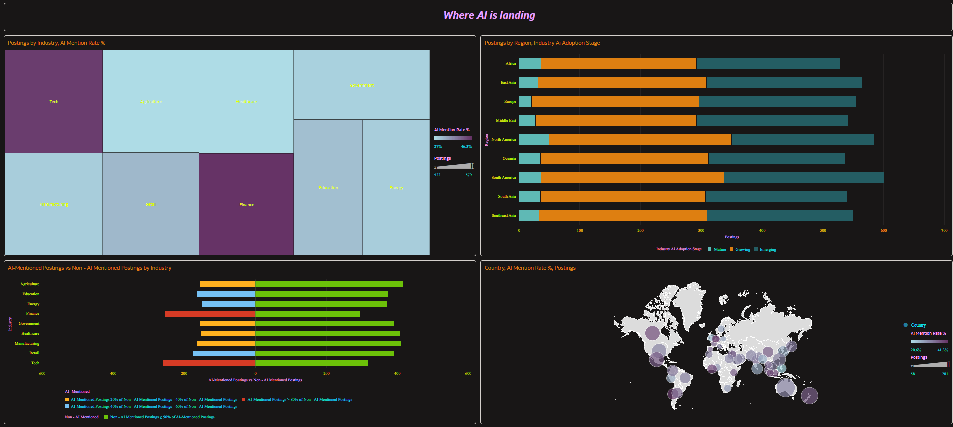
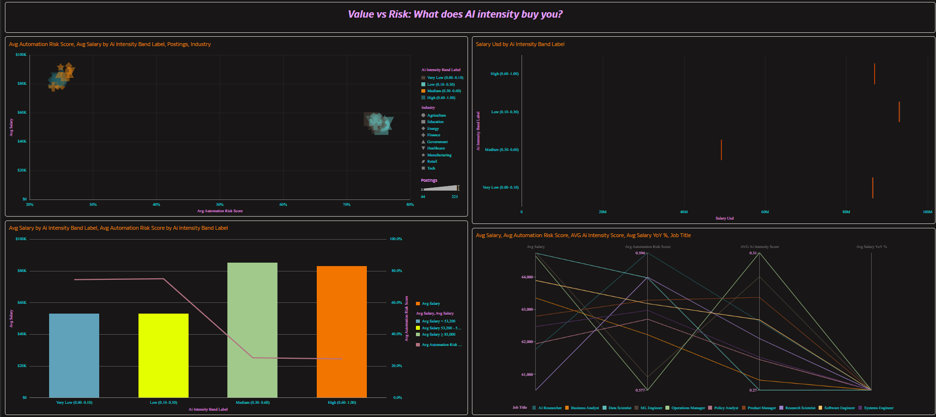
On the workforce impact side, the dashboard evaluates job posting volume, AI mention rate, AI intensity score distribution, salary levels and YoY change, automation risk, reskilling requirement rate, and adoption maturity by industry, region/country/city, seniority level, and AI intensity band. It highlights where AI is spreading fastest, which roles are changing most, and how adoption maturity (Emerging/Growing/Mature) differs across industries and geographies.
On the developer productivity side, the dashboard analyzes coding hours, commits, bugs reported, success rate, AI usage hours, AI share (intensity ratio), and cognitive load by AI intensity band. This reveals where AI assistance correlates with higher output, where quality trade-offs appear, and how workload/context factors (sleep, distractions, caffeine intake) relate to outcomes.
From a cross-domain executive view, the dashboard aligns both domains through the shared AI Intensity Band to compare outcomes such as salary premium vs automation risk alongside commits per hour, bugs per commit, success rate, and cognitive load—supporting a single story: how AI intensity influences both labor-market value/risk and developer delivery performance.
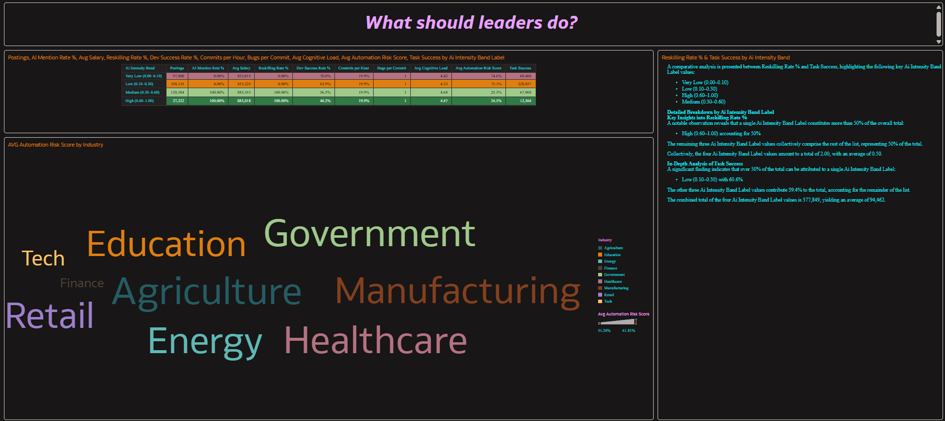
Overall, the dashboard supports strategic decision-making by identifying AI hotspots, high-value/low-risk role clusters, reskilling priorities, and the “value zone” of AI usage in development. It delivers a data-driven view of how AI adoption and intensity shape organizational competitiveness, talent strategy, and delivery efficiency.
1. Which dataset did you use?
AI DS Prepared (star schema) containing:
- Fact – AI Global Impact (Jobs)
- Fact – Dev Productivity
- Dimensions including Dim – AI Intensity Band (conformed key/label) and Dim – Calendar/Year
2. How did you analyze or prepare the data?
I modeled the data in a two-fact star schema with a conformed AI Intensity Band to safely compare Jobs and Dev metrics. I created standardized calculated measures, including:
- Postings, AI Mention Rate %, Avg Salary, Avg Automation Risk, Reskilling Rate %
- Commits per Hour and Bugs per Commit using ratio-of-sums for accurate aggregation
I also enforced band ordering by band_key and applied grain rules so cross-domain visuals stay correct (mixing Jobs + Dev only at AI band level).
3. Who is the intended audience for your visualization?
Executives and strategy leaders, HR/Talent and workforce planners, and Engineering leadership (VP Eng / directors) who need an integrated view of AI adoption, risk, reskilling, and productivity outcomes.
4. What is your visualization about, and what question or problem does it address?
The visualization shows how AI intensity varies across industries, regions, and roles, and how it relates to salary premium, automation risk, and reskilling needs, while also examining how AI share in development influences throughput, quality, and cognitive load.
It answers: Where is AI adoption accelerating, what value or risk does it create, and what actions should leaders take (reskilling, policy, investment, QA controls, adoption roadmap) by AI intensity band?
5. Did you use any Oracle Analytics AI features when building your visualization (ex. AI Assistant)? If so, please describe how they were used.
Not really, Although I tried to create an AI Agent in a user experience and interaction perspective. But, the tool did not allow me to do it as the dataset is joined out of two .csv files. I have an use-case to create an AI Agent with Instructions for this dashboard. Attaching the knowledge base doc I created.

