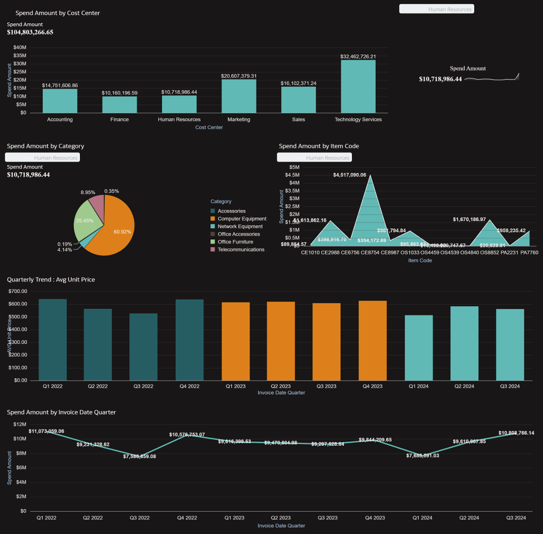
This Analysis shows clear picture on Total spend and Average based on Category , Cost center. This shows Quarterly and yearly trend of spend to better understand spend growth.
1. Which dataset did you use?
I Used Spend transaction data.
2. How did you analyze or prepare the data?
I used available fields to present the data in different aspects like category , cost center and by month , quarter.
3. Who is the intended audience for your visualization?
The intended audience for this visualization is business decision-makers and functional leaders who require data-driven insights to monitor performance, identify trends, and support strategic planning.
4. What is your visualization about, and what question or problem does it address?
The visualization analyzes spend transaction data to provide insights into organizational spending patterns, cost drivers, and supplier concentration.
1.Where is the organization spending the most?
2.How does spending vary by department, category, or time period?
3.Are there opportunities for cost optimization or supplier consolidation?
5. Did you use any Oracle Analytics AI features when building your visualization (ex. AI Assistant)? If so, please describe how they were used.
Yes, I leveraged Oracle Analytics AI capabilities to enhance the development of the visualization.
Auto Insights helped identify key drivers, outliers, and significant patterns within the spend transaction data.
Smart Visualization recommendations assisted in selecting the most appropriate chart types based on the dataset.