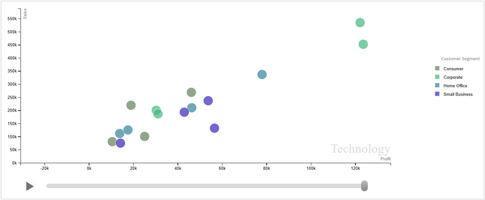
The Motion Chart custom extension displays data as an animated bubble chart to help track changes over time. It uses the X-axis, Y-axis, bubble size, and color to represent multiple measures simultaneously, making it useful for trend analysis and time-based comparisons.
Learn more about the extension: Video link | Blog
You can download the extension zip file here:
Upload the zip file into Oracle Analytics Cloud instance by navigating to Console→Extensions and you start adding the visualization to your workbooks.
Important:
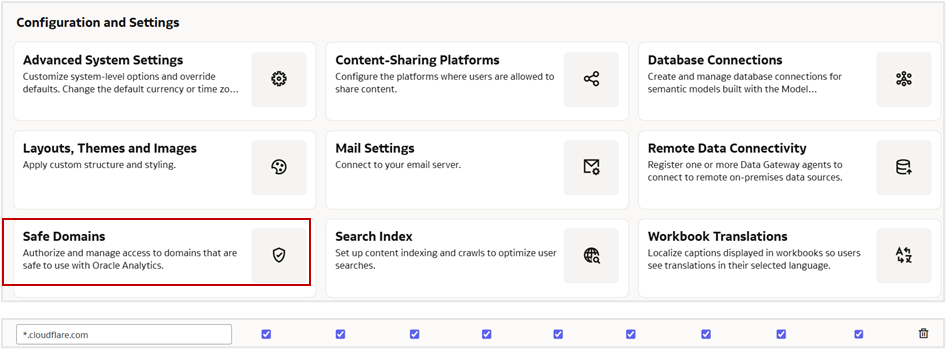
Ensure to whitelist the domain ‘*.cloudflare.com’ under Safe Domains in your Oracle Analytics instance.