 Sales & Supply Chain Performance Dashboard
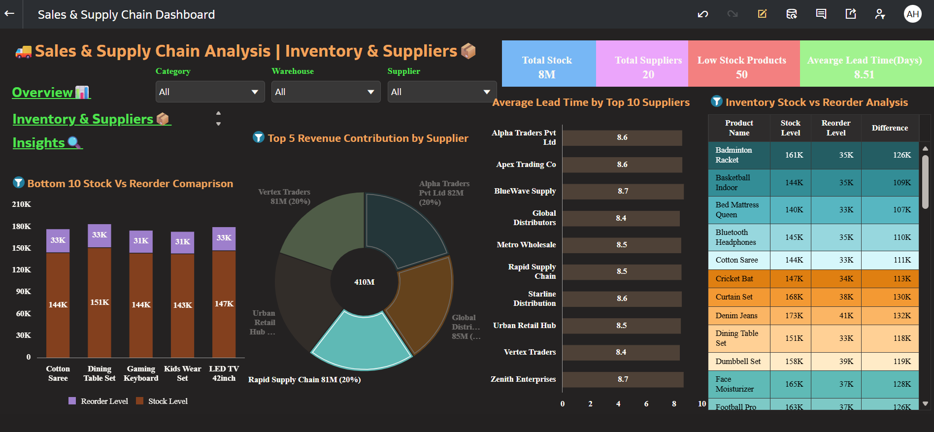
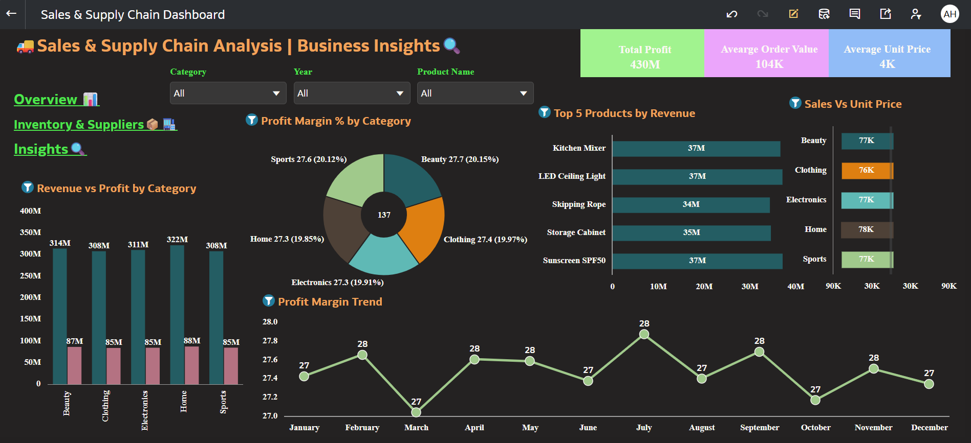
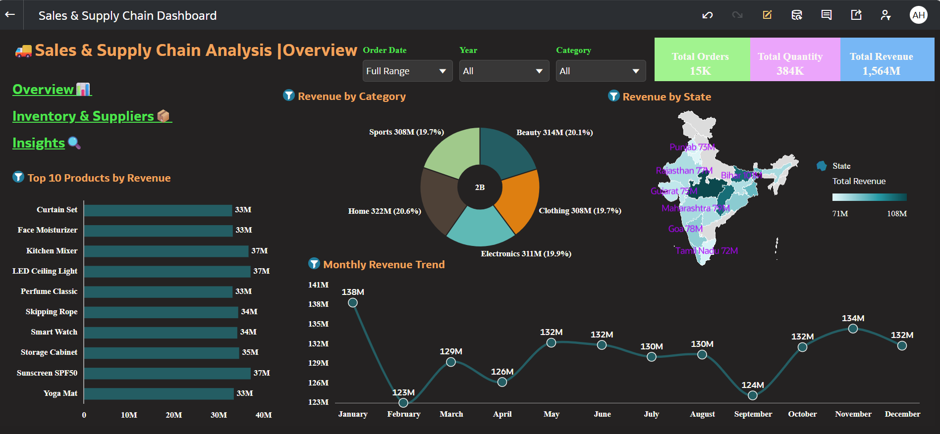
This dashboard provides an integrated analytical view of sales performance and inventory efficiency by combining revenue, stock levels, and reorder metrics into a single decision-support framework.
It connects sales trends with supply health indicators to ensure demand and inventory alignment across products
- Which dataset did you use?
I used an integrated dataset combining Product Master Data, Sales Transaction Data, and Inventory & Reorder Level Data to build the Sales & Supply Chain Performance Dashboard. - How did you analyze or prepare the data?
I standardized all measures into numeric formats and created calculated KPIs such as Revenue, Contribution %, and Stock Difference (Stock – Reorder Level). I structured relationships between sales and supply data in Oracle Analytics Cloud to ensure accurate cross-functional analysis and built calculated measures to detect inventory risk conditions. - Who is the intended audience for your visualization?
The dashboard is designed for Sales Managers, Supply Chain Managers, Operations Leaders, and Business Decision-Makers who need a consolidated view of revenue performance and inventory efficiency. - What is your visualization about, and what question or problem does it address?
The visualization provides an integrated analytical view of sales performance and inventory health. It addresses the key business question:
“Is inventory aligned with actual sales demand?”
By connecting sales trends with stock levels and reorder thresholds, the dashboard helps detect stock-out risks, overstock situations, and demand–supply mismatches, enabling proactive replenishment and better working capital management.
5. Did you use any Oracle Analytics AI features when building your visualization (ex. AI Assistant)? If so, please describe how they were used?
Yes, I leveraged Oracle Analytics AI capabilities to generate automated insights on revenue performance and inventory variance. These insights were refined and customized to highlight demand–supply alignment patterns and potential inventory risk indicators.
6. Did you upload your visualization image and DVA file?
Yes, completed successfully.


