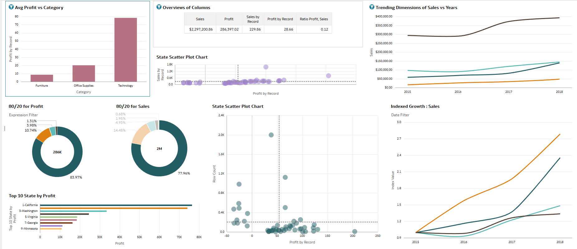
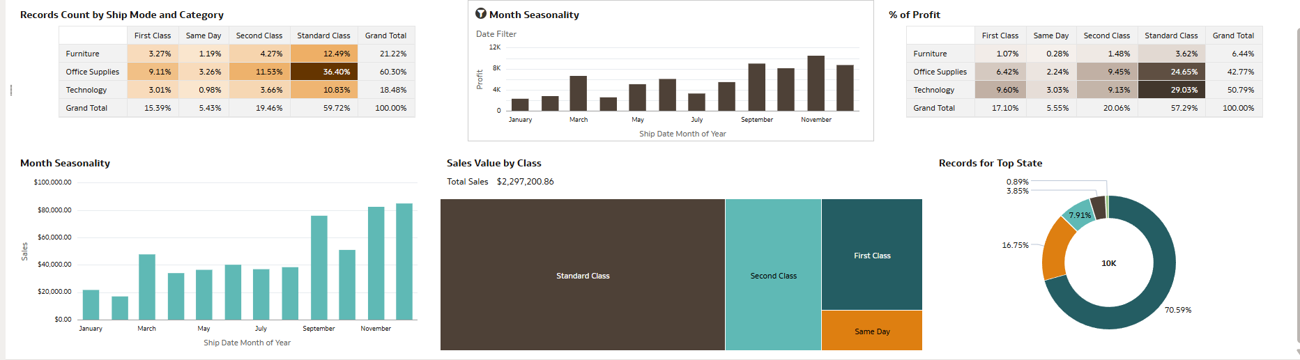
This Superstore Sales dashboard provides a comprehensive overview of business performance across categories, states, time, and shipping modes. It highlights total sales ($2.29M) and profit (286K), with Technology emerging as the most profitable category. The visualizations show sales growth trends over the years, state-wise profit distribution (with California leading), and the dominance of Standard Class shipping in both sales and records. Seasonal patterns indicate higher sales toward the end of the year, while 80/20 analysis reveals that a small portion of customers or states contribute to the majority of profit and sales. Overall, the dashboard effectively summarizes profitability, growth trends, and operational insights.
1. Which dataset did you use?
I used the Superstore Sales dataset.
2. How did you analyze or prepare the data?
I analyzed the data using built-in analytics features such as filtering, aggregation, trend analysis, and category segmentation. I explored sales, profit, shipping mode, and state-level performance to identify key insights and patterns.
3. Who is the intended audience for your visualization?
The intended audience is the Superstore Sales Manager.
4. What is your visualization about, and what question or problem does it address?
The visualization highlights sales and profit performance by category, state, shipping mode, and time. It helps the Sales Manager understand which cities and states generate higher sales and profit so that resources (FTE allocation) can be planned effectively. It also identifies seasonal trends and top-performing regions.
5. Did you use any Oracle Analytics AI features when building your visualization? If so, please describe how they were used.
Yes, I used AI-assisted insights such as automated explanations, trend detection, and suggested visualizations to better understand patterns in sales growth, state performance, and profit distribution.
6. Did you upload your visualization image and DVA file?
Yes, the visualization image and the corresponding project file were uploaded.
