This set of dashboards provides a comprehensive and interactive view of business performance, focusing on key areas such as sales, revenue, profitability, customer behavior, and marketing effectiveness. It is designed to support data-driven decision-making by presenting high-level KPIs alongside detailed analytical insights.
These dashboards are designed to:
- Provide a single source of truth for business performance
- Enable quick identification of trends and anomalies
- Support strategic and operational decision-making
- Improve visibility into key drivers of revenue and profit
- Facilitate efficient monitoring and performance tracking
Key Features
- Interactive Filters for dynamic analysis across multiple dimensions (e.g., product, category, region, and time)
- KPI Tiles summarizing critical metrics for quick understanding
- Multi-visual Layout combining charts, graphs, and tables for diverse insights
- Drill-down Capability enabling users to move from summary views to detailed analysis
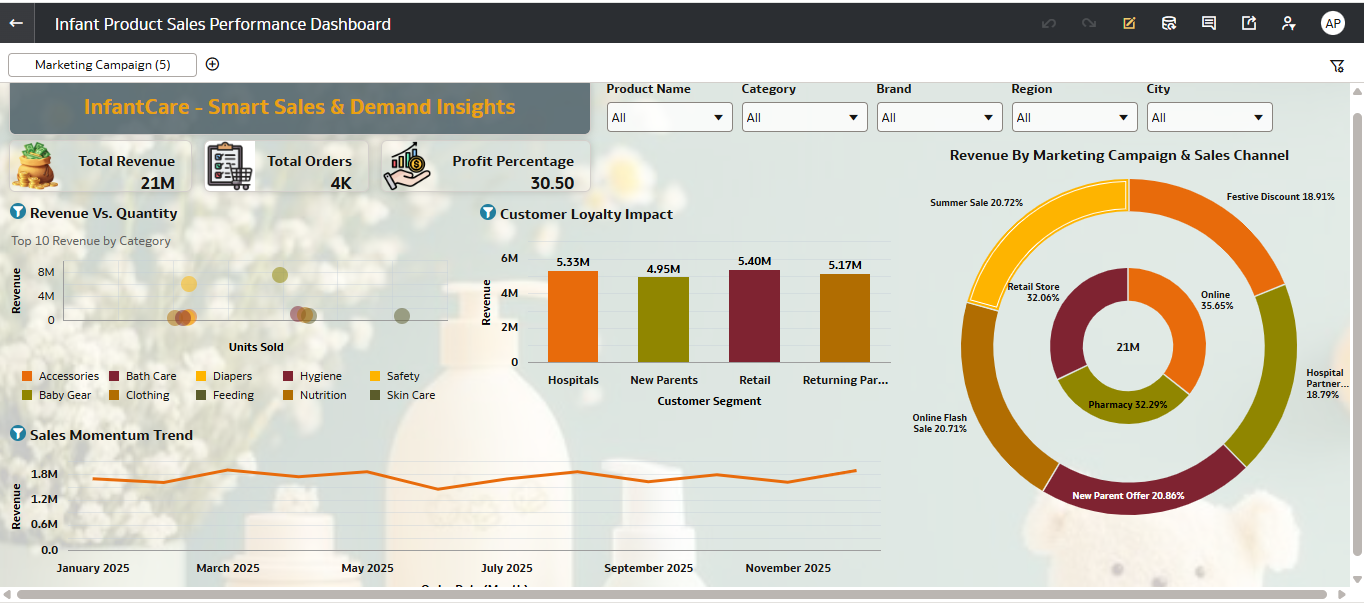
Infant Product Sales Performance Dashboard – OverviewThis dashboard provides a comprehensive, executive-level view of infant product sales, combining revenue performance, customer behavior, and marketing effectiveness into a single, interactive canvas.
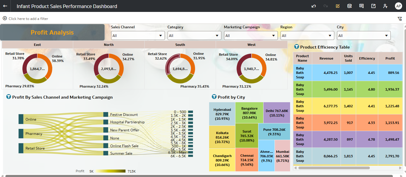
Profit Analysis Dashboard – OverviewThe Profit Analysis section of the dashboard in Oracle Analytics Cloud focuses on evaluating profitability across regions, sales channels, marketing campaigns, and cities to uncover key revenue drivers and optimization opportunities.