
1. Which dataset did you use?
Superstore Dataset provided by Oracle
2. How did you analyze or prepare the data?
I used Auto-Insights to understand, what the data is about. Furthermore, I invested the data on my own and created some additional KPIs in the dataset.
3. Who is the intended audience for your visualization?
Superstore Sales manager, Product Manager, C-Level, Decision Makers
4. What is your visualization about, and what question or problem does it address?
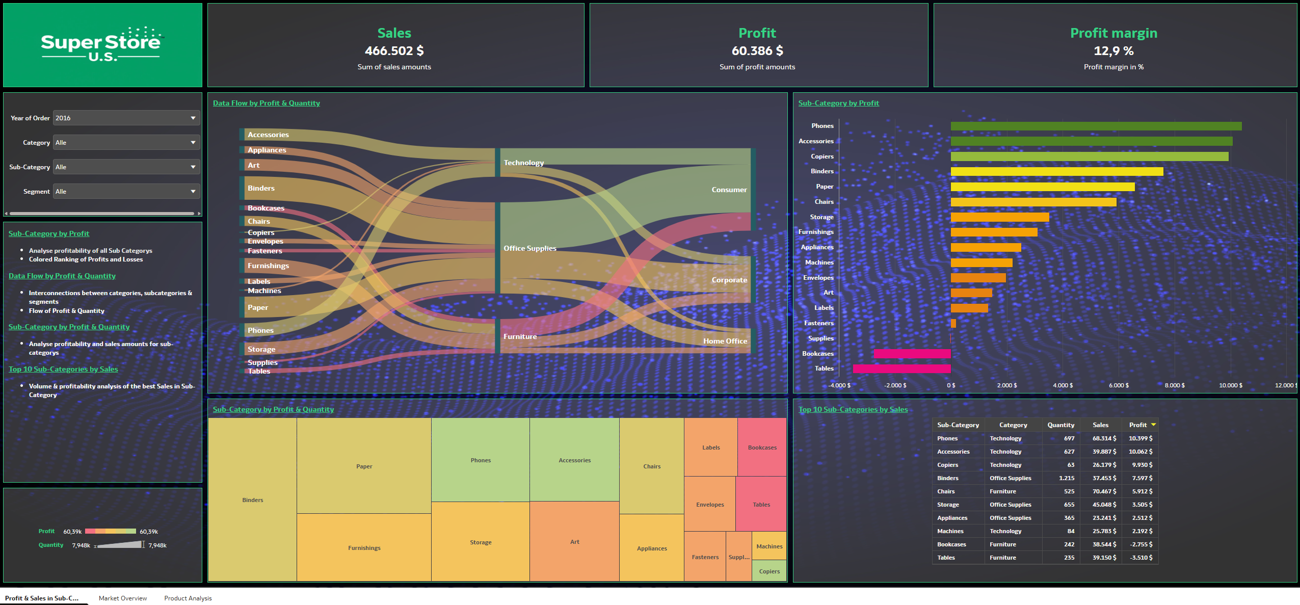
My analytical application presents the fictional case of the company “SuperStore U.S.”. A fictional logo was created, and the individual dashboards feature a green color scheme to illustrate a corporate identity.
- My visualization focuses on determining revenue, profits, and profit margins. To this end, I have created various KPIs that can be filtered, as can the charts.
- The application is divided into three dashboard pages.
- The first page displays revenue and profit figures for various categories and information about the product portfolio.
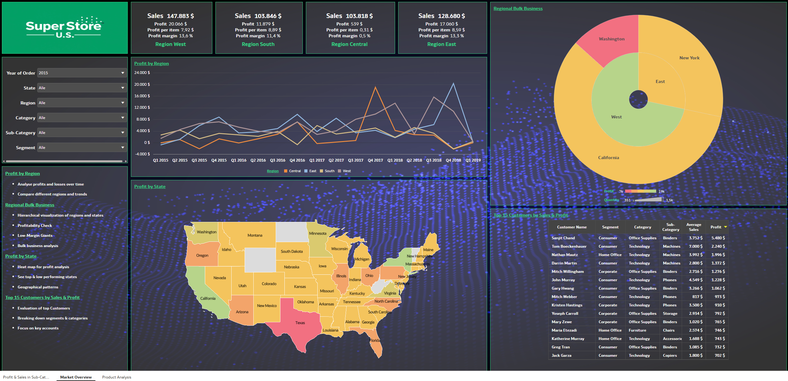
- The second page illustrates the impact of performance on regions and states across the U.S. This page also covers the customer segment, providing sales decision-makers with market insights to implement marketing initiatives for the customer base.
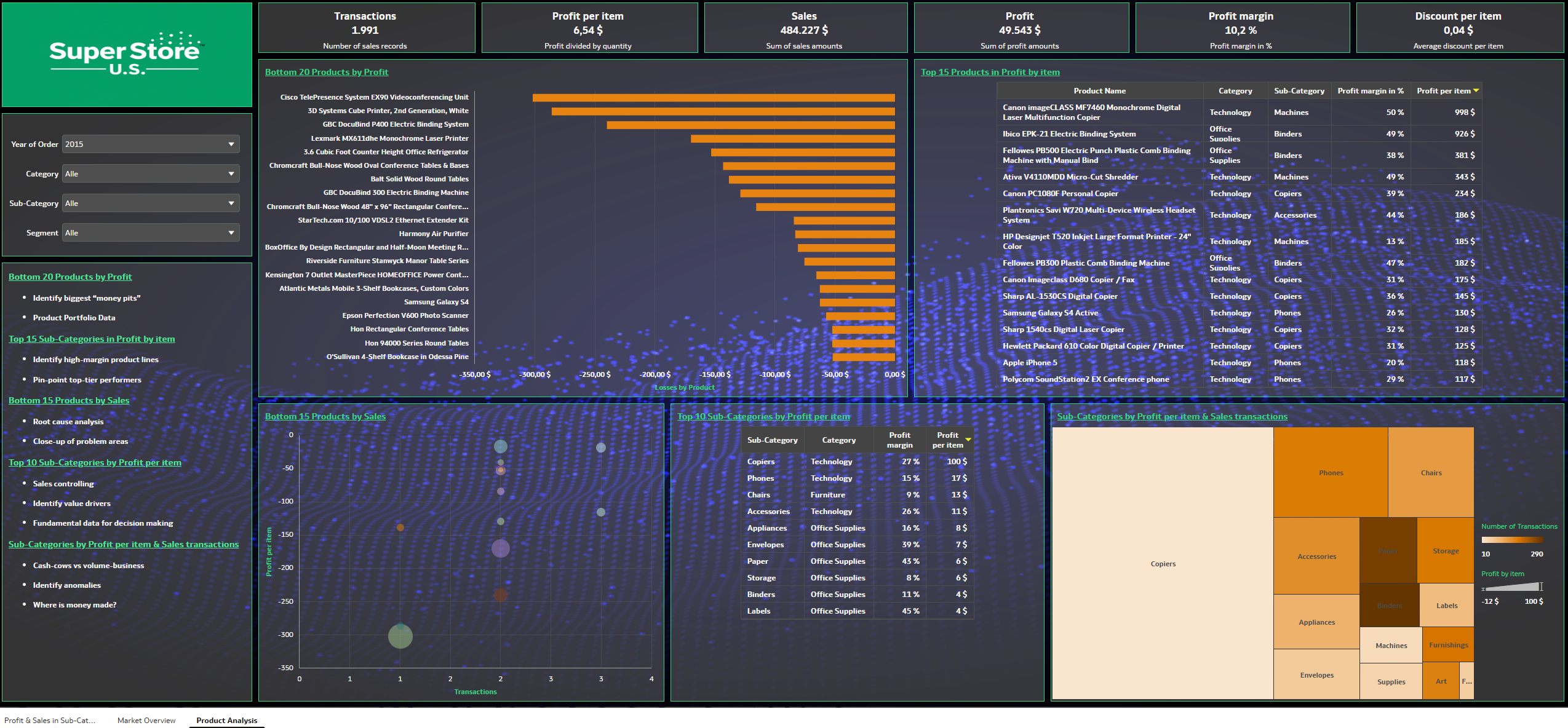
- The third page contains analyses regarding product performance.
- The application helps managers make decisions regarding the product portfolio:
- Can unprofitable products be brought back into the profit zone through price or discount adjustments?
- Which products have high profit margins but are rarely sold?
- Which products are not good for business?
- How has profitability changed over time?
- Which products have future potential?
- Each chart includes quick notes designed to help analysts derive the most value from the charts. In addition, every dashboard features a bullet-point list that explains the significance of the charts.
5. Did you use any Oracle Analytics AI features when building your visualization (ex. AI Assistant)? If so, please describe how they were used
Yes, I used the Auto Insights features to better understand the data and generate new ideas. Auto Insights helped me identify which KPIs might be relevant and meaningful for this dataset. Then I customized the suggestions from Auto Insights or revised them as needed.
6. Did you upload your visualization image and dva file?
Yes, I uploaded visualization and dva file.


