1.Which dataset did you use?
The dashboard uses a single consolidated dataset: Latest_BulkPlans_ThisYear_SLA_Final.xlsx.
This dataset contains shipment‑ and bulk‑plan–level operational data, including shipment identifiers, completion status, performance ratings, completion percentages, dates, regions/provinces, route or operational codes, and exception comments. It represents actual operational outcomes for the current year, not forecasts or simulated data.
2. How did you analyze or prepare the data?
The data was prepared through light transformation and aggregation to support executive‑level analysis:
- Converted raw date/time fields into reporting periods (Month, YTD)
- Grouped shipment‑level records to calculate summary metrics such as total shipments, completion rates, and SLA compliance
- Classified performance ratings into SLA Met (Excellent, Good) and SLA Missed (Poor, Very Bad/Critical)
- Filtered and flagged exception records to surface only materially relevant underperformance
- Standardized region and route attributes to enable consistent comparisons across views
No external datasets were joined; all metrics are derived directly from the source file to preserve data integrity.
3. Who is the intended audience?
The primary audience is senior leadership, including directors and executives responsible for operational performance and SLA oversight.
Secondary users include decision‑support analysts and operational managers who may use drill‑downs to investigate specific regions, routes, or shipments. The dashboard is intentionally designed so executives can understand performance at a glance, without needing to interpret raw operational detail.
4. What is your visualization about, and what problem does it address?
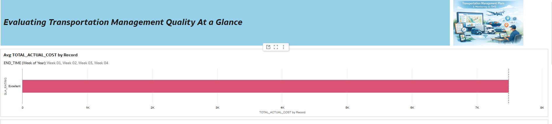
The visualization provides an executive‑level view of operational SLA performance across bulk plans and shipments. It addresses the problem of limited visibility into where and why SLA issues occur by:
- Clearly showing overall performance status and trends
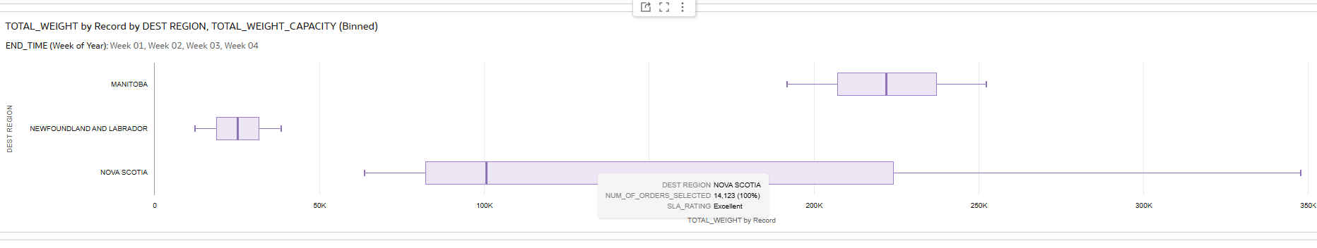
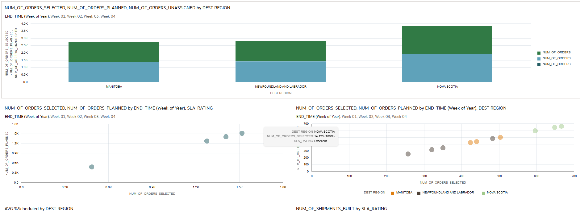
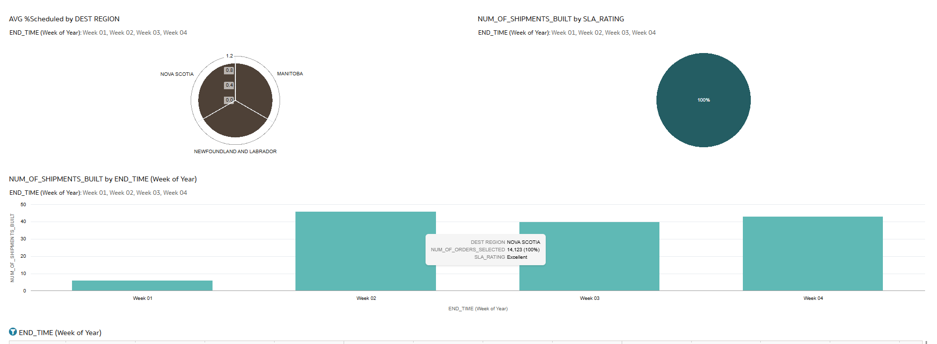
- Highlighting regions and routes driving underperformance
- Isolating critical exceptions that require leadership attention
- Allowing drill‑down from summary metrics to shipment‑level detail when needed
The goal is to support faster, more focused decision‑making, shifting conversations from “What happened?” to “Where should we intervene?
5. Did you use Oracle Analytics AI features?
Used Oracle Analytics AI to generate certain types of visualizations based on source data and further enhanced upon those suggestions such as the box plots and stacked bar chart.
6. Did you upload your visualization image and DVA file?
Yes, I uploaded the dashboard image and the DVA file for submission.
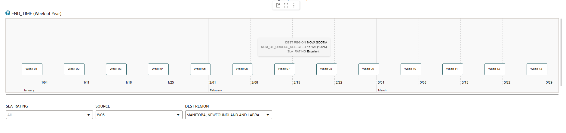
Drill-down
Able to drill down by the week number, SLA Rating of percentage of orders scheduled and source and dest region combinations.
Navigation Feature
N/A
