- 1. What data did you use?
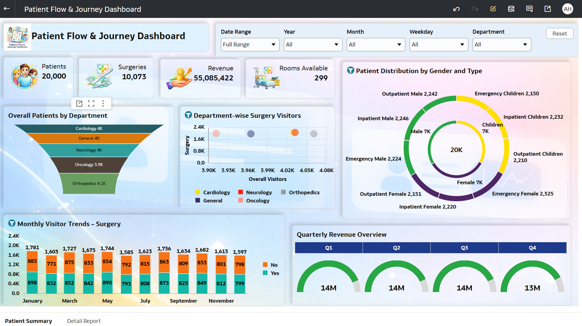
I used a comprehensive Healthcare Patient dataset containing patient-level and operational details such as:
- Patient count (Outpatient, Inpatient, Emergency)
- Surgeries and treatment records
- Revenue generated across departments
- Room availability and utilization
- Department details (Cardiology, Neurology, Orthopedics, Oncology, General)
- Patient demographics (Gender & Type – Male, Female, Children)
- Visit timelines (Month, Quarter, Weekday)
This dataset enabled multi-dimensional analysis across patient flow, hospital operations, revenue performance, and resource utilization.
2. How did you analyze or prepare the data?
I performed data preparation and transformation within Oracle Analytics Cloud (OAC) by:
Standardizing key measures like Patients, Surgeries, Revenue, and Room Availability into proper numeric formats
Creating calculated KPIs such as:
Total Patients
Total Surgeries
Total Revenue
Rooms Available
Department-wise Patient Count
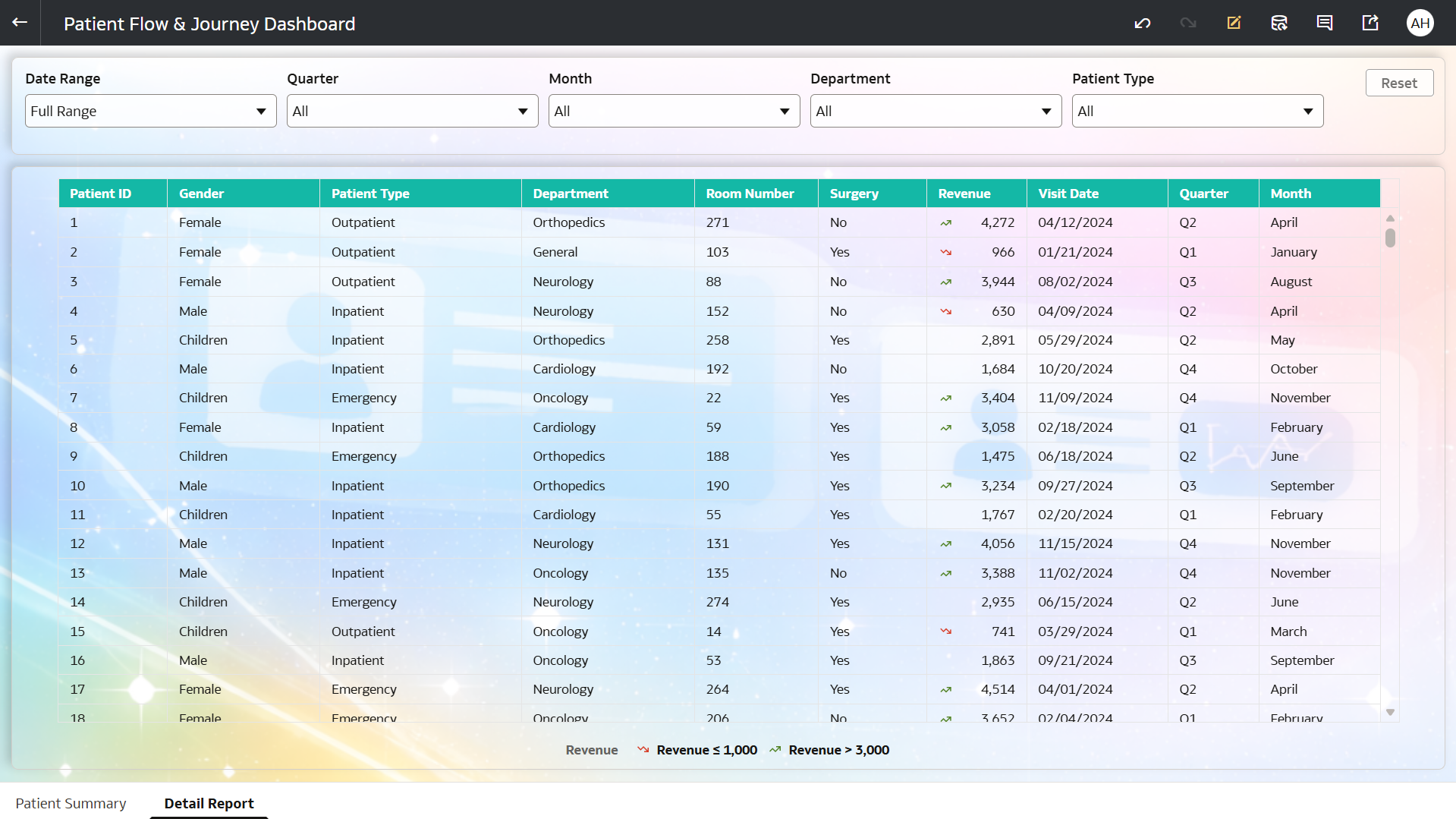
Designing interactive drill-down navigation from summary dashboard to detailed reports
Structuring data to support:
Department-level analysis
Monthly and quarterly trends
Patient distribution by gender and type
Implementing dashboard prompts (filters)
Applying conditional formatting to highlight performance trends and improve visual clarity
3. Who is the intended audience for your visualization?
This dashboard is designed for:
Hospital Management / Administrators → to monitor hospital patient details
Operations Teams → to manage patient flow and resource utilization
Healthcare Analysts → to analyze trends in patients, surgeries, and revenue
Department Heads → to evaluate department-wise performance
Decision-Makers → to improve efficiency, capacity planning, and patient care
4. What is your visualization about, and what question or problem does it address?
This dashboard provides a comprehensive view of patient flow and hospital operations, focusing on patients, surgeries, revenue, and departmental performance.
It addresses key business questions such as:
“How are patient visits and surgeries trending over time?”
“Which departments are handling the highest patient load?”
“How is revenue distributed across quarters and services?”
“What is the patient distribution by gender and type?”
By combining KPIs, funnel analysis, trend charts, and distribution visuals, the dashboard helps:
Identify high and low-performing departments
Monitor patient inflow and surgery trends
Analyze resource availability (rooms)
Understand demographic distribution of patients
Enable data-driven healthcare planning and optimization
5. Did you use any Oracle Analytics AI features? If so, how?
Yes, I used Oracle Analytics AI features to enhance insights:
- Generated AI-driven insights on patient trends and revenue patterns
- Identified key drivers behind department performance variations
- Detected patterns in patient distribution and surgery volumes
- Used AI suggestions to highlight seasonal and quarterly trends
These AI capabilities helped convert healthcare data into actionable operational insights.
- Enabled the AI Assistant for the dataset, allowing users to ask natural language questions and receive automated insights
6. Did you upload your visualization image and DVA file?
Yes, the dashboard image and DVA file have been successfully uploaded.