1. Which dataset did you use?
I used multiple datasets related to climate, energy, and geopolitics:
- OWID_CO2_DATA (
owid-co2-data.csv) → Contains country-wise CO₂ emissions, per capita metrics, fossil fuel dependency, renewable energy, and related environmental indicators. - ACLED_CONFLICTS (
acled_conflicts.csv) → Contains data on global conflicts and geopolitical events. - BRENT_CRUDE_PRICE (
brent_crude_price.csv) → Historical crude oil price data. - OUTPUT (
esg_geopolitics_master.csv) → Consolidated dataset combining ESG, energy, and geopolitical indicators for analysis.
This combined dataset allows a multi-dimensional analysis of environmental, energy, and geopolitical factors and their interactions over time.
2. How did you analyze or prepare the data?
Data preparation and analysis were done using Python and Pandas. Key steps included:
- Data Cleaning & Standardization:
- Ensured consistent country names and ISO codes
- Standardized date/season fields for time-based analysis
- Handled missing values and inconsistent data types
- Derived Metrics Creation:
- Calculated per capita CO₂, fossil fuel dependency ratio, and renewable energy percentages
- Aggregated CO₂ by source (coal, gas, oil, cement, flaring)
- Created indicators for ESG and geopolitical risk
- Time-Based Transformations:
- Extracted year-wise trends for CO₂, energy mix, and temperature change
- Enabled seasonal and annual comparisons
- Aggregation & Validation:
- Verified totals for CO₂ emissions and energy consumption
- Ensured correct aggregation across countries and years
- Advanced Structuring:
- Grouped data by Year → Country → Indicator
- Prepared the data for visualizations including radar charts, stacked bar/area charts, and tree diagrams
3. Who is the intended audience?
This dashboard is designed for:
- Climate Analysts → To track country-level emissions trends and energy mix
- Policy Makers & ESG Teams → To assess environmental performance and reliance on fossil fuels
- Energy Traders & Economists → To understand the impact of geopolitical events on energy prices
- Researchers & Media → To explore trends in climate, energy, and conflicts interactively
4. What is your visualization about, and what problem does it address?
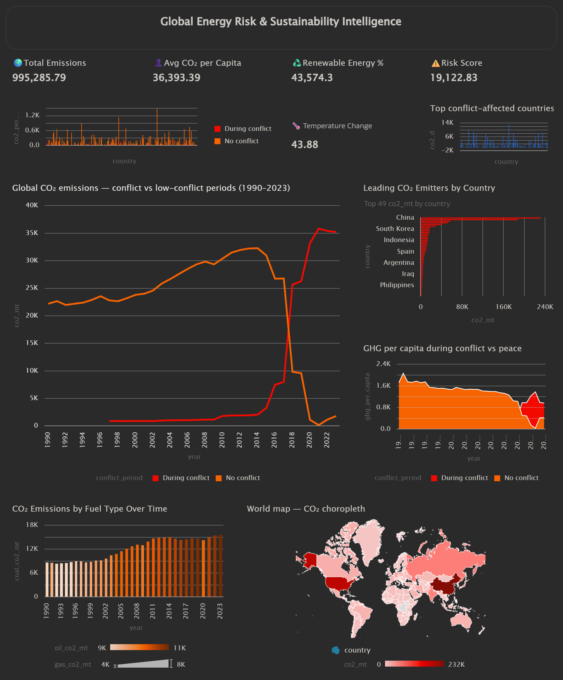
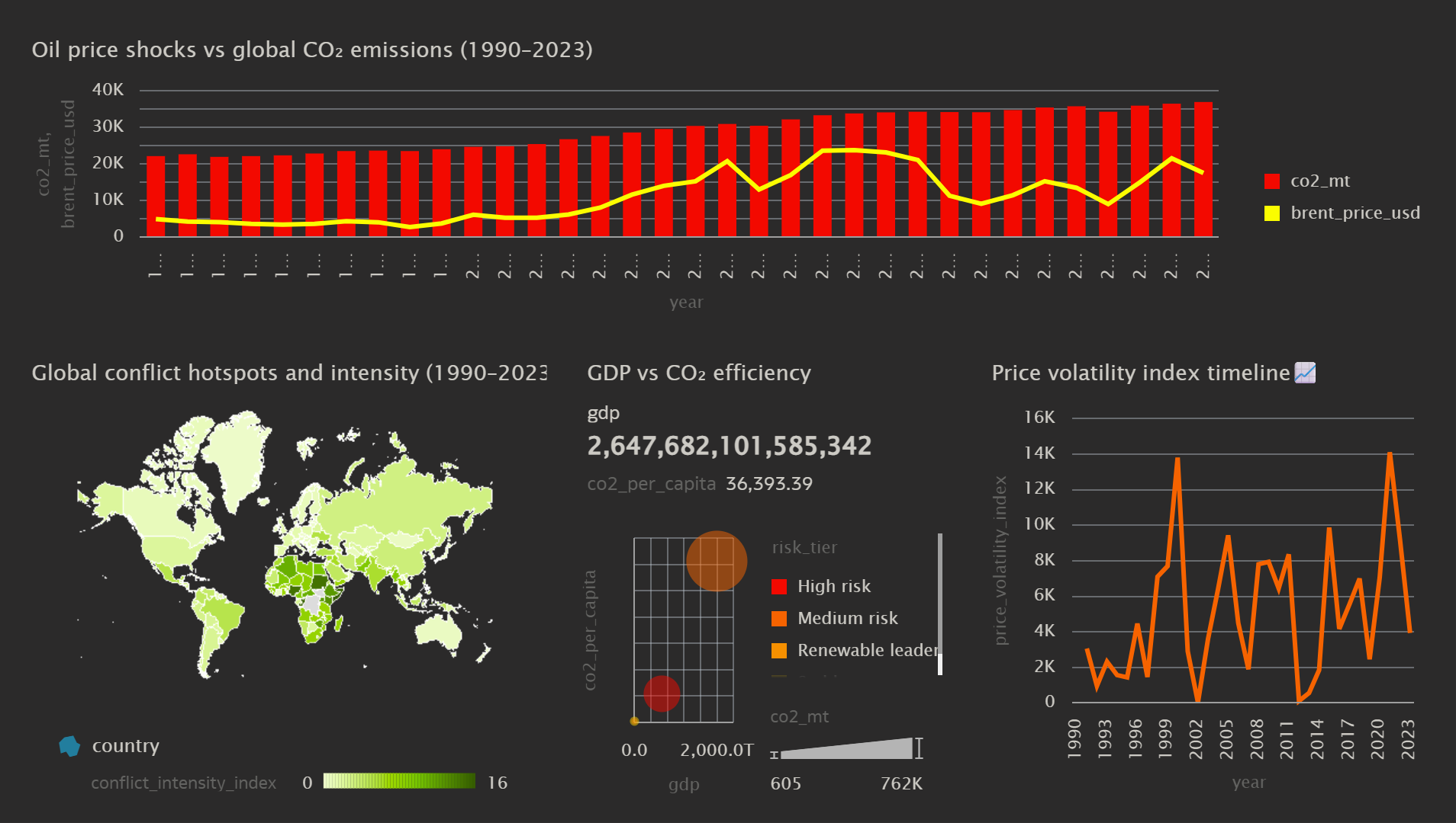
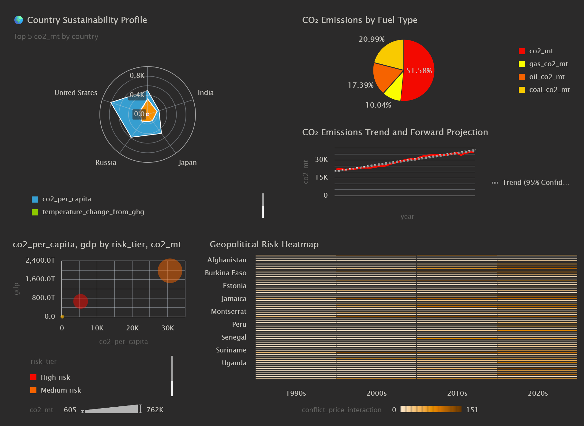
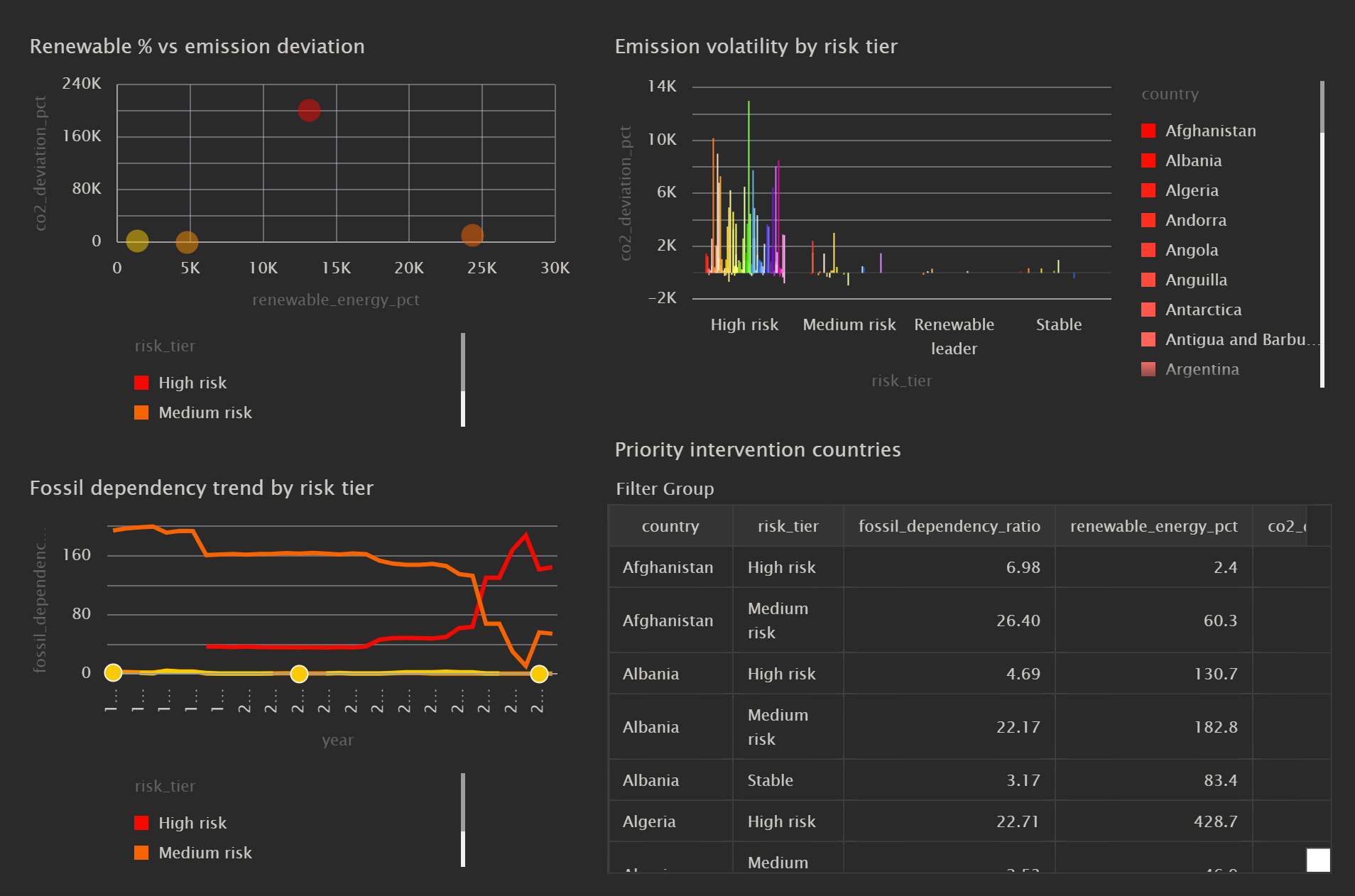
The dashboard focuses on climate, energy, and geopolitical analysis. It answers questions such as:
- How do countries compare in CO₂ emissions, renewable energy adoption, and fossil fuel dependency?
- What are the trends in emissions, temperature change, and energy consumption over time?
- How do geopolitical events and crude oil prices influence energy and ESG metrics?
- Which countries are leading in sustainable energy adoption and emissions reduction?
The visualizations provide a comprehensive overview, helping stakeholders understand environmental impact, energy trends, and geopolitical risks in one platform.
5. Did you use AI features?
Yes, AI features were applied to generate insights and detect trends:
- Automated trend detection using Pandas and time-series aggregation
- Calculated key indicators such as fossil dependency ratio, CO₂ per capita, and temperature change contribution
- Prepared the data for AI-assisted dashboards and predictive analytics
Additionally:
- Exported processed datasets for reporting
- Shared the master dataset (
esg_geopolitics_master.csv) for analysis and visualization
6. Did you upload your visualization image and dva file?
Yes, I have uploaded both the visualization images and the corresponding DVA file.