Food Delivery Analytics Dashboard
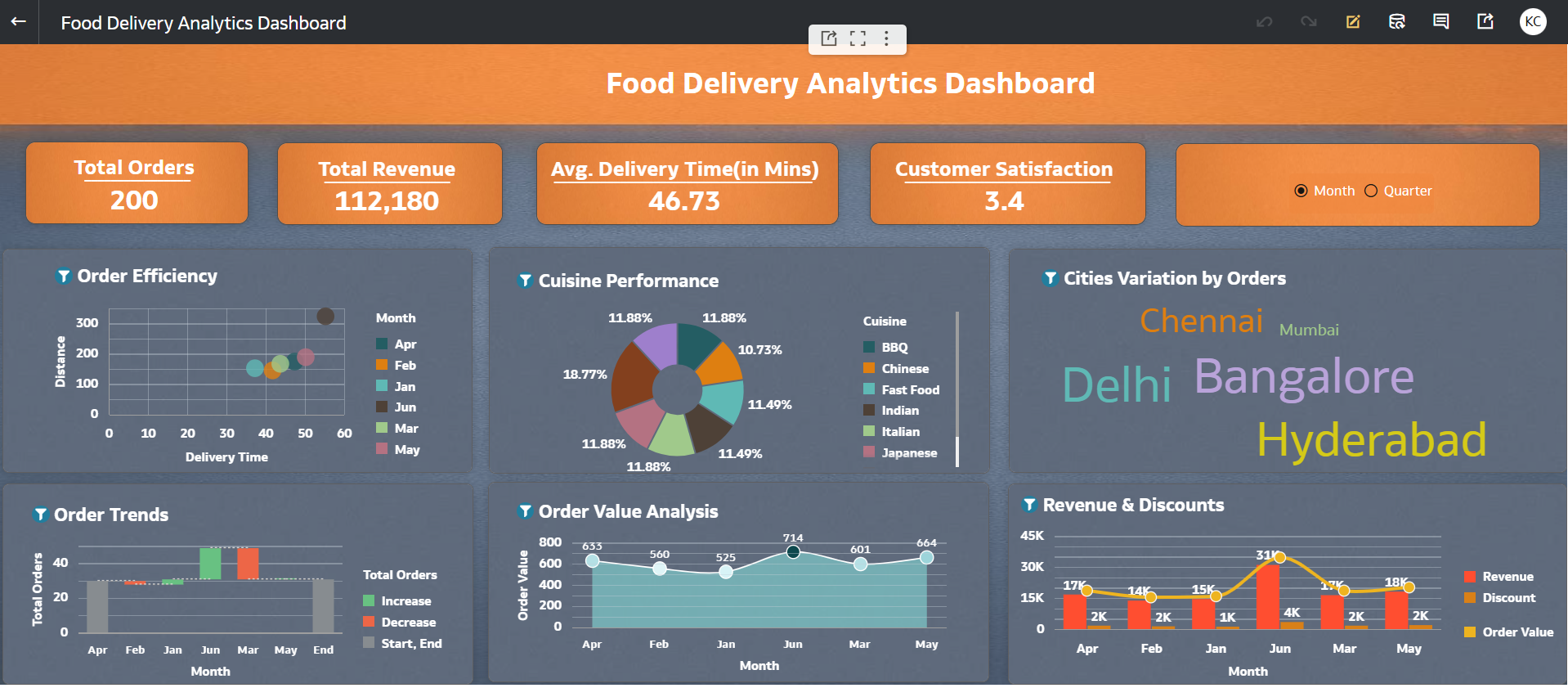
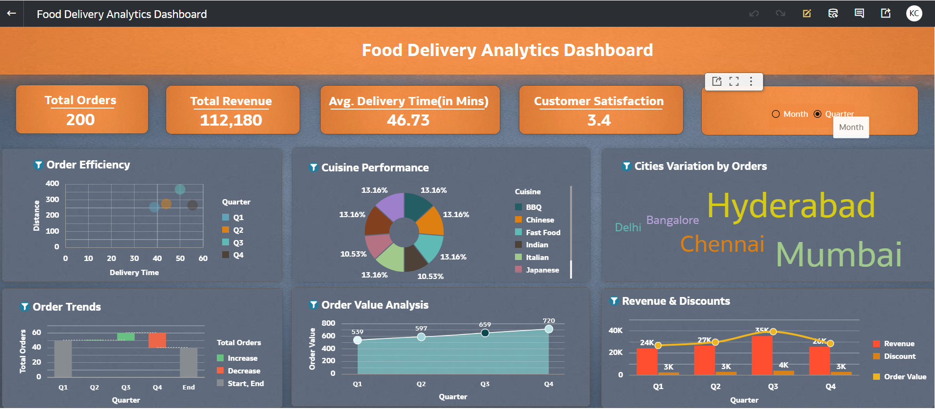
This dashboard provides an integrated analytical view of food delivery operations and customer behavior by combining key attributes such as city, cuisine, delivery time, ratings, and order value into a single framework.
The dashboard enables dynamic analysis across both monthly and quarterly levels, allowing users to track trends over time.
It helps identify high-performing areas, popular cuisines, and customer preferences.
Overall, it supports data-driven decision-making to optimize delivery efficiency and enhance customer satisfaction.
1. Which dataset did you use?
I used a Food Delivery Orders dataset containing transactional data such as Order ID, Order Date, Month, Quarter, City, Area, Cuisine, Order Value, Discount, Final Amount, Delivery Time, Distance, Order Status, Rating, Customer Type, Surge Flag, and Weather conditions.
This dataset was uploaded and structured within an Oracle Analytics Cloud (OAC) workbook to build an interactive dashboard for analyzing delivery performance and customer behavior.
2. How did you analyze or prepare the data?
I performed the following data preparation steps:
- Standardized categorical fields such as City, Cuisine, Order Status, Weather, and Customer Type
- Ensured all numerical measures like Order Value, Discount, Final Amount, Delivery Time, Distance, and Rating were correctly formatted
- Created calculated KPIs such as:
- Total Revenue (Final Amount)
- Average Delivery Time
- Average Rating
- Enabled time-based analysis at both Month and Quarter levels
- Implemented a parameter-driven button bar to dynamically switch between Monthly and Quarterly views across all visualizations
3. Who is the intended audience for your visualization?
The dashboard is designed for:
- Food delivery platform managers – to monitor operations and delivery efficiency
- Business analysts – to identify trends in orders, delays, and customer behavior
- Operations teams – to analyze delivery time, distance, and surge impact
- Marketing teams – to understand customer segments (New vs Returning) and discount effectiveness
4. What is your visualization about, and what question or problem does it address?
The visualization provides a comprehensive view of food delivery operations, customer behavior, and performance metrics across multiple cities and cuisines, with analysis available at both Monthly and Quarterly levels.
It addresses key business questions such as:
- Which cities or areas have higher orders?
- How does impact delivery time and order volume relate?
- Which cuisines generate higher revenue and better ratings?
- How do these trends vary over time (Month vs Quarter)?
Overall, the dashboard helps in:
- Optimizing delivery efficiency
- Improving customer satisfaction
- Supporting data-driven operational decisions across different time granularities
5. Did you use any Oracle Analytics AI features when building your visualization?
Yes, I leveraged OAC’s AI capabilities to design visualizations related to Order Trends (i.e. Total Orders by Month /Quarter)
6. Did you upload your visualization image and DVA file?
Yes, the dashboard visualization image and the OAC DVA file have been successfully uploaded.
