
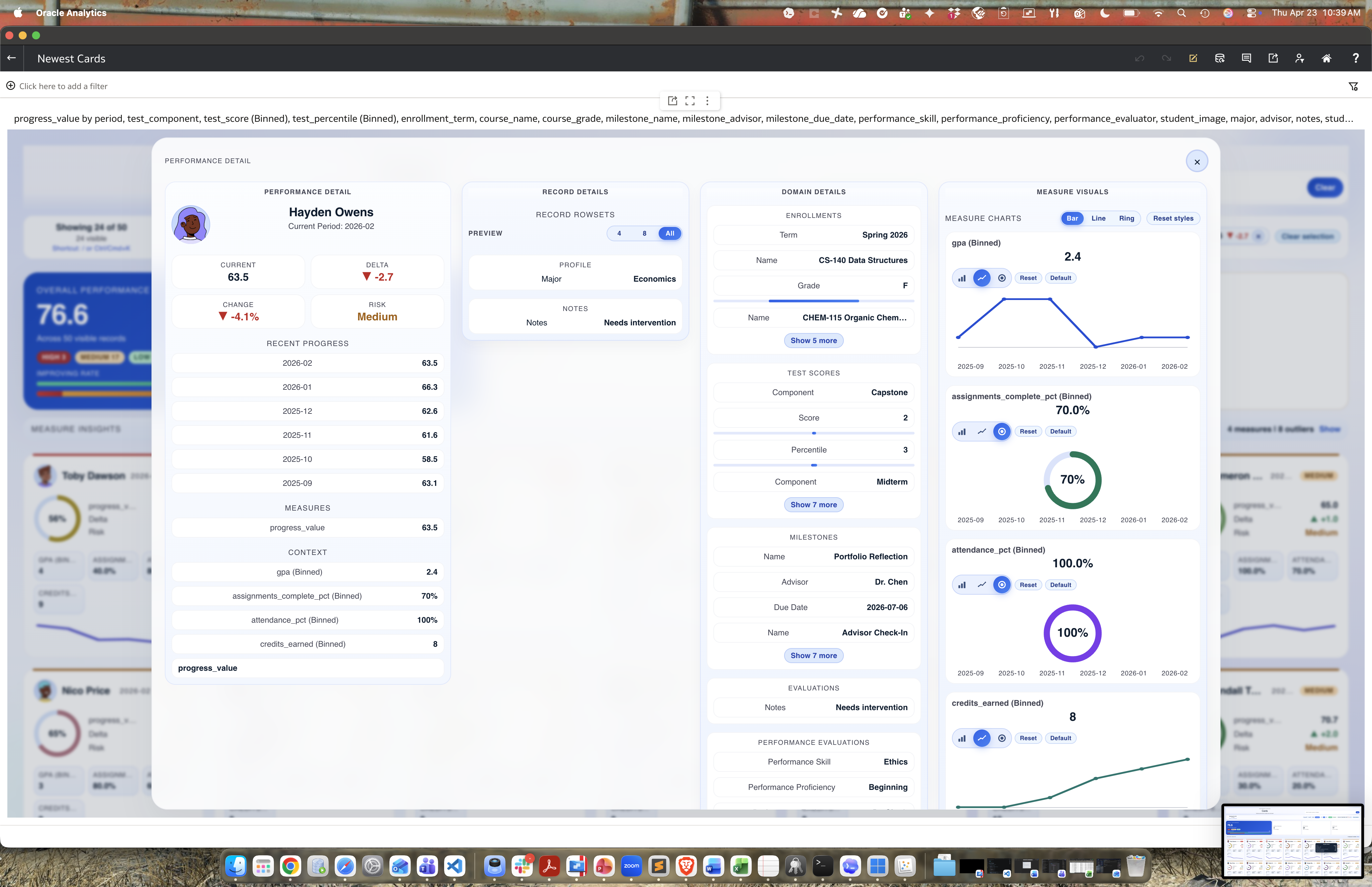
We wanted to test whether a single custom visualization could behave like a dashboard experience, instead of stitching together many separate tiles. The goal was an app-like flow: a “Student Overview” card wall with search/filtering and a drill-down “Student Progress Detail” in the same visual context. I hope you all enjoy it and this example inspires you all to experiment as well.
Which dataset did you use?
An anonymized student progress dataset (plus a 50-student synthetic test CSV) with:
- Student identity fields (name/ID/program/cohort)
- Progress measures (for example GPA and completion metrics)
- Optional image field (URL or base64)
- Detail fields for rowset-style records (enrollments, test scores, milestones, etc.)
How did you analyze or prepare the data?
I created a synthetic dataset to explore what was possible across many attributes, facts, measures, etc.. We normalized measure handling and added guardrails (for example, preventing invalid GPA scaling). We also separated field mappings in the grammar panel so each area has a clear contract:
- Photo (Rendered from either URL or base64)
- Sub-tile measures
- Measure insights
- Record row sets
- Tooltip
I reused functionality from the rings visualization (ceremony sweep on render and fluid fill), photo display from the Oracle Org Chart visualization, along with some design cues from racing bars.
Who is the intended audience for your visualization?
Student success/advising teams, academic leadership, and operations users who need quick cohort status plus fast drill-down to individual records. The same pattern also generalizes well to HR/workforce performance.
What is your visualization about, and what question or problem does it address?
It delivers both summary and detail in one cohesive experience. Users can quickly answer:
- Who needs attention right now?
- Which metrics are strong or lagging?
- What supporting detail explains a student’s status?
Did you use any Oracle Analytics AI features when building your visualization?
This was built as a custom Oracle Analytics plugin with standard OA data modeling/filtering and custom JavaScript interaction logic. I used AI for look and feel design along with custom design validations.


