Categories
- All Categories
- Oracle Analytics Learning Hub
- 30 Oracle Analytics Sharing Center
- 20 Oracle Analytics Lounge
- 250 Oracle Analytics News
- 45 Oracle Analytics Videos
- 16.1K Oracle Analytics Forums
- 6.3K Oracle Analytics Idea Labs
- Oracle Analytics User Groups
- 92 Oracle Analytics Trainings
- 16 Oracle Analytics and AI Challenge
- Find Partners
- For Partners
Welcome to the Oracle Analytics Community: Please complete your User Profile and upload your Profile Picture
Analyzing Transit Performance Using Gantt Charts and Maps
InsightSeeker-Oracle
Rank 5 - Community Champion
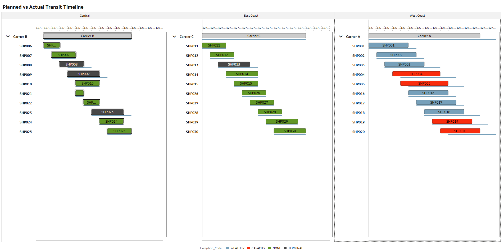
Hi! I used a Gantt chart to analyze transit performance and see how shipments are actually moving over time. I also added a lane map to quickly spot which routes are experiencing the most delays.
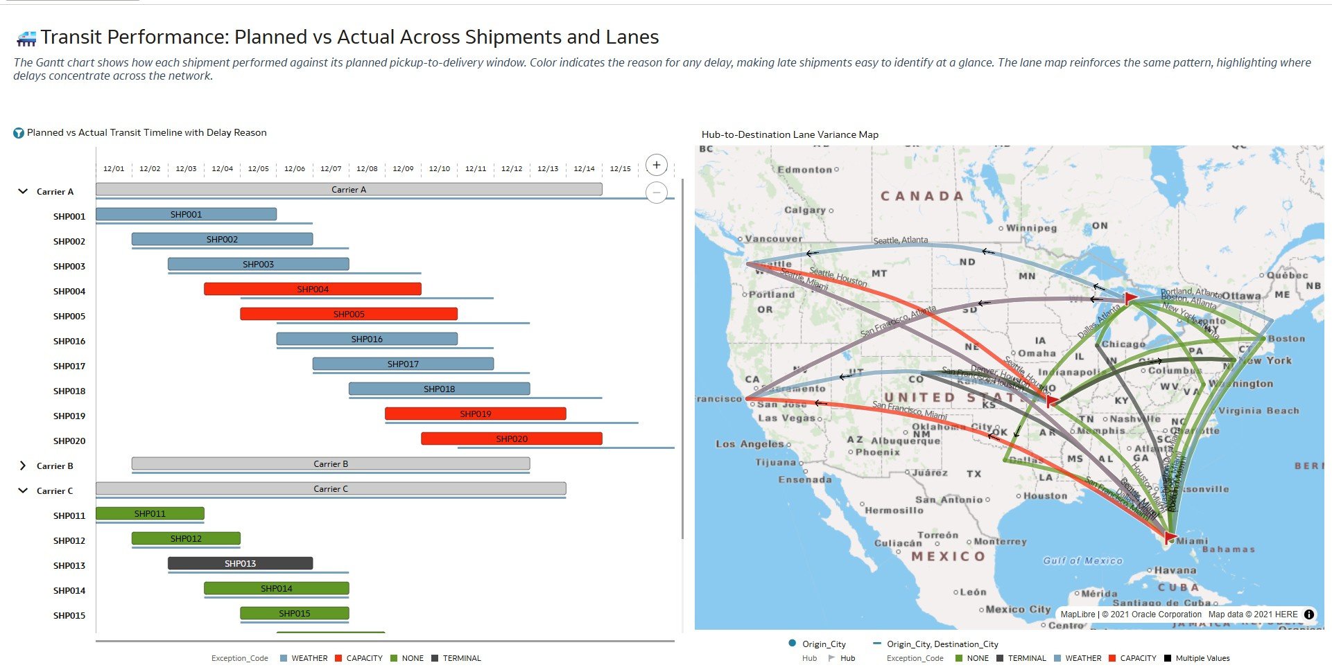
I then broke it down by carrier and individual shipments to check whether delays are tied to a specific carrier or just a few shipments.
Such a fun and intuitive way to explore the data where the insights really just jump out 😀
5
Comments
-
Cool one! Thank you for testing the new features!
1 -
@InsightSeeker-Oracle - logistics truly is #fun! 😃
1 -
That looks so amazing and clean.
Thanks for posting.
1


