Categories
- All Categories
- Oracle Analytics and AI Learning Hub
- 53 Oracle Analytics and AI Sharing Center
- 20 Oracle Analytics and AI Lounge
- 293 Oracle Analytics and AI News
- 57 Oracle Analytics and AI Videos
- 16.4K Oracle Analytics and AI Forums
- 6.5K Oracle Analytics and AI Labs
- Oracle Analytics and AI User Groups
- 116 Oracle Analytics and AI Trainings
- 21 Oracle Analytics and AI Challenge
- Find Partners
- For Partners
An Animated Way To Visualize How Data Evolves Over Time
The Racing Bar custom extension displays data as an animated bar chart showing how values evolves across a third dimension like time. As the data changes, the bars dynamically reorder and “race” across the chart, making it easier to observe trends, shifts in ranking, and relative movement between categories over time.
Learn more about the extension here.
You can download the extension zip file here:
Upload the zip file into Oracle Analytics Cloud instance by navigating to Console→Extensions and you start adding the visualization to your workbooks.
Important:
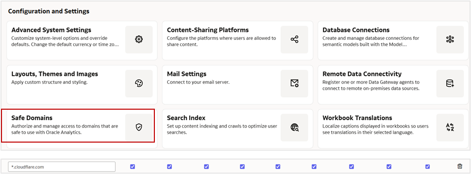
Ensure to whitelist the domain ‘*.cloudflare.com’ under Safe Domains in your Oracle Analytics instance.
Comments
-
This is a fantastic and engaging way to visualize changes over time.
Thank you very much, @Prasenjit_Thakur-Oracle for sharing the extension and the clear setup instructions, including the Safe Domains note.
0 -
beautiful visualization, thx for sharing with the community. Keep it up!
0 -
Animated time variation in data is such an important visualization. End users love this kind of functionality
0


