Project Portfolio Profitability Insights Dashboard (Oracle Analytics Cloud)
I recently built an Oracle Analytics Cloud (OAC) dashboard designed to provide clearer visibility into project portfolio financial performance.
In large project portfolios, it is often difficult to quickly understand which projects are driving profitability, which organizations contribute the most value, and where margin performance may be declining. This dashboard helps address that challenge by presenting portfolio-level profitability insights in a clear and actionable format.
1. Dataset Used
The dashboard uses the Project Portfolio Management (PPM) subject area from Oracle Fusion.
This dataset provides access to key project financial metrics including:
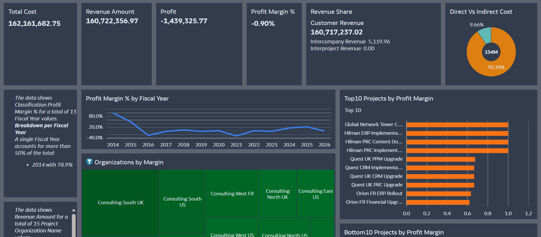
- Project revenue
- Burdened project costs
- Project classifications
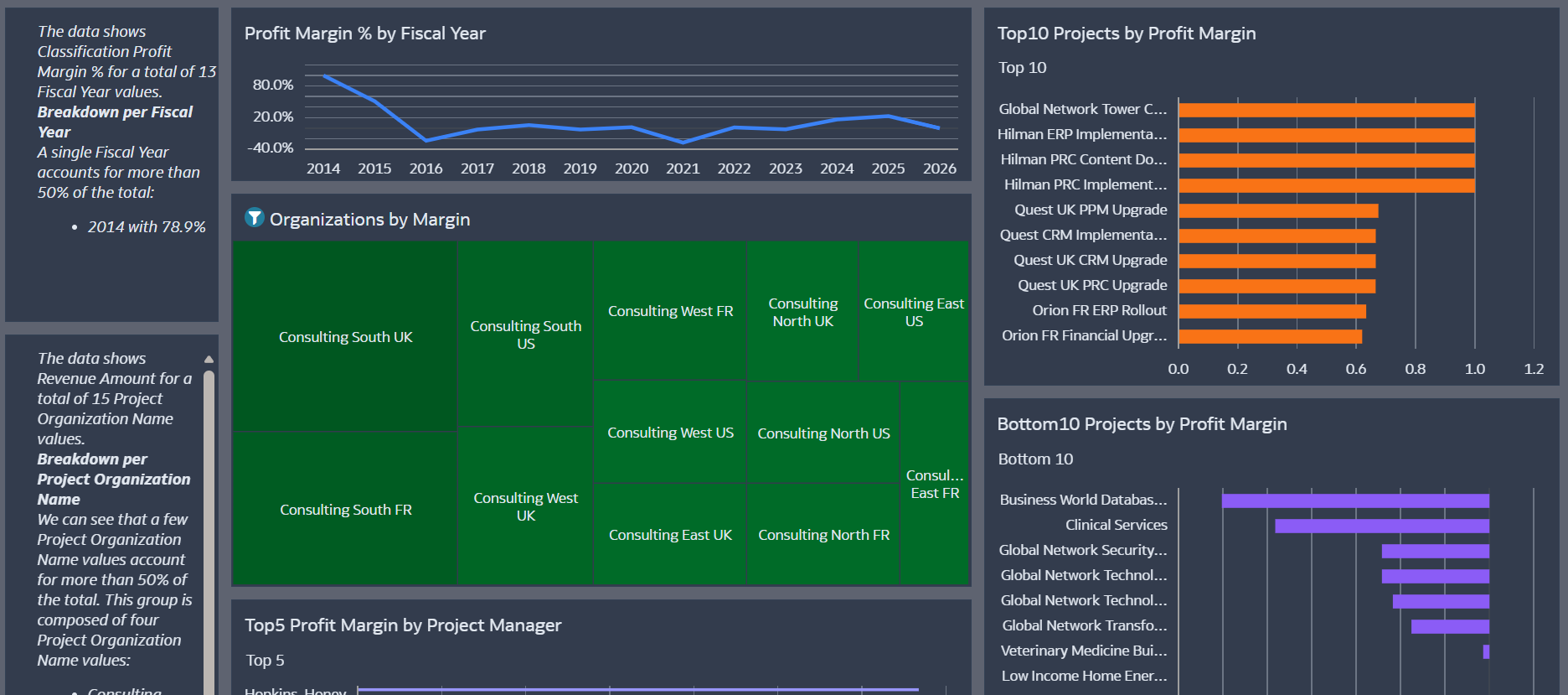
- Project organizations and project managers
- Customer revenue contributions
These measures allow a consolidated view of portfolio revenue, cost, and profitability across projects and organizations.
2. Data Analysis and Preparation
To better understand the dataset structure and distributions, I first explored the data using OAC AI Insights.
AI Insights helped highlight:
- Distribution of financial metrics across projects
- Patterns in cost and revenue contribution
- Data patterns and value distributions that needed to be considered when designing the visualizations
Based on this exploration, I created calculated measures directly in OAC, including:
- Profit = Revenue − Cost
- Profit Margin %
These derived measures allow the dashboard to present profitability trends and portfolio performance indicators.
3. Intended Audience
The dashboard is primarily designed for:
Finance Controllers, Project Controllers, and PMO analysts responsible for monitoring project financial performance across the organization.
It also supports executive leadership by providing a quick overview of portfolio profitability through high-level indicators and summary visualizations.
4. Key Business Questions Addressed
The dashboard is designed to answer key portfolio-level questions such as:
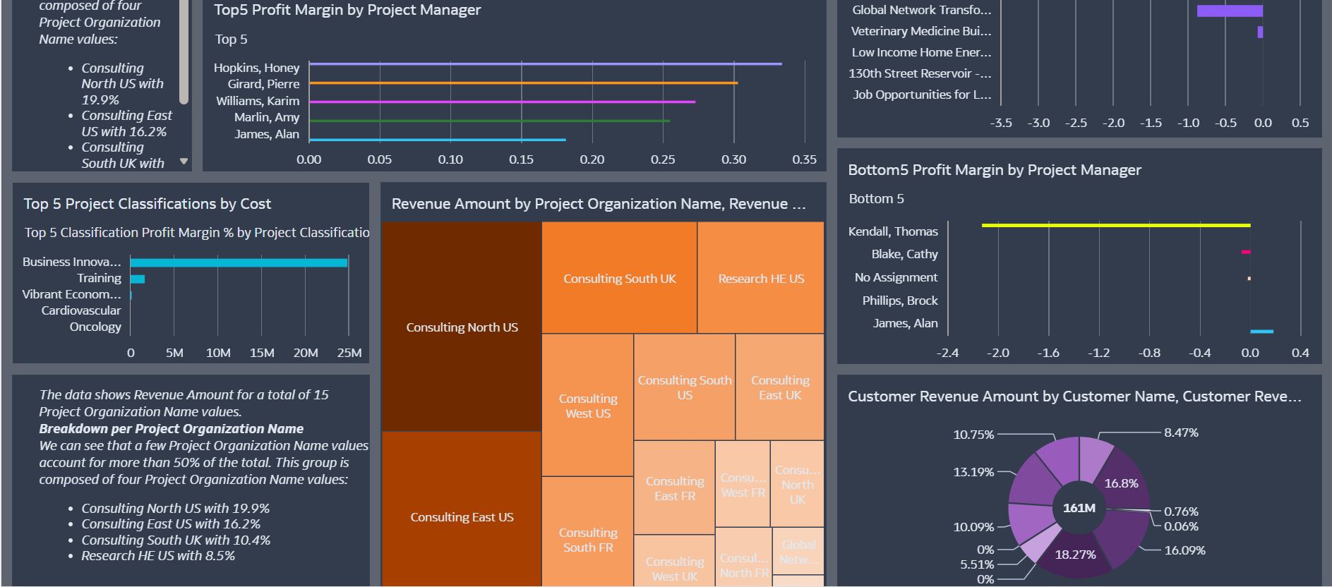
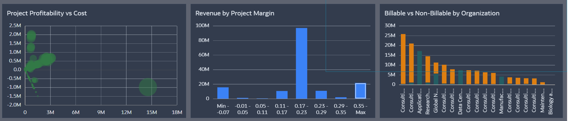
- Which projects are the most profitable and which are underperforming?
- How is profit distributed across project organizations and managers?
- Which project classifications contribute the most cost to the portfolio?
- Which customers generate the highest revenue?
- How is project cost distributed between billable and non-billable work?
The Portfolio Overview provides the overall financial picture, while additional visualizations highlight profitability distribution across projects, organizations, and classifications.
5. Use of Oracle Analytics AI Features
Yes — OAC AI Insights was used during the data exploration phase. Language Narrative is used.
AI Insights suggested alternative analytical views and visualizations that could better highlight financial patterns within the dataset. These insights helped guide the selection of charts used to present profitability trends and portfolio performance indicators.