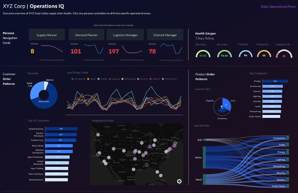
When supply chains break, the world feels it—empty shelves, delayed shipments, frustrated customers. Yet the employees keeping them running spend hours each day buried in data, emails, etc., trying to keep up. Sentient Supply Chain Intelligent Dashboard flips that. Actionable insights instantly surface up what need attention across inventory, demand, logistics, and fulfillment—giving four key personas the clarity to act in seconds, not hours.
Note: In the live dashboard, each persona card on the homepage is clickable—navigating users directly to their personalized operational view with interactive filters.
Thanks,
Anil Sebastian (Oracle)
1. Which dataset did you use?
Created a synthetic dataset myself—two fact tables (Daily Inventory Supply, Daily Demand Orders) and three dimension tables (SKUs, Customers, Carriers) with 45,000+ rows of realistic supply chain operational data.
2. How did you analyze or prepare the data?
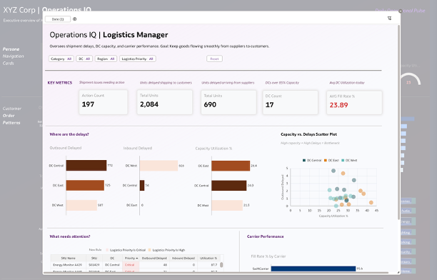
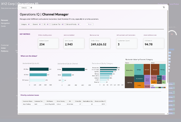
I designed the data model to support persona-specific operational views. Pre-calculated "Action Required" flags, priority scores, and metrics (Days of Cover, Fill Rate %, Forecast Error %) were built into the dataset to enable instant filtering to critical items without complex workbook calculations.
3. Who is the intended audience for your visualization?
Four supply chain personas: Supply Planner, Demand Planner, Logistics Manager, and Order Management—plus executives who need a daily operational pulse across all areas.
4. What is your visualization about, and what question or problem does it address?
Supply chain professionals spend hours every morning mining spreadsheets to find what needs attention. This dashboard answers one question for each persona: "What needs my attention today?" It instantly surfaces stockout risks, forecast misses, shipment delays, and backorders—turning hours of analysis into seconds of actionable insight.
5. Did you use any Oracle Analytics AI features when building your visualization (ex. AI Assistant)? If so, please describe how they were used
Yes, I used several AI features. I used the AI Assistant to explore the dataset and generate initial visualizations. Auto Insights helped identify key patterns across inventory and demand data. I also added Language Narratives to provide dynamic text summaries that explain KPI performance in plain language for end users.
6. Did you upload your visualization image and dva file?
Completed!