Categories
- All Categories
- Oracle Analytics and AI Learning Hub
- 53 Oracle Analytics and AI Sharing Center
- 20 Oracle Analytics and AI Lounge
- 293 Oracle Analytics and AI News
- 57 Oracle Analytics and AI Videos
- 16.4K Oracle Analytics and AI Forums
- 6.5K Oracle Analytics and AI Labs
- Oracle Analytics and AI User Groups
- 116 Oracle Analytics and AI Trainings
- 21 Oracle Analytics and AI Challenge
- Find Partners
- For Partners
Welcome to the Oracle Analytics Community: Please complete your User Profile and upload your Profile Picture
Salary gender pay gap
Stefano_Mazzocca
Rank 6 - Analytics & AI Lead
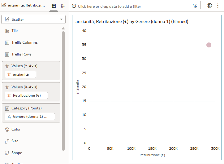
I have this example:
1st column: salary
2nd: gender
3rd and on: other variables
I'm trying to plot a scatter chart, so far I have this:
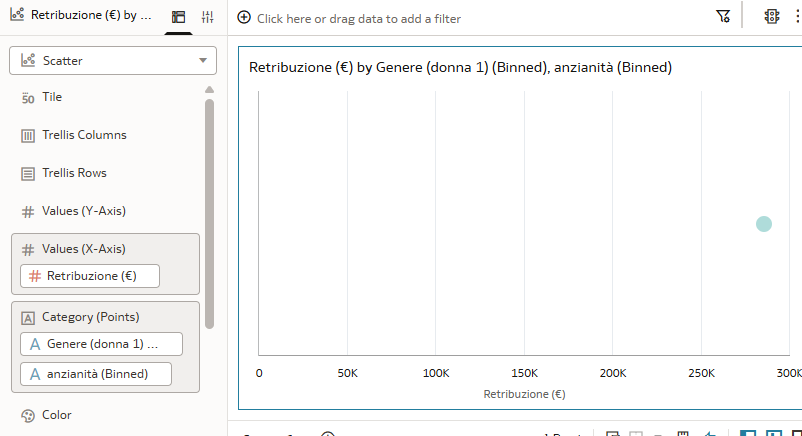
I'm trying to obtain something like this, with line showing all coefficients:
What I'm doing wrong? I tried different configurations
Tagged:
0
Answers
-
Your scatter plot only has the X-axis configured (Retribuzione/Salary) but is missing a Y-axis measure. A scatter plot needs two numeric measures to plot points meaningfully.To get the regression line like in your example image, after the chart renders properly you need to: right-click on the visualization → Add Statistics → Trend Line, then choose Linear.
0 -
Hi @Vasudha_Oracle-Oracle , this is the result:
0


