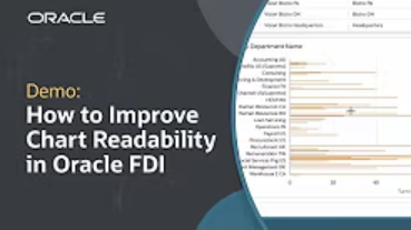
Effectively sorting data in your visualizations can significantly improve chart readability, making it easier to identify key patterns and outliers. This tutorial demonstrates how to sort and filter visualization values in Oracle Fusion AI Data Platform (FAIDP).
In this guide, you’ll learn how to:
- Sort table columns in ascending or descending order to highlight departments with the highest or lowest headcount.
- Apply filters to exclude irrelevant data, such as departments without assigned values.
- Sort horizontal bar charts to display departments with the highest voluntary turnover rates.
- Utilize filters to focus on top values, like the top 10 departments by turnover.
- Sort data alphabetically to organize information systematically.
Chart readability enhances your ability to quickly interpret data, leading to more informed business decisions.
Watch the full tutorial to see these methods in action.