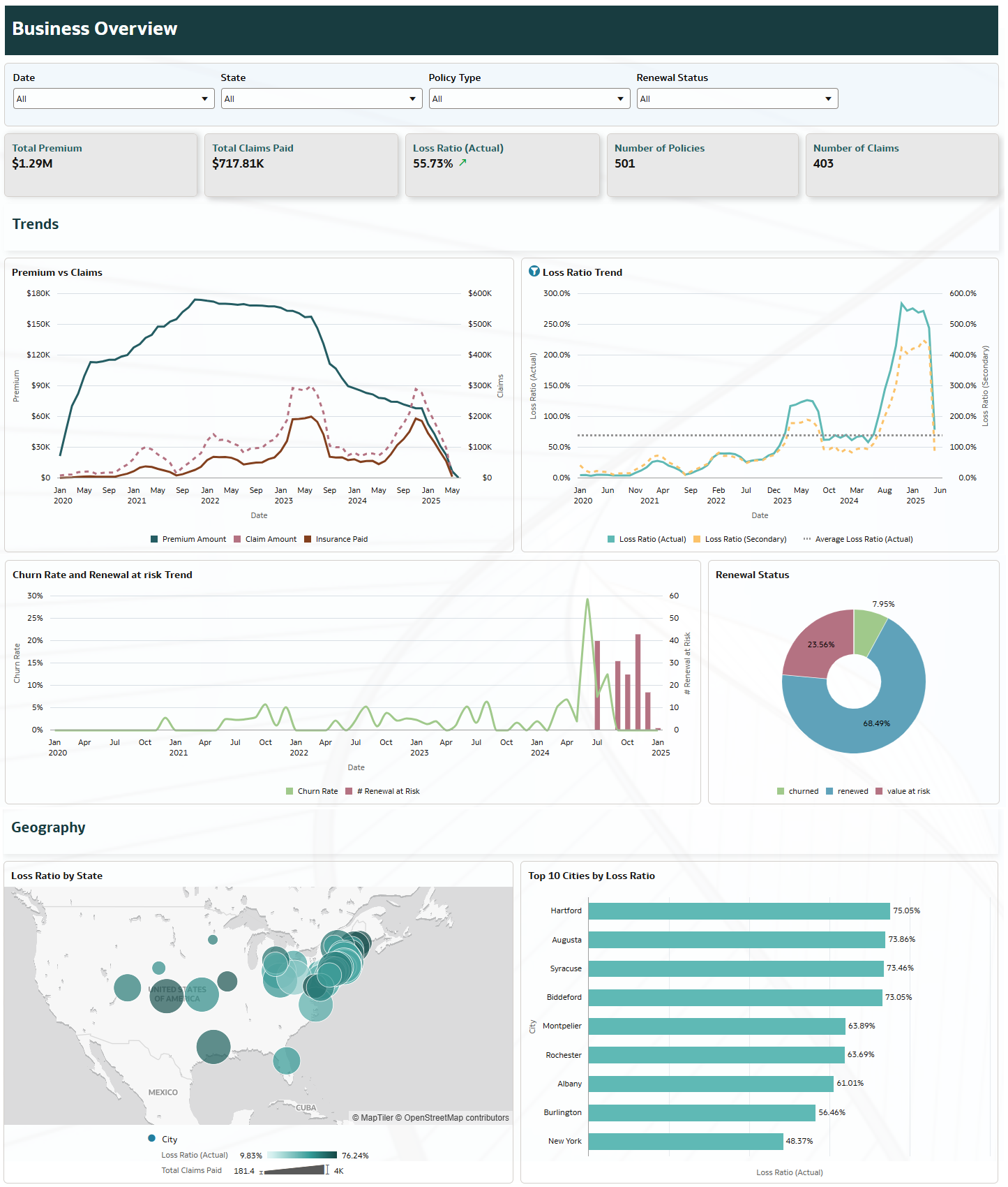
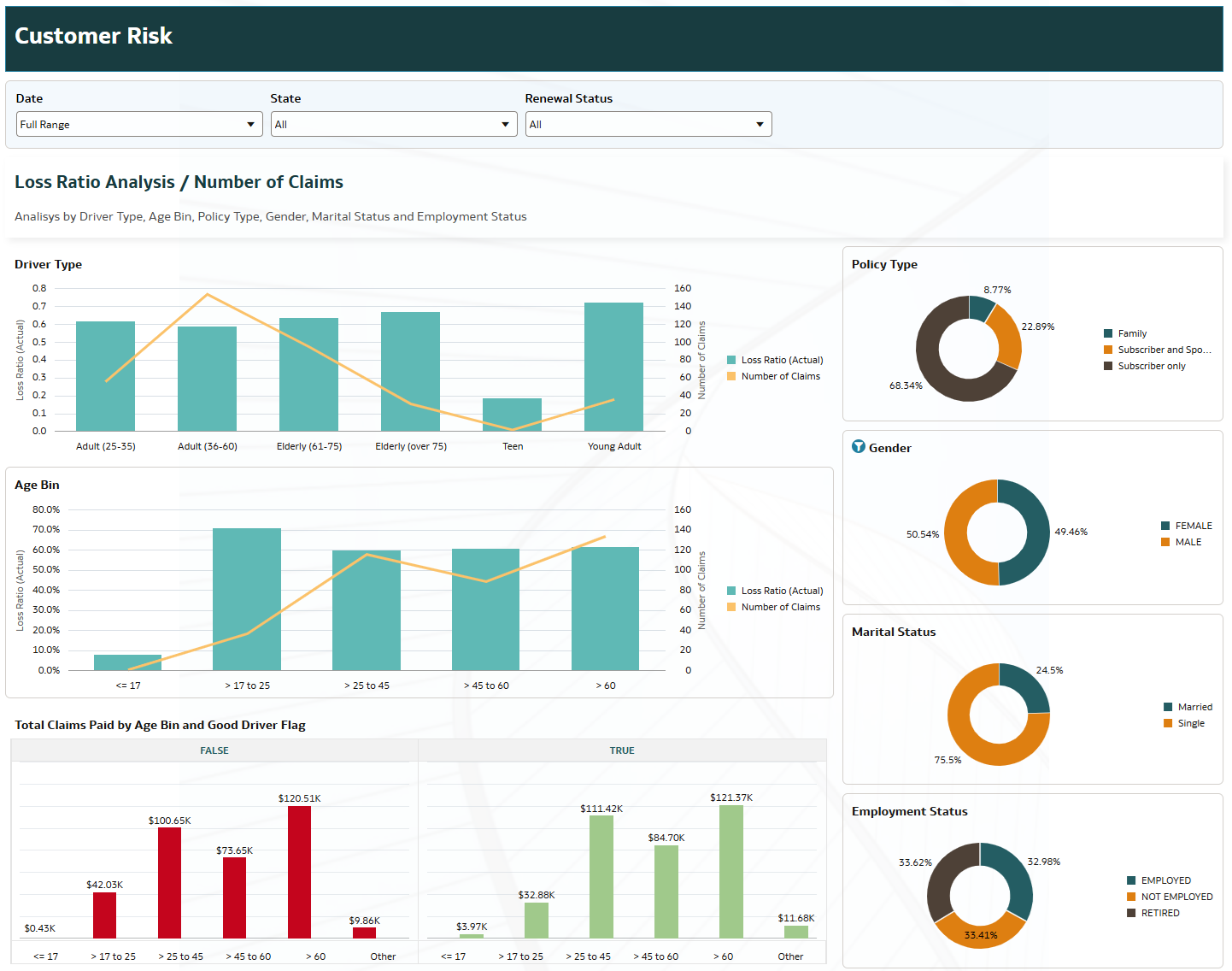
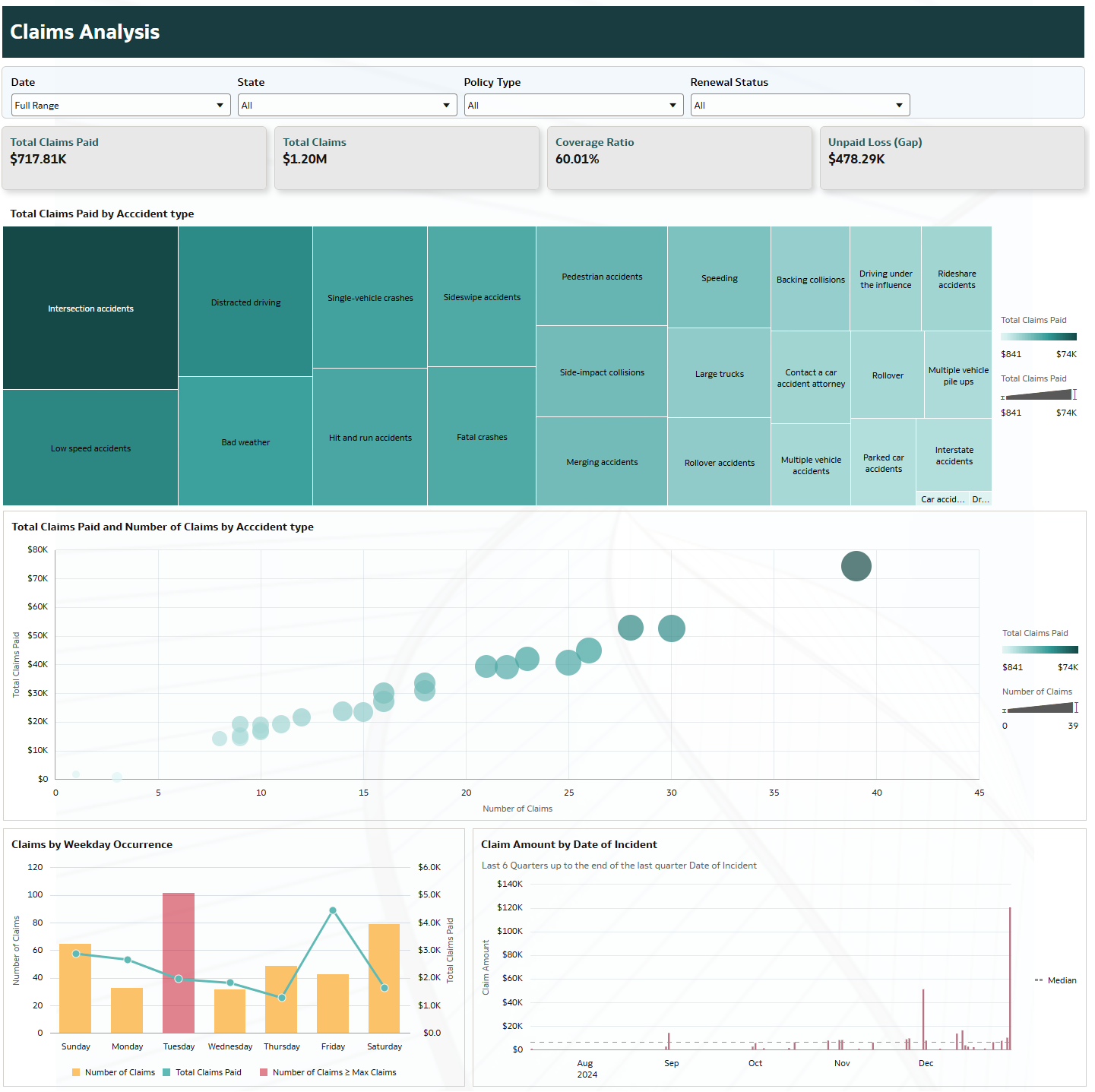
These dashboards analyze auto insurance performance by linking premiums, claims, and customer risk profiles through the Loss Ratio metric. It provides a structured view of where profitability is generated or lost, highlighting high-risk segments, geographic concentrations, and key drivers of claim costs. The analysis enables data-driven decisions in underwriting, pricing, and claims management.
1. Which dataset did you use?
I used the Auto Insurance dataset provided in the environment provisioned for this challenge.
2. How did you analyze or prepare the data?
I conducted an initial data model and data profiling analysis, reviewing relationships between tables and validating key measures such as premiums and claims.
Additionally, I explored the dataset using summary tables and preliminary visualizations to understand distributions, identify relevant dimensions (e.g., customer, geography, driver attributes), and ensure the data supported profitability and risk analysis.
3. Who is the intended audience for your visualization?
The dashboards are designed primarily for:
- Business Managers – to monitor overall profitability and performance
- Risk Analysts – to identify high-risk segments and drivers of loss
- Claims/Operations Managers – to analyze claim behavior and cost drivers
4. What is your visualization about, and what question or problem does it address?
The dashboards focus on profitability, customer risk, and claims analysis, using Loss Ratio (based on insurance paid) as the central metric.
They address the key business question:
“What is driving profitability across customers, locations, and time?”
To answer this, the analysis provides:
- Segmentation by customer and driver profiles to identify high-risk groups
- Geographic insights to detect loss concentration by location
- Claims analysis to understand drivers of loss, including accident types, claim frequency, and severity
This structured approach enables users to move from a high-level view to detailed insights through interactive drill-down.
5. Did you use any Oracle Analytics AI features when building your visualization (ex. AI Assistant)? If so, please describe how they were used.
Yes, I used Oracle Analytics AI features (such as Auto Insights) during the initial exploration phase to identify patterns and generate visualization ideas.