JET Version: 10.0
Hi Community
We are implementing the Editable Form Table pattern in oj-table which utilises the Row Template pattern.
We require responsive column drop so are using the responsive classes for screen sizes to control the rendering in the row template i.e.
<tr>
 <td>
   <oj-bind-text value="[[row.data.EmployeeId]]"></oj-bind-text>
 </td>
 <td class="oj-lg-down-hide">
   <oj-bind-text value="[[row.data.DepartmentName]]"></oj-bind-text>
 </td>
</tr>
The columns are correctly hidden/shown according to the screen dimension however there is an issue in that when a column is hidden, the remaining columns do not stretch to take up the additional space. This contrasts to the pattern where Row Template is not used and the classes are added to the ‘className’ and ‘headerClassName’ column object properties where the remaining columns do stretch to take up the additional space when a column is hidden.
columns='[{"headerText": "Employee Id",
 "field": "EmployeeId",
 "headerClassName": "oj-sm-only-hide",
 "className": "oj-sm-only-hide",
 "resizable": "enabled"},
{"headerText": "Department Name",
 "field": "DepartmentName",
 "className": "oj-lg-down-hide",
 "headerClassName": "oj-lg-down-hide"}]'
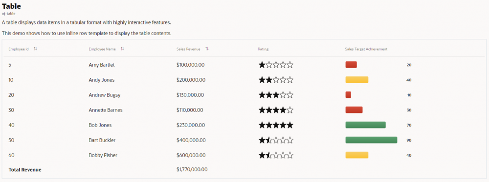
You can see this in the Cookbook demo for the Row Template pattern. By default, the demo does not include responsive column hide but you can add this using the following steps to highlight the issue:
In demo.html, add ‘class="oj-lg-down-hide"’ to the <td> element for Rating and Sales Target Achievement:
<td class="oj-lg-down-hide">
In demo.js, add ‘className: "oj-lg-down-hide", headerClassName: "oj-lg-down-hide"’ to this.columnArray for the same columns
{ headerText: "Rating", sortable: "disabled", className: "oj-lg-down-hide", className: "oj-lg-down-hide", headerClassName: "oj-lg-down-hide" },
{ headerText: "Sales Target Achievement", sortable: "disabled", className: "oj-lg-down-hide", headerClassName: "oj-lg-down-hide" },
Click Apply Changes
Zoom in on the browser to something lower than XL.
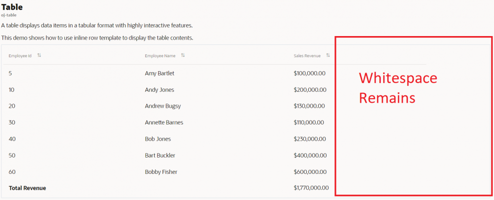
You will see the Ratings and Sales Target Achievement columns hiding as the view port changes. Notice though how the whitespace where those columns were remains in place and the remaining columns do not stretch to fill the space.
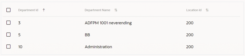
 Contrast this with the Basic demo which uses responsive classes within the columns template and the columns do stretch to fill the remaining space. Here, I have set the className and headerClassName to 'oj-lg-down-hide' on the column 'Manager Id'. See in the image below how when Manager Id is hidden, the remaining columns fill the available space.
 This issue becomes a significant issue for small screens such as mobiles where as the columns drop off, the whitespace remains. This negates the point of hiding the columns as the remaining columns do not take up the remaining space.
So the question is, how can we use Row Template with responsive column drop where the remaining columns fill the remaining horizontal space when the view port size changes?
Any ideas greatly appreciated.