Categories
- All Categories
- Oracle Analytics Learning Hub
- 33 Oracle Analytics Sharing Center
- 22 Oracle Analytics Lounge
- 256 Oracle Analytics News
- 45 Oracle Analytics Videos
- 16.1K Oracle Analytics Forums
- 6.3K Oracle Analytics Idea Labs
- Oracle Analytics User Groups
- 97 Oracle Analytics Trainings
- 16 Oracle Analytics and AI Challenge
- Find Partners
- For Partners
Hints and Tips - How to Control the Colours in a Graph

Summary
Explanation of how to drive the colours in your graphs by the values being displayed
Content
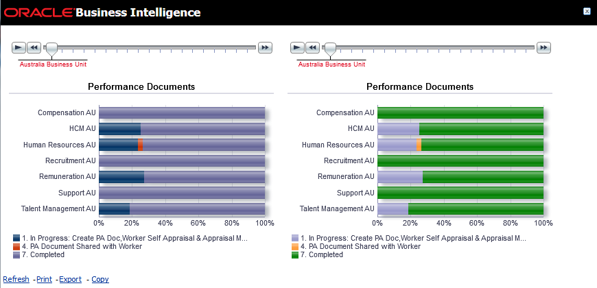
This is part of a series of sample reports created by Oracle BI and HCM Product Management. You can copy the setup for this report and add it to your Oracle HCM Cloud Service environment.
You may have noticed that when you create a chart, the colours shown depend on the number of values being displayed. So the first value is blue by default, the second red, the third lilac etc. That is fine if you only have one page on a graph, but if you add a slider or a drop down to create multiple “pages” of information, the same value may show as different colours on different “pages” because of its different relative position on that “page”. So, for example, a value may be blue on one page (where it is the first and perhaps only value) but lilac on another where it is the third value.
This default behaviour can make comparing results difficult but it can be overridden by hardcoding the colours based on the value being displayed so that a particular value will always show as the same colour.
The attached word document provides simple instructions on how to achieve this. I have also provided a sample report using this technique.
To add this report to your environment:
- Create a new analysis using Oracle Business Intelligence Answers.
- Copy and paste the XML from the attached txt document into the Advanced Tab.
- Click Apply XML.
Subject areas used: Workforce Performance - Performance Document Status Real Time (but technique works on any report)
5 minutes to copy into your environment.
Comments
-
How to change colors of the bar graph in the pivot graph.
I need to change the color of the bar for each vertically grouped entity
Eg. I have an analysis showing Employee score and ranking them on that basis. The graph should should display different colored bar for each employee.
Request your assistance.
 0
0 -
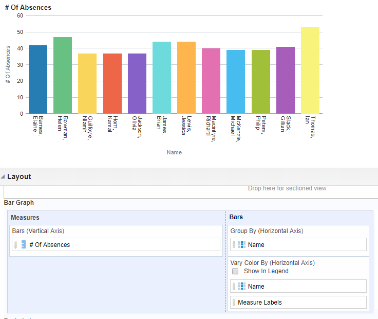
Hi Rashmi - if you want each employee to be a different colour but with no legend displayed - add employee name to the report a second time and place it as shown below and then switch off the box so the legend does not display
Hope that helps
Caroline
 1
1 -
Hi Caroline,
Thank you for the update.
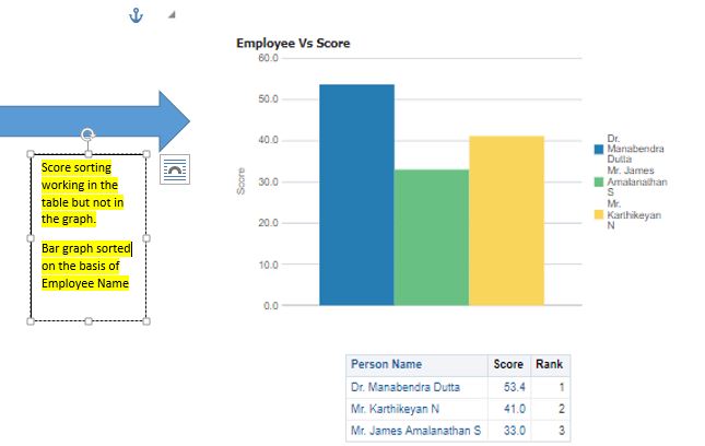
Here I am able to achieve the different color for the bar in a normal graph. .
I am not able to sort the bars in the graph in either ascending/descending manner even I though I have applied the sorting rule on the column in the criteria section. I have uploaded the image for your reference.
The image i had uploaded in the previous post was for a pivot graph. Let me know if we can change the colors of the bars in a pivot graph.
Thanks.
 0
0 -
Many thanks
0