Categories
- All Categories
- Oracle Analytics Learning Hub
- 26 Oracle Analytics Sharing Center
- 18 Oracle Analytics Lounge
- 234 Oracle Analytics News
- 45 Oracle Analytics Videos
- 16K Oracle Analytics Forums
- 6.2K Oracle Analytics Idea Labs
- Oracle Analytics User Groups
- 87 Oracle Analytics Trainings
- 15 Oracle Analytics Data Visualizations Challenge
- Find Partners
- For Partners
Map Visualisation - Dash/ Dotted Lines with Flow of Direction as Animation
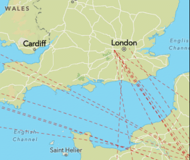
It would be a great addition to have dashed / dotted lines with animation to show the flow of direction in configurable speed. Noticed this as a useful option in Icon Map Pro which is a custom visual for Microsoft Power BI providing enhanced geo spatial analytics capabilities.
Example can be referred here:
Comments
-
Great suggestion and would be a real benefit for the users, as it provides additional information is a very simple way
1 -
Thank you Brendan for highlighting the value of this enhancement and your support!
0
