1. Which dataset did you use?
I used the Digital Lifestyle Benchmark Dataset authored by Tarek Masry and hosted on the Hugging Face platform. Used under the CC BY 4.0 license, this dataset allows research and commercial use with proper credit. Accordingly, I have included author attributions in the footer of every analysis canvas.
2. How did you analyze or prepare the data?
My analysis of the dataset started with the AI Assistant configuration and asking natural language queries to get more clarity about the insights within. Also created an AI Agent, to be able to add more context through document knowledge feature, by uploading publicly available research documents on the impact of digital media on mind. Through the questions asked via the Agent playground, was able to gain greater clarity on the story to be portrayed.
Further analysis were done through the integrated AI/ML features - Explain, Auto Insights and Contextual Insights.
Preparation wise, following are the features primarily used:
- Dataset Editor - to cleanse, rename columns via Gen AI feature, Binning & Grouping
- No data enrichment or external blending was required, as the primary dataset offered a comprehensive scope of behavioural and mental wellness indicators for this analysis.
3. Who is the intended audience for your visualization?
The visualization is designed for digital citizens or anyone curious about how our 'Always-On' culture reshapes wellness and mental health. Specifically, it targets individuals looking to understand the driving attributes behind digital stress and those seeking data-driven motivation to adopt healthier, more intentional digital habits.
4. What is your visualization about, and what question or problem does it address?
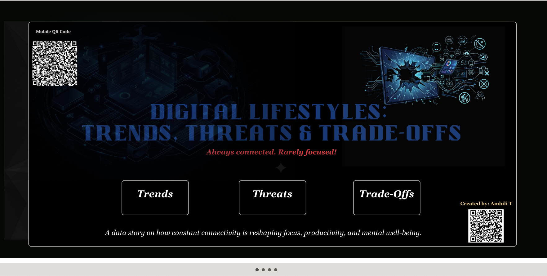
"Digital Lifestyles: Trends, Threats & Trade-offs!" is a data-driven narrative exploring the fragile equilibrium of our hyper-connected world. It is structured into three strategic segments - Trends, Threats and Trade-offs; which can be dynamically routed from the cover page below:
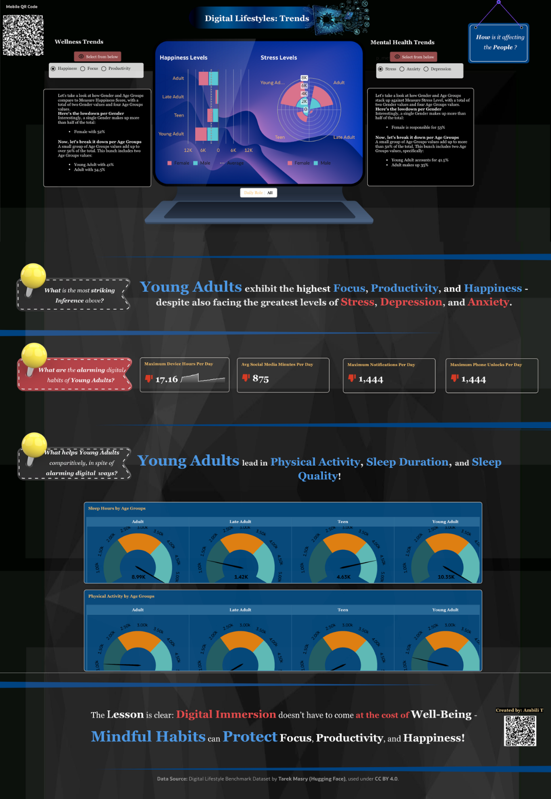
Trends:
In addition to providing interactive analysis, this section specifically addresses the following questions:
- How is a digital lifestyle affecting people?
- What are the alarming digital habits of young adults who exhibit the highest focus, productivity, and happiness scores?
- What helps young adults, comparatively, in spite of their alarming digital habits?
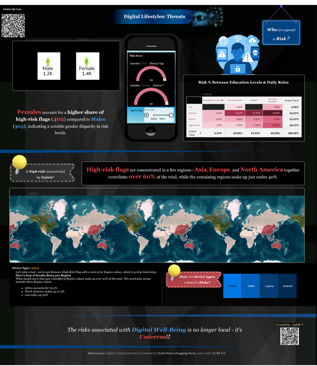
Threats
This section deep dives into risk exposure to identify critical vulnerabilities, specifically investigating:
- Demographic Vulnerability: Which groups face the highest exposure?
- Geographic Concentration: Are risks clustered within specific regions?
- Device Correlation: How do different device categories influence risk levels?
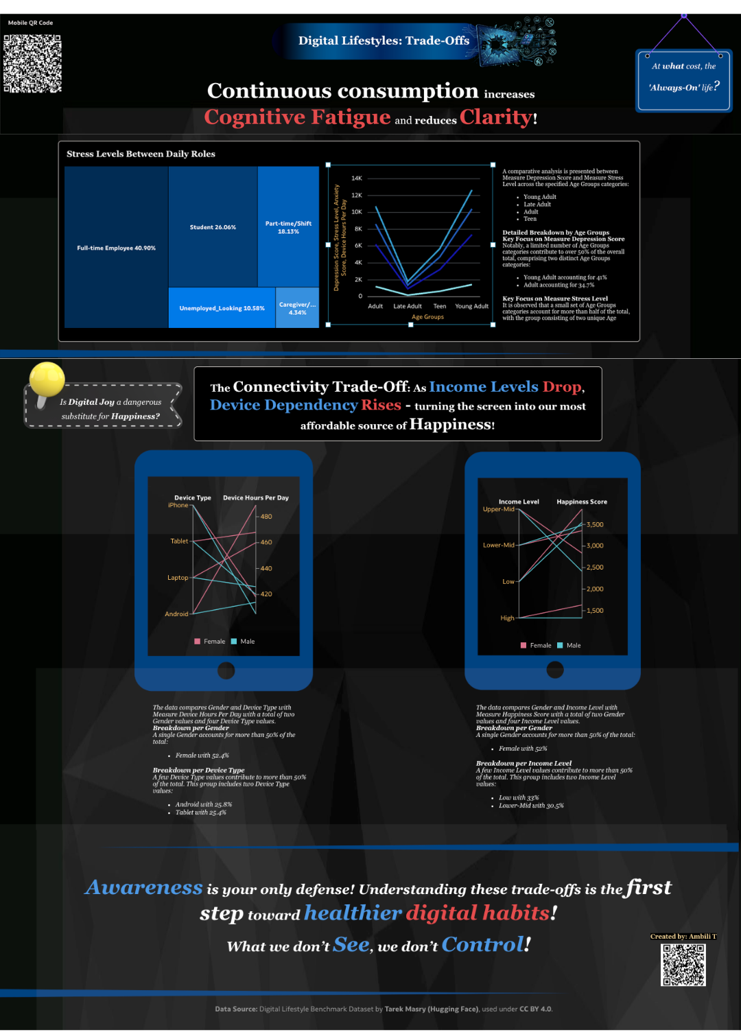
Trade-Offs:
This concluding section examines the hidden costs of our digital existence, highlighting critical inferences found within the data. We specifically investigate:
- The Physiological Ransom: At what cost do we maintain an 'always-on' life?
- The Emotional Exchange: Is digital joy becoming a dangerous substitute for genuine happiness?
- The Final Verdict: What is the essential takeaway for the modern digital citizen?
5. Did you use any Oracle Analytics AI features when building your visualization (ex. AI Assistant)? If so, please describe how they were used
Absolutely!
Below are the AI features used for creating this data story:
- The AI Assistant: My favourite AI feature in DV! I started off indexing my dataset for AI Assistant configuration and utilising natural language queries to uncover initial trends within the dataset. To deepen the narrative, I also developed a specialised AI Agent equipped together with the Document Knowledge feature. By ingesting publicly available research on the psychological impacts of digital media, the Agent provided a scholarly context that bridged the gap between raw data and human behaviour.
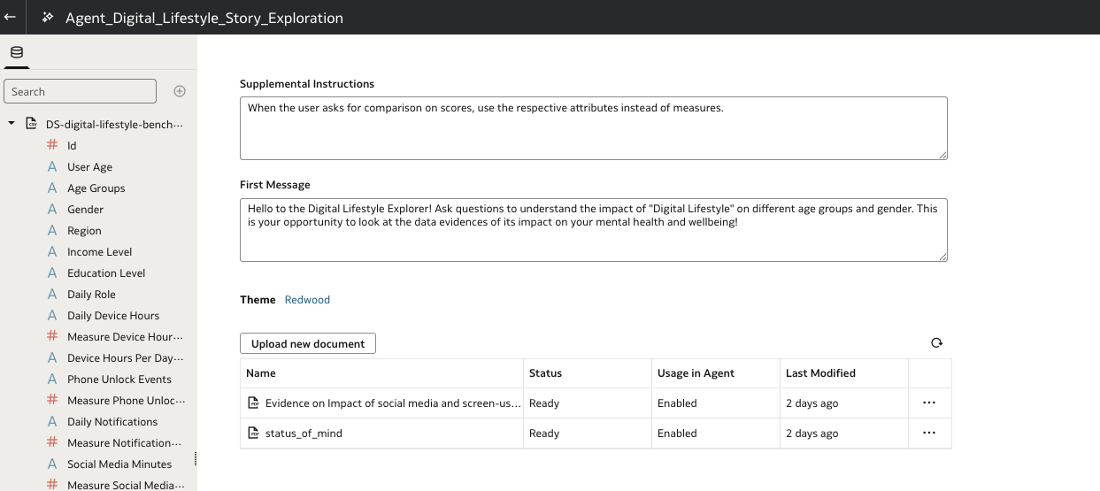
Below are few sample questions that gave response from the built-in knowledge and document knowledge:
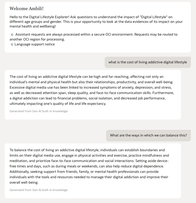
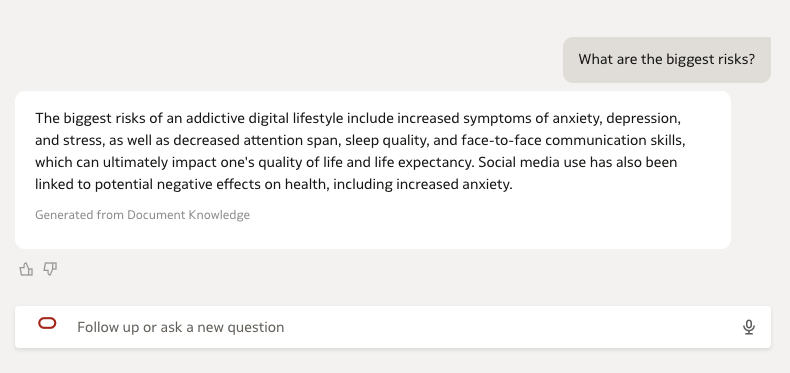
Love the way, the AI Agent is able to give greater control to AI Assistant responses, with the help of the prompts added as well as the documents knowledge (via RAG). I was able to directly add the metric comparisons used under 'Trends' and map visualisation under 'Threat' - as generated from the AI Assistant and further modify it.
2. Auto-Insights:
This feature significantly accelerated the comparative analysis between attributes. I utilised few AI-generated visualizations as a foundation, which were then further customized to align with the story’s narrative.
3. Explain:
The 'Explain' tool was instrumental in identifying the key drivers behind specific wellness attributes. It provided the statistical evidence needed to select the most impactful comparison views for the final story.
4. Contextual Insights
Used to bridge the gap between visual data and actionable understanding. This feature provided automated, natural language narratives that explain the 'why' behind the trends which helped immensely to refine my story.
5. Other Key Features Explored and Used:
- Parameterised dynamic visualisation via dashboard prompts
- Advanced and latest released plugins (ShapeBarChart, The DialGaugeViz)
- Conditional Formatting
- Mobile QR Code integration
- Dashboard Filter play option, etc.
- Map with layers and advanced configurations
- NLG using Language Narrative with tones, levels and analysis settings explored.
- Filter interactions via Treemaps.
- Buttons
Here is a short video that highlights the interactivity part.
6. Did you upload your visualization image and dva file?
Yes


