Currently in OAS DV, for bar visualizations (both vertical and horizontal), you can add a data label to the visualization for any field that is on the X-Axis when you go to properties and click on the # symbol to see 'Data Labels Position' and 'Data Labels Font'.
However, there is no existing feature for fields on the Y-Axis, or an ability to have Custom Data Labels to have both X-Axis fields and Y-Axis fields together.
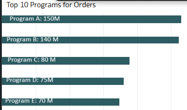
For example, let's say I am working with a horizontal bar chart with an amount field for my X-Axis and programs for my Y-Axis.
My goal is to have a data label inside the bar similar to the attached picture below (I made this manually with Paint), where I can have the programs from the Y-Axis on the bar along with the amount from the X-Axis follow right after, with a ':' and a space in between them.
Adding this feature would make bar charts clearer, more flexible, and more self-explanatory for business users.
