Oracle Analytics Cloud and Server

Welcome to the Oracle Analytics Community: Please complete your User Profile and upload your Profile Picture

“horizontal 100% stacked bar” chart. Can the axis labels be resized?

Received Response
11
Views
2
Comments
User_GCUO0
User_GCUO0 Rank 1 - Community Starter

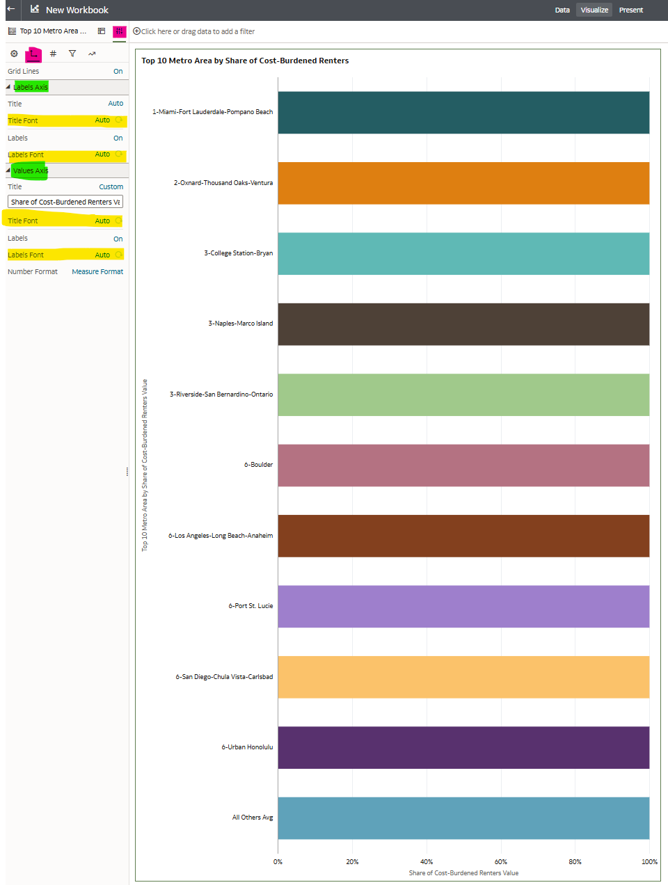
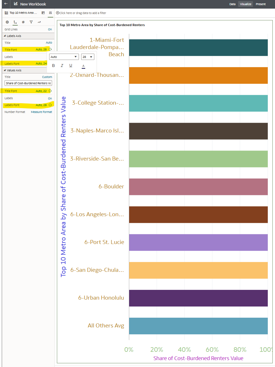
Right now the Y axis labels are unreadable because of the area being too small.

We would like to resize to meet our needs for visibility

In other visualisations for example table, we can resize columns manually. Could we enable that on this “horizontal 100% stacked bar” chart?

Answers

  • Hello @User_GCUO0 ! Thank you for your question. I think this post would fit better in another forum for a faster answer.

    I am just inquiring with my team which channel and will move your question ASAP. Thank you for your patience!

  • Hi @User_GCUO0, this should be possible.
    Refer to my screenshots below as you follow along with the steps:

    Screenshot 1:

    Within the workbook,
    - Select the visualization that you would like to modify.
    - Navigate to the Properties icon (highlighted in pink) on the Grammar Panel.
    - Navigate to the Axis icon (highlighted in pink)
    - Look under the Labels Axis (x-axis) and Values Axis (y-axis) (highlighted in green)
    - Select "Auto" in theTitle Font or Labels Font (highlighted in yellow).

    image.png


    Screenshot 2:

    - You can see how the colors/font change have changed after I adjusted the font & color size

    image.png


    Hope this helps!