Oracle Analytics Cloud and Server

Welcome to the Oracle Analytics Community: Please complete your User Profile and upload your Profile Picture

Designing a Pill shaped chart in OAS (v 6.4)

Received Response
52
Views
8
Comments

Hello,

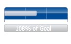
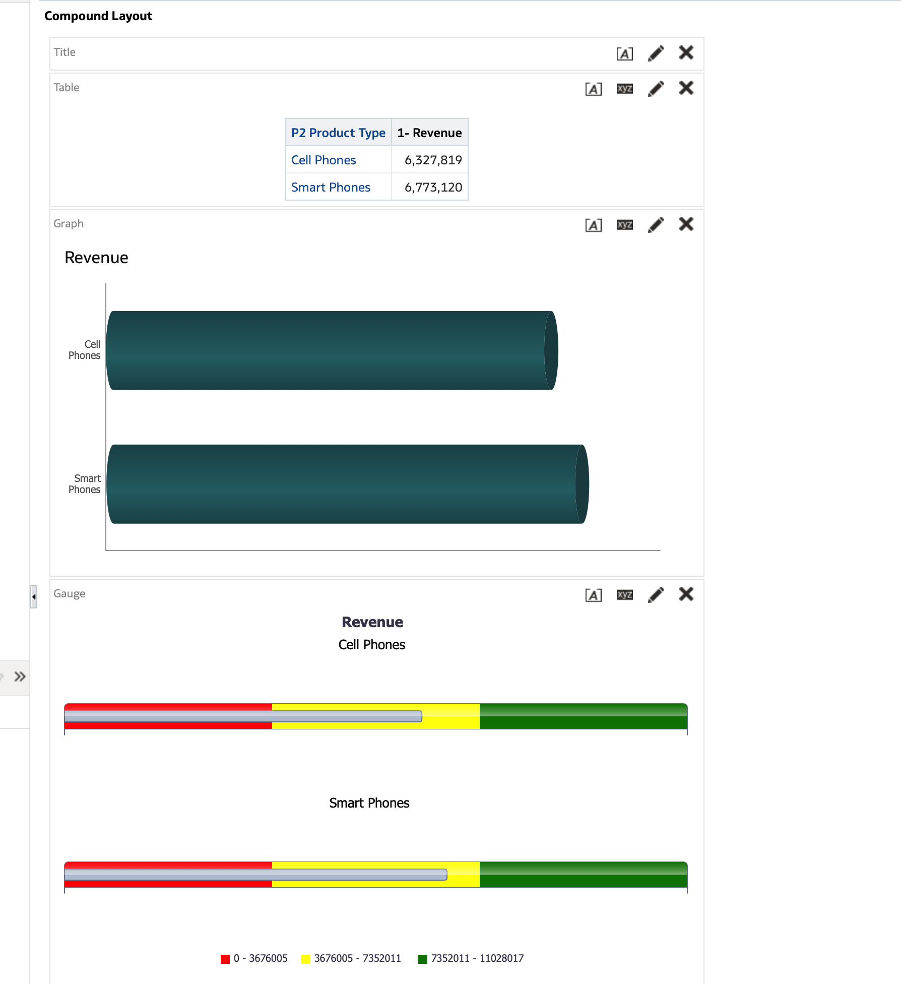
I am trying to design a Pill shaped chart in OAS. I am using OAS 6.4. I was able to achieve something close using the inbuilt gauge view but it was not accepted. the chart needs to be similar to how a brightness pill looks on a smartphone.
Any ideas or help as to how to achieve it will be very helpful. Thanks in advance.

Answers

  • Welcome to the community, @User_16KMJ!

    When you say that you're using the inbuilt gauge view (and it wasn't accepted), can you please clarify the visualization type name (as it appears in OAS) and which traits about the visualization type were not acceptable for what you were looking for?

    There is a new feature available for Oracle Analytics Cloud customers in the May 2025 update that
    allows users to create a Horizontal Gauge chart. However, since you have OAS, this feature will be available in your instance likely in the next OAS release cycle (early 2026), so this does not immediately answer your question.

    Video Link

  • Hello @User_16KMJ , can you share a few more details on what you mean by Pill-shaped chart so we can best think about options.

    Thanks

  • User_16KMJ
    User_16KMJ Rank 1 - Community Starter

    Hi, I am trying to achieve something like this.

    Pill shaped chart OBIEE.png

    As of now using the horizontal gauge option available in OAS i have been able to achieve

    image.png

    the below chart. However I need to customize it more to match the desired look and feel.

  • User_16KMJ
    User_16KMJ Rank 1 - Community Starter

    This option is not yet available in the version I am using. Also I am using the analytics(/analytics) view instead of the DV(/DV) views of OAS.

  • Thanks, I think one alternative you have if the vanilla viz is not what you need, is to design a custom viz extension plugin. There is an SDK that allows you to do this. You can check the series of blogs here for example

    Unlocking Custom Visualizations in Oracle Analytics: Integrating Data Sources – Part 5

    let us know if you need help with that part.

  • User_16KMJ
    User_16KMJ Rank 1 - Community Starter

    Thank you for your response @Philippe Lions-Oracle . While I will take a look at it, the customer was ready to accept a different visualization( a regular horizontal bar chart). However the horizontal axis needs to be removed in order for that to be accepted. I went through some blogs online and it seems there is no direct way to do it. Do you have any suggestions as to how I can achieve that? Need to remove the highlighted portion. I already tried all options under formatting.

    graph x axis.png
  • SteveF-Oracle
    edited May 15, 2025 4:12PM

    Hi Souvik,
    In classic /analytics, you should be able to hide/disable the horizontal axis labels in the graph properties > Axis labels > Display Options (set to none).

    The navigation is slightly different with Horizontal bar vs. horizontal gauge, but the options are there to hide.

    image.png
  • User_16KMJ
    User_16KMJ Rank 1 - Community Starter

    HI @SteveF-Oracle I am not trying to hide the horizontal axis labels. I am trying to hide the horizontal axis itself. I am able to hide the vertical axis but the horizontal axis does not seem to be hide able. I need to hide (make invisible) the highlighted line (x axis).

    graph x axis.png