Categories
- All Categories
- Oracle Analytics Learning Hub
- 31 Oracle Analytics Sharing Center
- 20 Oracle Analytics Lounge
- 251 Oracle Analytics News
- 45 Oracle Analytics Videos
- 16.1K Oracle Analytics Forums
- 6.3K Oracle Analytics Idea Labs
- Oracle Analytics User Groups
- 93 Oracle Analytics Trainings
- 16 Oracle Analytics and AI Challenge
- Find Partners
- For Partners
Advice on Graph Visualization
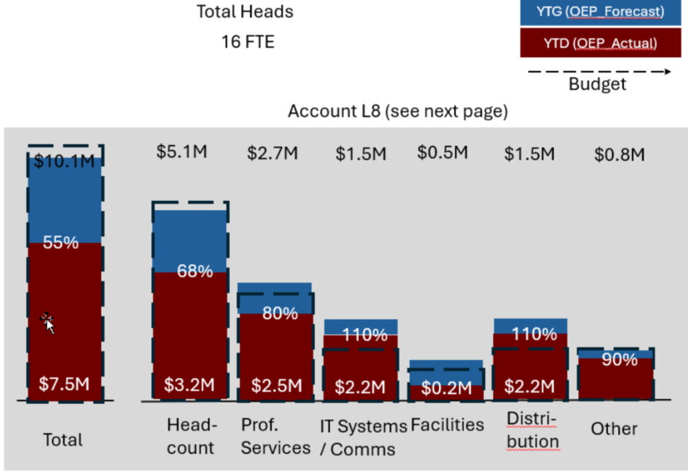
Hi-I am trying to create a version of a stacked bar chart but I'm not having much luck and wondered if anyone has had success with this. Within each bar I want to show the original budget, the actual expenses against the budget, and the reforecasted (budget amount). For example, if the original budget was $11 M, and the actuals were $8 M, and the reforecast was $10 M, the height of the bar would be $11 M, the actuals would show within that bar up to $8M, and the reforecast would show as $10M within the same bar. A stacked bar chart adds those three together so puts the height at $29M. Has anyone done anything like this successfully?
Answers
-
That seems a little misguided, unless the relative magnitude of the 3 values is always the same. I assume your reforecasted budget could be larger or smaller than the original budget. It sounds like you want the height of the stack to be equal to the largest value, with the others superimposed on top of it. There may be more imaginitive ways to display it, but I'd lean towards something like this:
Alternatively, you can do some awkward calculations that show the differences among your 3 values so that they stack up to the correct height.
0 -
Thanks. that is how I am currently showing it but my clients asked for the other view. Yes, the highest value, whether it be actual, original budget, or reforecast would be the highest value of the bar. i am attaching a pic of what they requested.
0 -
Have you considered using a Combo or Overlay visualization, not quite the same as what your are asking, but it seems like it may be a better visual to compare and present the data (budget, forecast actual, etc.). You can present the secondary elements in a variety of ways on the bars.
https://docs.oracle.com/en/cloud/paas/analytics-cloud/tutorial-overlay-chart/index.html#before_you_begin0 -
Thanks. actually what I have now is an overlay chart with two bars, one for actuals one for forecast, and a line chart with the original plan. it's good as an alternative i was just trying to see if there was any way to do what my client had requested.
0


