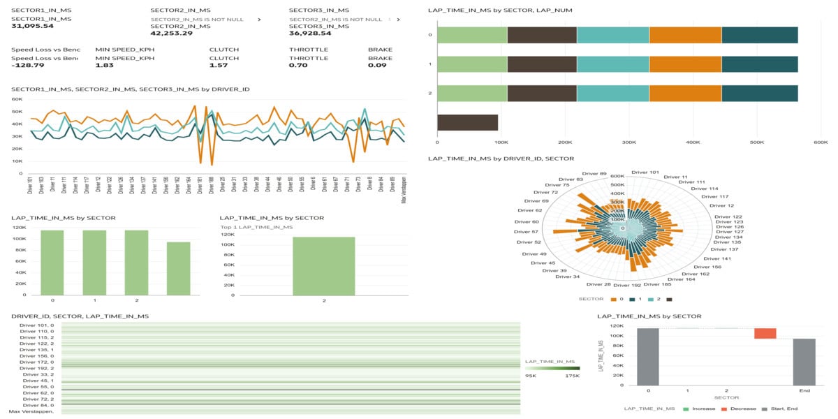
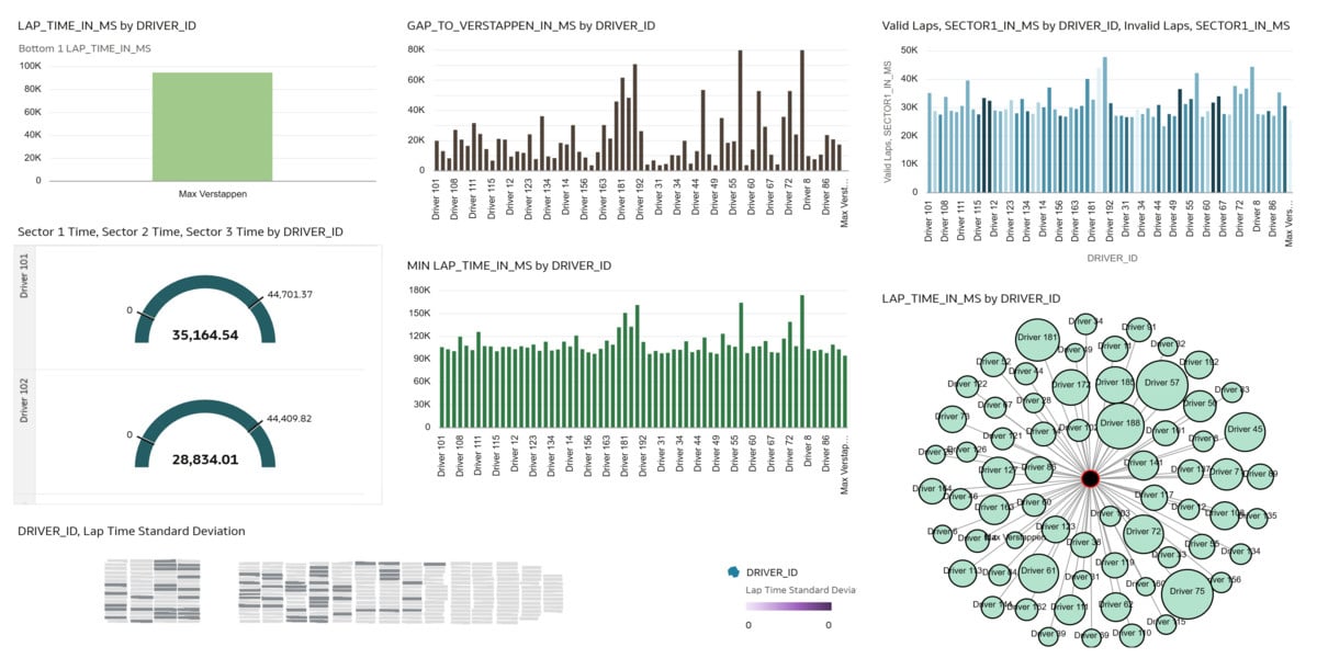
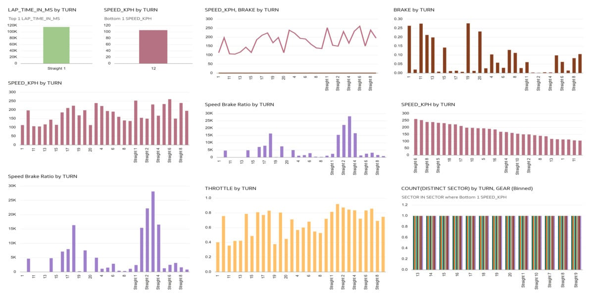
This Oracle Red Bull Racing Esports dashboard provides a comprehensive overview of driver performance across laps, sectors, and turns using detailed telemetry data. It highlights overall lap time performance, gap to Verstappen (benchmark driver), sector-wise strengths, and turn-level braking and speed behavior. The visualizations reveal performance differences between drivers, consistency levels, and areas of time loss.
The dashboard shows minimum lap times by driver, lap time standard deviation (consistency), and sector comparisons (Sector 1, 2, and 3). Turn-level analysis highlights brake intensity, throttle application, and speed–brake ratios, helping identify aggressive braking zones and performance bottlenecks. Speed distribution across turns reveals where drivers gain or lose momentum. Overall, the dashboard converts raw telemetry into actionable racing intelligence, enabling performance benchmarking and driver improvement strategies.
Which dataset did you use?
I used the Oracle Red Bull Racing Esports Simulator dataset, which includes Sessions, Telemetry, and Turns tables containing lap times, sector times, speed, throttle, brake, RPM, gear, and track position data.
2. How did you analyze or prepare the data?
I analyzed the data using Oracle Analytics by applying filtering (valid laps), aggregation (average, minimum, maximum lap times), and calculated metrics such as:
- Gap to fastest driver (Verstappen benchmark)
- Brake intensity per turn
- Speed–Brake ratio
- Sector performance comparison
- Lap time standard deviation (driver consistency)
I joined Telemetry and Turns tables using track distance to perform turn-level analysis and created sector-level performance breakdowns.
3. Who is the intended audience for your visualization?
The intended audience is:
- Race Engineers
- Performance Analysts
- Esports Team Managers
- Driver Coaches
4. What is your visualization about, and what question or problem does it address?
The visualization focuses on driver performance analysis and competitive benchmarking. It helps answer key performance questions such as:
- Which driver has the fastest lap time?
- Who is closest to the benchmark (Verstappen)?
- Which sector contributes most to time loss?
- Which turns require heavy braking?
- Where is speed lost on the track?
- Which driver is most consistent?
The dashboard enables data-driven performance decisions and helps identify technical or driving weaknesses that impact lap time.
5. Did you use any Oracle Analytics AI features when building your visualization? If so, please describe how they were used.
Yes, I used Oracle Analytics AI features such as:
- Explain to understand drivers of lap time variation
- Auto Insights to detect patterns in sector and turn performance
- AI-assisted visual suggestions to identify optimal charts for speed and braking analysis
These features helped uncover performance gaps and highlight critical turns impacting lap time.
6. Did you upload your visualization image and DVA file?
Yes, the visualization images and the corresponding Oracle Analytics project file were uploaded.


