Question 1: Which dataset did you use?
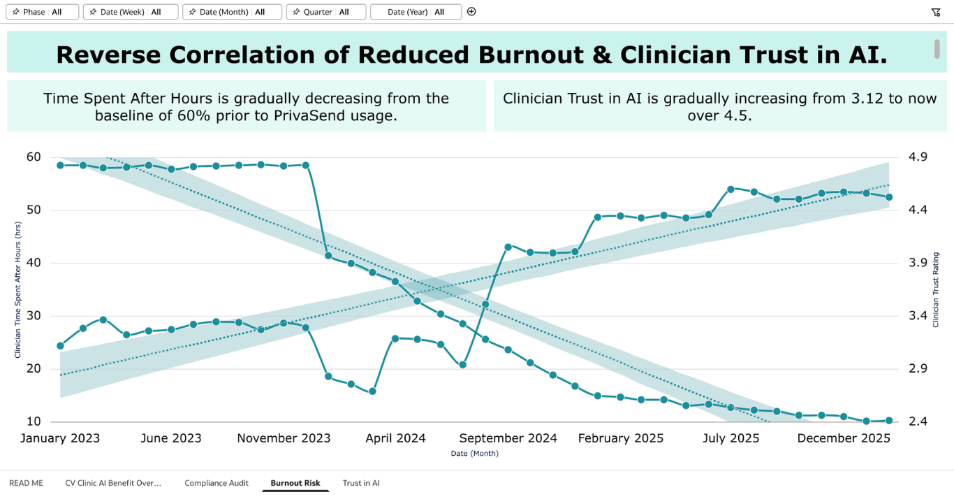
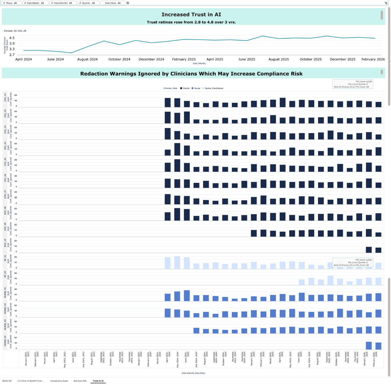
I created a synthetic dataset simulating three years of clinical AI usage across 16 clinicians at Cedar Valley Family Clinic (January 2023 – February 2026). The dataset contains 12,106 rows tracking every AI interaction across five adoption phases: No AI, Direct AI, Basic Filter, PrivaSend Gateway, and Maturity. Each row captures document type, PHI elements detected and leaked, time saved, clinician role, rehydration status, trust rating, after-hours flag, tool used and more. The synthetic approach was intentional, allowing me to model realistic clinical patterns including a gradual adoption curve, a rehydration bug incident in July 2024, an Insurance_ID detection gap in October 2025, and a 58% to 10% reduction in after-hours documentation over three years. No real patient data was used at any point.
Question 2: How did you analyze or prepare the data?
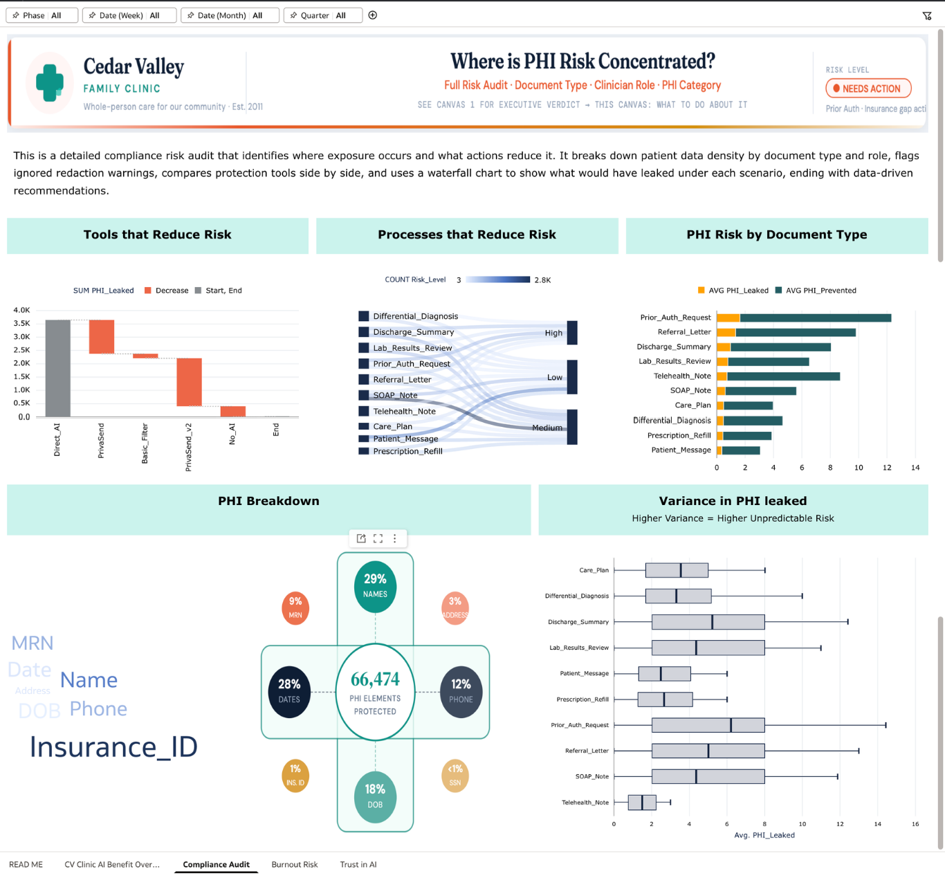
I structured the data to answer three questions a clinic administrator would actually ask: Are we HIPAA compliant? Are we reducing clinician burnout? Are clinicians building trust in AI over time? I created calculated fields for PHI exposure rate (leaked vs. total), an AI trust score derived from user ratings, and phase-filtered metrics to show post-PrivaSend performance separately from the historical baseline. I used conditional formatting so tiles change color based on thresholds and Auto Insights in author mode to surface patterns I might have missed, particularly around which document types carry the highest residual leakage risk. Global filters for Phase, Quarter, Date, and Year apply across all visualizations, and every chart is cross-filter enabled so judges can click any data point to explore a specific time window, document type, or clinician.
Question 3: Who is the intended audience?
The primary audience is practice administrators and compliance officers at small to mid-size US clinics (practices with 5 to 20 clinicians who are evaluating whether AI is safe enough to use, and whether it is actually helping their team). These are not data analysts. They need a dashboard that gives them a clear answer fast, shows them where the risk is, and tells them what to do about it. Secondary audiences include physician champions who need to justify AI adoption to skeptical colleagues, and burnout-aware clinic managers who are watching after-hours documentation as a leading indicator of staff wellbeing.
Question 4: What is your visualization about and what question does it answer?
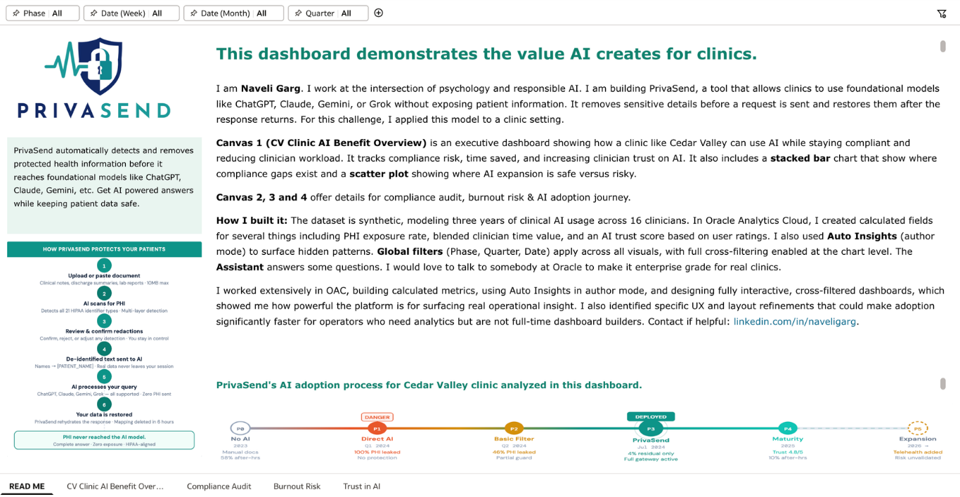
The dashboard answers a question every small clinic is quietly asking: should we be using AI, and if so, are we doing it safely?
Canvas 1 gives the executive verdict — tracking PHI leakage, clinician hours recovered, trust scores, and active adoption across three years of AI usage. Canvas 2 is a compliance audit showing where PHI risk is concentrated by document type, which clinicians are ignoring redaction warnings, and how different tools compare on protection. Canvas 3 tracks burnout reduction through after-hours documentation trends, showing a drop from 58% to under 10% since PrivaSend deployment. Canvas 4 tracks the trust trajectory (2.8 stars when clinicians were using unprotected AI to 4.8 stars today) alongside ignored redaction warnings as a human risk signal that pure compliance metrics miss.
The through-line is that responsible AI adoption is not just a technical problem. It requires the right tool, the right training, and ongoing measurement of both compliance and human behavior. This dashboard provides that measurement layer.
Question 5: Did you use Oracle Analytics AI features?
Yes, I used three Oracle AI features. I used Auto Insights in author mode to surface non-obvious patterns in the data, particularly around which document types carry disproportionate PHI density relative to their time savings, directly shaping the recommendations in Canvas 2. I used the AI Assistant so that clinic staff without analytics training can ask natural language questions like "which document type has the highest PHI risk" or "show me burnout trends since July 2024" and get immediate answers without needing to filter manually. I also used trend line forecasting across the burnout and trust charts, which extends the observed trajectory into 2026 and gives administrators a forward-looking view, not just a historical one. All three features are live and interactive in the submitted workbook.
Attaching all canvases below.