Categories
- All Categories
- Oracle Analytics and AI Learning Hub
- 54 Oracle Analytics and AI Sharing Center
- 25 Oracle Analytics and AI Lounge
- 307 Oracle Analytics and AI News
- 57 Oracle Analytics and AI Videos
- 16.4K Oracle Analytics and AI Forums
- 6.6K Oracle Analytics and AI Labs
- Oracle Analytics and AI User Groups
- 118 Oracle Analytics and AI Trainings
- 22 Oracle Analytics and AI Challenge
- Find Partners
- For Partners
How to edit Color of a Series in Chart
Hi,
Hoping to gain some wisdom from you all.
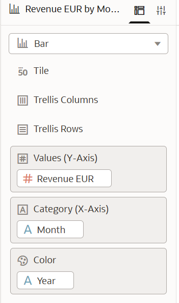
I want to graph Year over Year sales in Netsuite using a Workbook. My initial idea was to have bars for current year and area for last year sales, however, I wasn't able to do that.
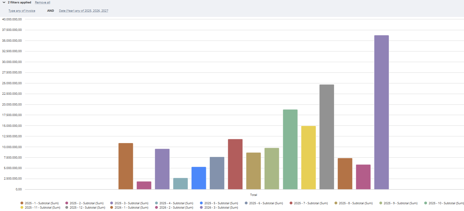
The best I could do is a Series for Last year and a Series for Current year. I thought that by having Month1 of Last Year and This Year close together, gives good enough idea of how each month has grown, ONLY if I could identify each year by a color (blue Last year, black this year, for example). But I haven't been able to do that. The Property tab only allows me to change titles and subtitles, but not colors. Here's a representation of how it currently looks.
Any idea on how to display efficiently YoY growth? I would really like to stick to Workbooks.
Answers
-
Hi,
Welcome to the Oracle Analytics and AI community and forum.
What product are you using exactly? It isn't OAC, right?
Because in OAC or OAS, it is a quick drag&drop to decide which column drives colours.
If you are working inside NetSuite itself, maybe you should consider asking in as that is focused on NetSuite itself.
0


