Categories
- All Categories
- Oracle Analytics and AI Learning Hub
- 54 Oracle Analytics and AI Sharing Center
- 26 Oracle Analytics and AI Lounge
- 311 Oracle Analytics and AI News
- 57 Oracle Analytics and AI Videos
- 16.4K Oracle Analytics and AI Forums
- 6.7K Oracle Analytics and AI Labs
- Oracle Analytics and AI User Groups
- 117 Oracle Analytics and AI Trainings
- 24 Oracle Analytics and AI Challenge
- Find Partners
- For Partners
The AI Displacement Wave: 2026 Tech Layoffs

What is this Visualization about?
"How artificial intelligence is reshaping the global tech workforce in Q1 2026"— Neutral and journalistic. Works well for a professional/academic audience. Sets up the visualization as an analytical piece rather than an editorial one.
Which dataset did you use?
I used the Tech Layoffs 2026 | AI Job Cuts Tracker dataset from Kaggle.
Who is the intended audience for your visualization?
Business/tech analysts — someone who wants to explore patterns across companies, sectors, and regions, compare layoff sizes, and filter by factors like AI adoption. The sortable table and multi-filter setup assume some comfort with data exploration.
What is your visualization about, and what question or problem does it address?
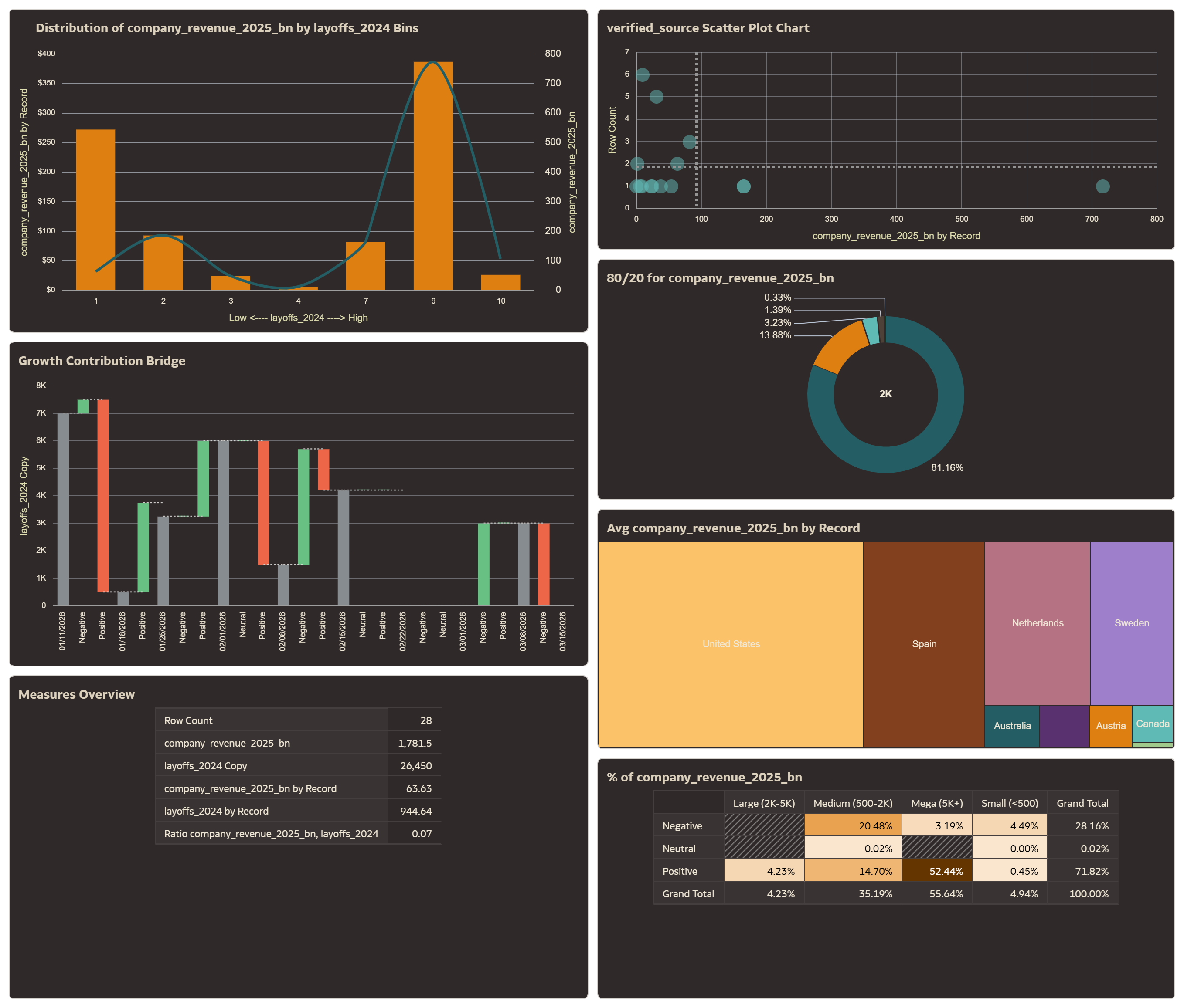
The visualization is a 2026 Tech Layoffs Tracker dashboard — an interactive overview of workforce reduction events across major tech and non-tech companies in Q1 2026.
The core question it addresses:
Where are the biggest layoffs happening, and is AI adoption a driving factor?
More specifically, it helps users explore:
Scale — how many jobs are being cut, and by which companies?
Concentration — which sectors and regions are most affected?
AI as a cause — are companies citing AI tools/automation as a reason for cuts, and does that pattern differ by sector?
Market reaction — how did stock prices respond on the day of each announcement?
The problem it addresses is that layoff data is scattered across news sources and hard to compare at a glance.
The dashboard consolidates 28 company events into one explorable view, letting users filter and sort to find the patterns most relevant to them.
Did you use any Oracle Analytics AI features when building your visualization (ex. AI Assistant)? If so, please describe how they were used
Auto Insights helped me decide what to include in the dashboard.
Conclusion
The 2026 tech layoffs affected over 103,000 workers in just one quarter, with Oracle, Amazon, and Meta leading the cuts. About half the companies cited AI tools as the reason, replacing roles like customer support, QA, and middle management. The hardest-hit workers were in software, fintech, and SaaS sectors, while manufacturing and retail also saw significant job losses. Most companies saw their stock prices rise after announcing cuts, showing investors viewed it as a positive efficiency move. The visualization helps make sense of all this by letting users filter, compare, and explore the data across companies, sectors, and regions in one simple dashboard.
Comments
-
Good Analysis
0 -
Insightful and highly relevant analysis for today’s tech landscape.
It not only highlights the scale of layoffs but also serves as a clear wake-up call for professionals.
As AI adoption accelerates, the need to upskill quickly is essential to stay relevant and competitive.0 -
This visualization makes it easy to understand how AI is changing jobs across sectors.
0 -
This visualization provides a clear and insightful analysis of how AI is transforming jobs across various sectors.
0
