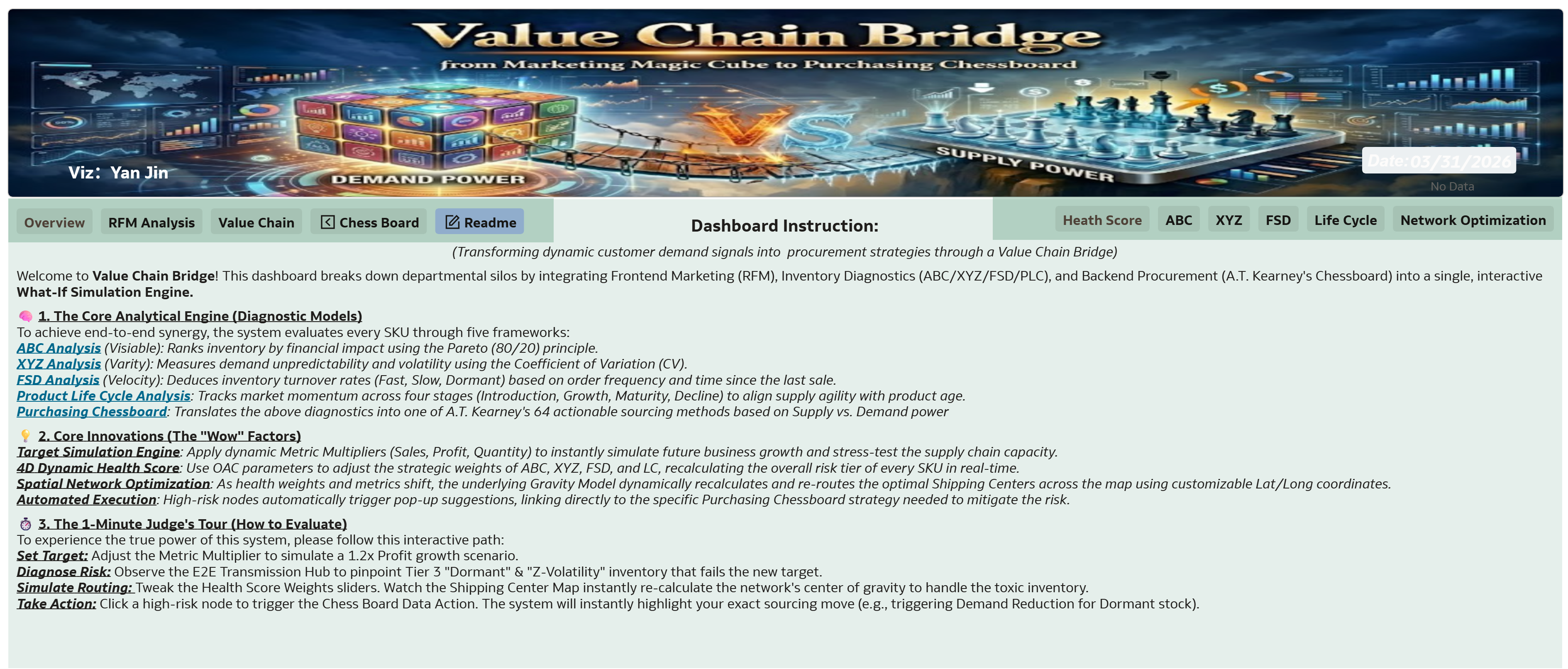
Welcome to Value Chain Bridge! This dashboard breaks down departmental silos by integrating Frontend Marketing (RFM), Inventory Diagnostics (ABC/XYZ/FSD/PLC), and Backend Procurement (A.T. Kearney's Chessboard) into a single, interactive What-If Simulation Engine. Leveraging OAC's Canvas Data Actions, it seamlessly bridges multiple distinct datasets (Sales vs. Procurement logic) into one unified strategic flow.
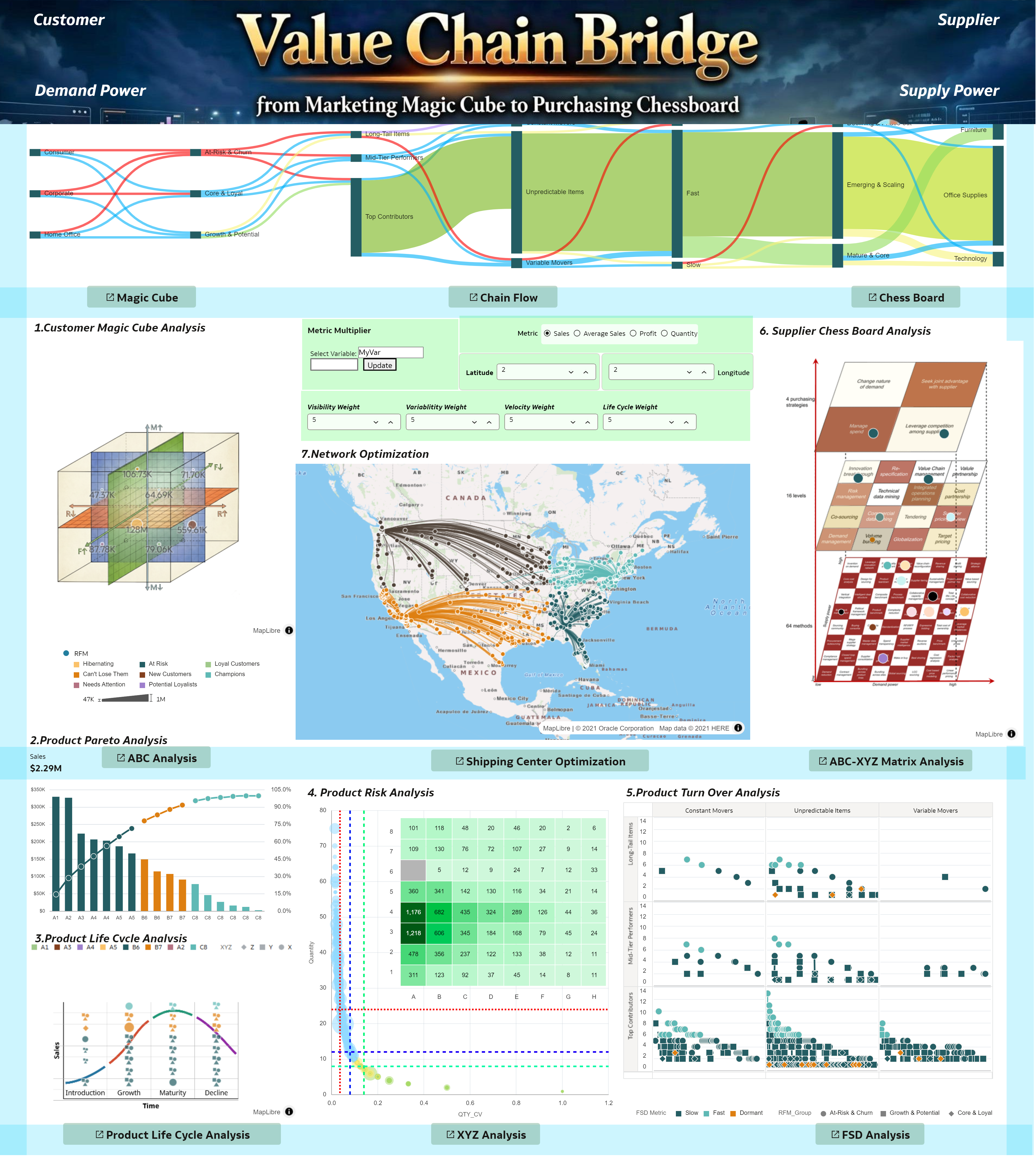
By adjusting parameters such as the target multiplier, business metric (sales, profit, or quantity), the weights assigned to each product scorecard, or the number of shipping centers based on latitude and longitude, the dashboard provides real-time, dynamic recommendations.
Guided Drill-Down Navigation: To ensure a clean and focused executive experience, the top-level menu is streamlined to feature only the Overview and Readme tabs. All detailed analysis modules (e.g., RFM, ABC/XYZ, FSD) are hidden from the main menu and accessed via intuitive drill-down links embedded directly within the homepage visualizations. Once inside a detailed module, a local navigation bar allows users to effortlessly switch between sub-pages or return to the main Overview.
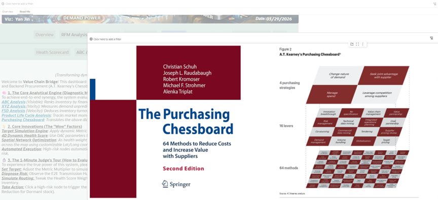
This dashboard incorporates A.T. Kearney's Purchasing Chessboard framework. Please click the book cover below to explore detailed information about this methodology and the original publication.
This dashboard incorporates the ABC, XYZ, FSD, and Product Life Cycle (LC) analytical frameworks for intelligent inventory diagnostics. Please click the 'Tools' button below to open a pop-up window exploring detailed definitions and the underlying business logic of these methodologies.
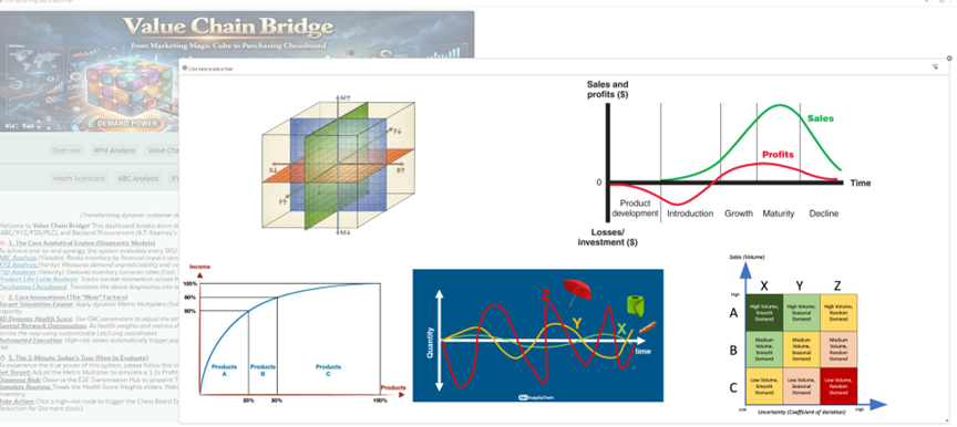
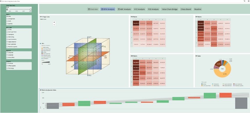
[ Deep Dive: The 4D Interactive RFM Engine ] To provide a highly granular and dynamic view of customer behavior (Recency, Frequency, and Monetary value), this module is empowered with advanced OAC interactive features:
- Decomposed Matrices (RF, FM, MR): Beyond the macro 3D Magic Cube, the system breaks down customer segments into dual-dimension matrices (Recency-Frequency, Frequency-Monetary, and Monetary-Recency) to pinpoint specific behavioral patterns and targeted marketing opportunities.
- Time-Lapse Animation (2015-2018): By utilizing the time-based dashboard filter's auto-play function, executives can watch the evolution of customer segments unfold dynamically across years, tracking exactly how customer loyalty and churn risks shift over time.
- Dynamic Metric Selector: Users are not locked into a single viewpoint. A parameter-driven selector allows you to seamlessly toggle the core evaluation metric among Sales, Average Sales, Profit, and Quantity, assessing customer value from multiple strategic perspectives.
- Waterfall Variance & Trend Forecasting: A built-in waterfall chart visually deconstructs the month-over-month variance, augmented with predictive trend lines to forecast future purchasing momentum and proactively manage customer lifecycles.
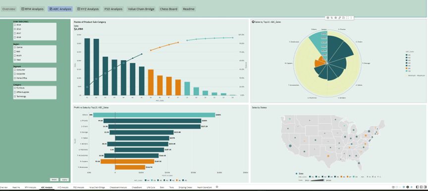
[ Deep Dive: The High-Resolution ABC Inventory Engine ] To overcome the "low resolution" limitation of traditional ABC analysis, we pioneered an 8-Tier Micro-Segmentation model. By aggressively subdividing the high-value 'A' class into five granular tiers (A1-A5), 'B' into two (B6-B7), and 'C' into one (C8), the system offers unprecedented financial visibility. This module features three advanced visualizations:
- 8-Tier Radar Chart: Dynamically maps out how the Top 10 product sub-categories are distributed across the 8 granular capital tiers, instantly exposing hidden asset concentrations.
- Profit vs. Sales Butterfly Chart: Revenue is vanity, profit is sanity. This diverging chart contrasts top-line sales against bottom-line profit, instantly highlighting "empty calories" (high-revenue but low-profit items) within our core inventory.
- Geospatial Capital Mapping: The US bubble map physicalizes our financial data. By projecting the 8-tier ABC segments across different states, executives can precisely pinpoint where our most expensive A1-A5 assets are piling up geographically, enabling targeted local liquidation or redistribution
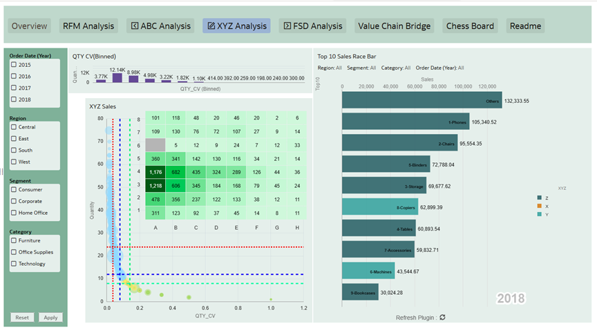
[ Deep Dive: The 64-Grid ABC-XYZ Volatility Matrix & Racing Bar ] To transcend the limitations of the traditional 9-box inventory model, this module introduces a hyper-granular approach to demand uncertainty.
- CV-Based 8-Tier XYZ: By calculating the Coefficient of Variation (CV = Standard Deviation / Mean), we measure the exact demand volatility of each SKU, subdividing the traditional X, Y, and Z classes into 8 micro-segments (XA to ZH).
- The 64-Grid Strategic Matrix: Intersecting the 8-tier ABC (Capital) with the 8-tier XYZ (Volatility) generates our proprietary 64-Grid ABC-XYZ Matrix. This is not a random number; it is engineered to perfectly map 1-to-1 against A.T. Kearney’s 64 Purchasing Chessboard methods, bridging inventory diagnosis directly to procurement execution.
- Top 10 Sales Racing Bar: A time-lapse racing bar chart dynamically visualizes how the Top 10 products compete and shift in rankings over time. Color-coded by their XYZ categories, executives can instantly observe whether their top revenue drivers are stable cash cows (X) or highly unpredictable risks (Z).
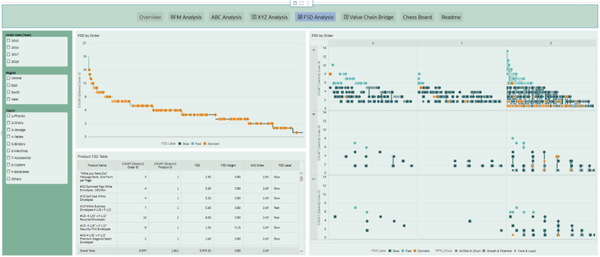
[ Deep Dive: The 5D Strategic Combo Chart & FSD Velocity Model ]
- Overcoming Data Constraints (FSN to FSD): Due to the absence of direct physical inventory records in the dataset, the traditional FSN (Fast, Slow, Non-moving) analysis could not be applied. To overcome this limitation, we innovated by replacing FSN with our proprietary FSD (Fast, Slow, Dormant) model. By leveraging "Order Age" (days since the last transaction), the system accurately reverse-engineers and deduces the true turnover velocity of every product based purely on historical sales behavior.
- AI-Driven Thresholding: Instead of relying on static, textbook rules for inventory classification, we utilized Oracle Analytics' AI Assistant and Auto Insights. By analyzing the 4-year data distribution of average order frequencies, the AI helped dynamically set the optimal mathematical thresholds for our Fast, Slow, and Dormant (FSD) categories, ensuring a data-driven and hyper-accurate velocity model.
- Multi-Dimensional Integration: This calculated FSD velocity is then integrated with the ABC (Capital) and XYZ (Volatility) frameworks into a single, high-density Combo Chart. The X and Y axes construct the ABC-XYZ strategic space, while the FSD status is mapped to the data points (e.g., via color coding).
- RFM Shape Mapping: To truly bridge frontend demand with backend supply, RFM customer segments are mapped as distinct shape markers on the same chart. This enables executives to instantly visualize the distribution of products and answer complex questions at a glance—such as identifying whether a high-risk, "Dormant" inventory item is primarily being consumed by "Champions" or "At-Risk" customers.
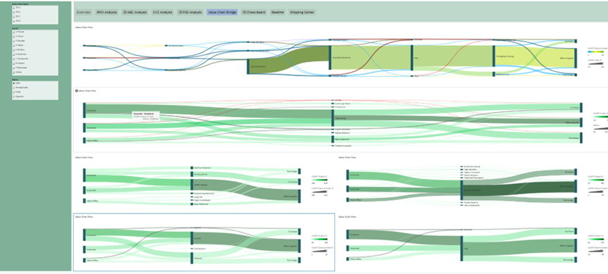
[ Deep Dive: Macro-Synergy & Micro-Diagnostics ] Within the Value Chain module, the dashboard empowers executives to seamlessly switch between a macro-level holistic view and micro-level granular insights:
- The Macro-Synergy (Sankey Diagram): A dynamic Sankey diagram is utilized to comprehensively analyze the integrated impact of the RFM, ABC, XYZ, FSD, and LC models in a single view.
- End-to-End Mapping: By tracing the flow from Customer Segments on the far left to Product Categories on the far right, it visually bridges the complete journey from frontend market demand to backend inventory status.
- Micro-Level Diagnostics: Concurrently, the system provides dedicated, individual deep-dive analysis pages for each specific framework (RFM, ABC, XYZ, FSD, LC) to support isolated and highly granular metric explorations
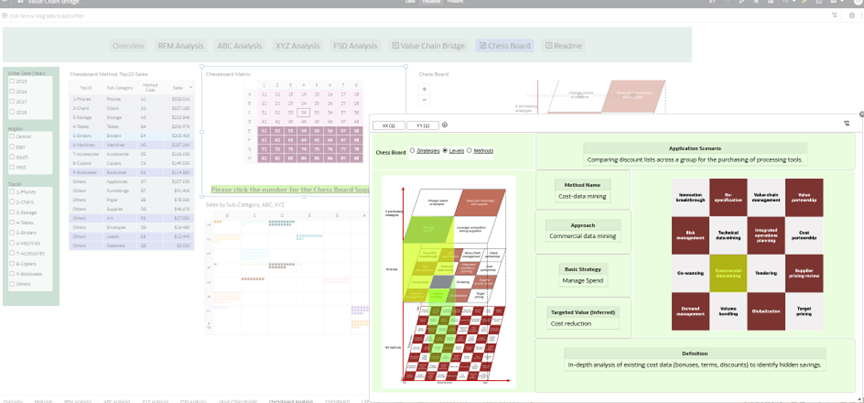
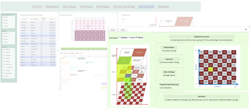
[ Deep Dive: The Interactive 64-Grid Strategic Chessboard ] Within the Chessboard module, the intersection of the highly granular ABC and XYZ calculations forms a precise 8x8 strategic matrix. To bridge inventory diagnostics with procurement execution, this module features advanced dynamic interactivity:
- Interactive Matrix Mapping: By clicking on any specific coordinate within the 8x8 matrix, users trigger a dynamic pop-up window that links to the exact corresponding square on the Purchasing Chessboard.
- Automated Strategy Generation: This pop-up instantly retrieves and displays the specific procurement intelligence mapped to that exact node, including the Basic Strategy, Approach, Method Name, Targeted Value, and a practical Application Scenario.
- Dynamic Dashboard Controls: Executives can use the built-in radio button controls to seamlessly toggle the visual layout among the 4 Strategies, 16 Levels, or 64 Methods. The system will dynamically reconstruct the Chessboard view, allowing users to zoom in and out of the strategic landscape effortlessly.
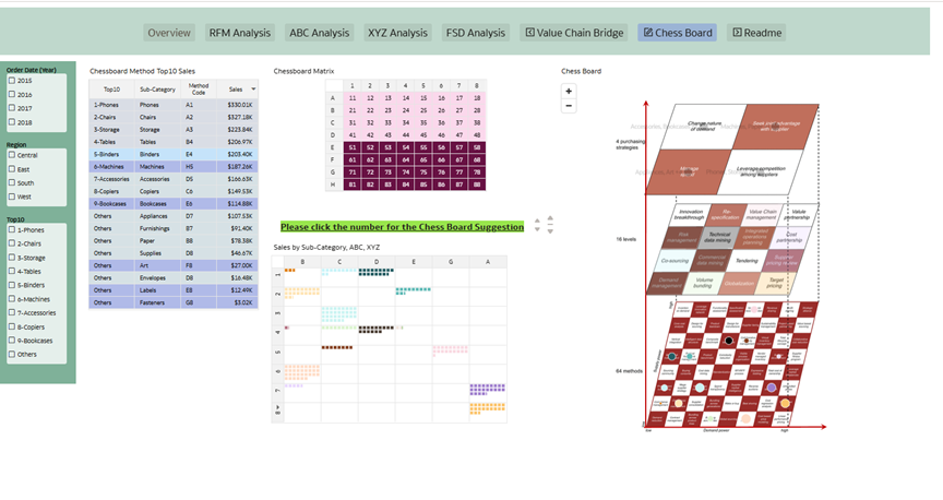
4 Chessboard Strategies 2x2
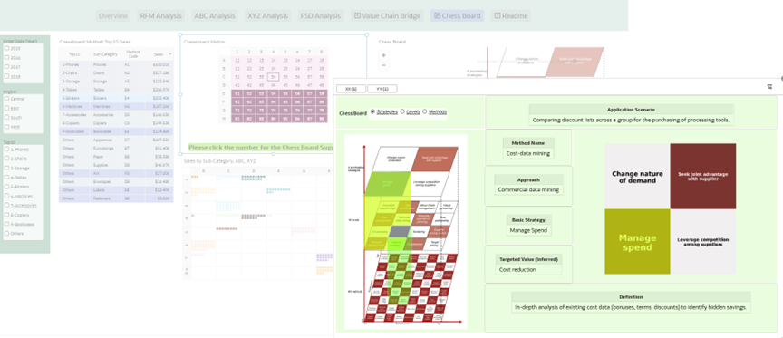
16 Chessboard Levels 4x4
64 Chessboard Methods 8x8
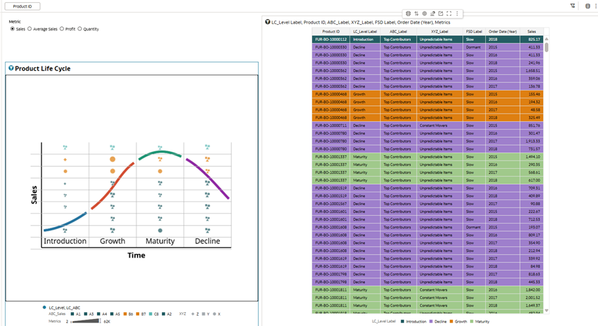
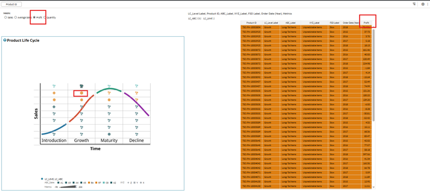
[ Deep Dive: The Dynamic & Multi-Metric Product Life Cycle (LC) Engine ]In this module, a product's life cycle is not determined by a static "time-in-market" attribute. Instead, the system calculates the real-time life cycle stage of each product using a comprehensive composite algorithm. By evaluating dynamic behavioral indicators such as Order Age, FSD Velocity (Fast/Slow/Dormant), and YoY (Year-over-Year) Growth, the engine intelligently classifies every SKU into its exact current stage: Introduction, Growth, Maturity, or Decline.💡 The Multi-Metric Perspective (Interactive Simulation): Crucially, this calculation is entirely interactive. Executives are not locked into a single viewpoint. Using the dynamic parameter selector, users can change the underlying evaluation metric—toggling seamlessly among Sales, Average Sales, Profit, and Quantity. As the metric shifts, the system instantly recalculates the algorithm and re-plots the products. This empowers decision-makers to discover hidden risks, such as a product that appears to be in the "Growth" stage by Quantity, but is actually in "Decline" when evaluated by Profit.
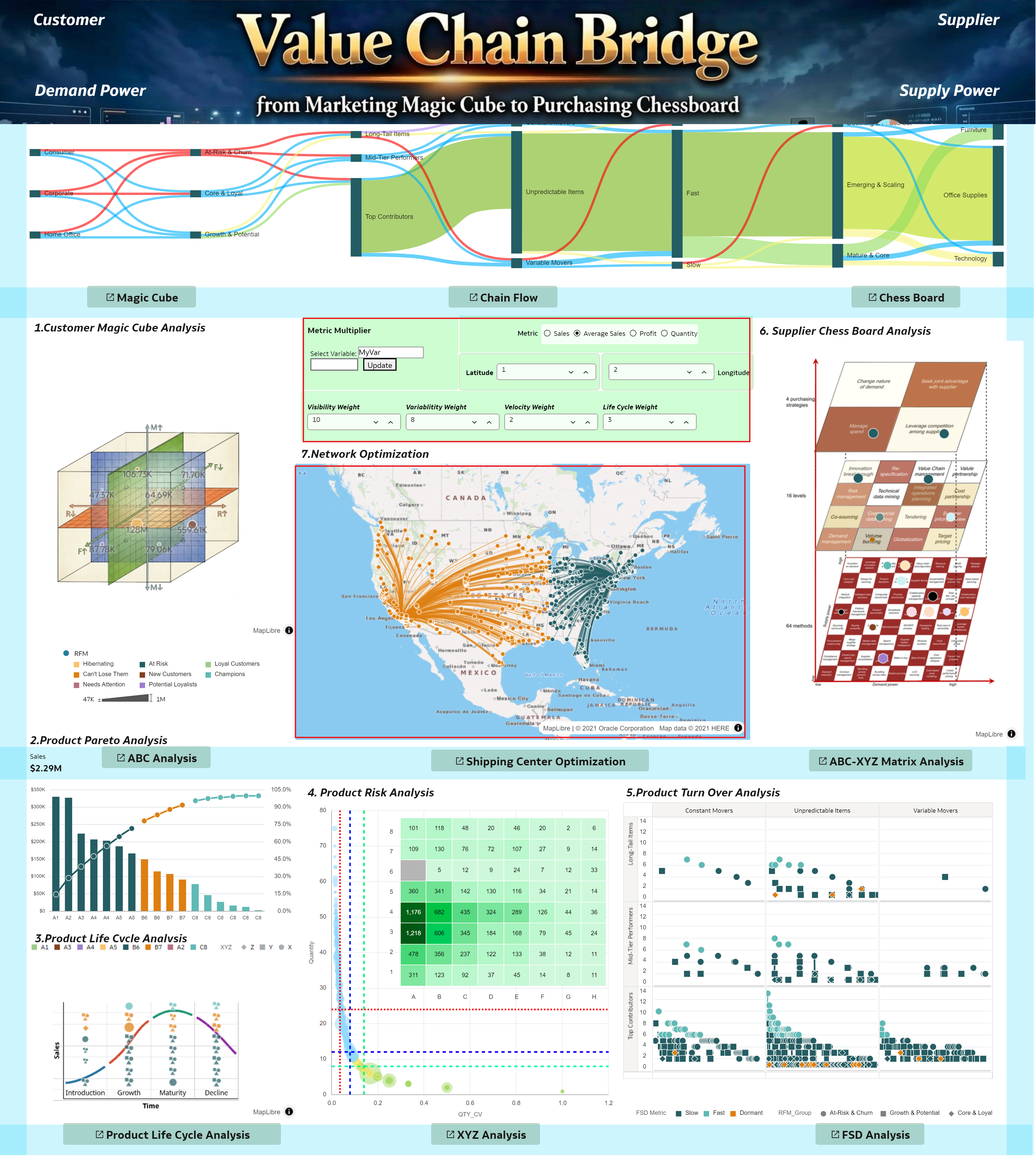
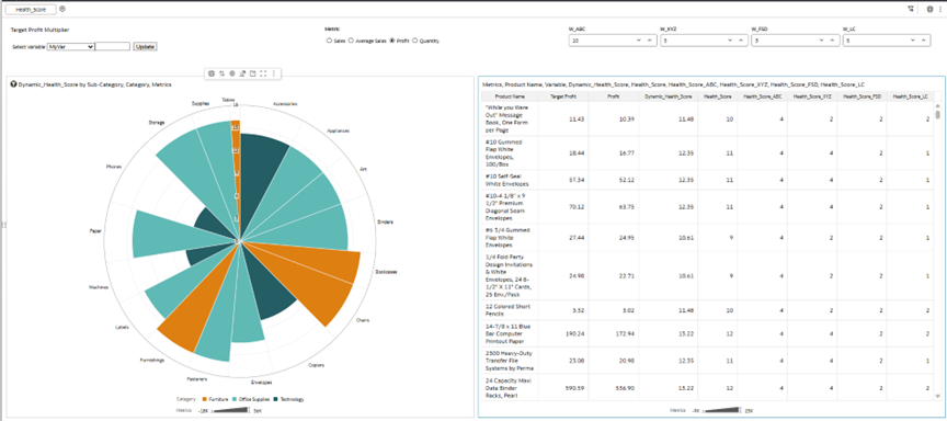
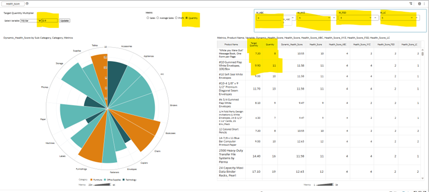
[ Deep Dive: The 4D Dynamic Product Health Scorecard & What-If Simulator ]Moving beyond isolated metrics, this dashboard synthesizes the results of four critical frameworks—ABC (Capital), XYZ (Volatility), FSD (Velocity), and LC (Life Cycle)—to generate a comprehensive Product Health Scorecard. To empower executives with predictive capabilities, this scorecard is engineered as a fully interactive What-If Simulation Engine:
- Dynamic Weighting: Business strategies are never static. Using the built-in parameter sliders, users can dynamically adjust the strategic weights of the four indicators (Visibility/ABC, Variability/XYZ, Velocity/FSD, and Life Cycle). The system instantly recalculates the scorecard to align with shifting organizational priorities.
- Metric Multiplier & Scenario Simulation: The scorecard features a powerful Metric Multiplier. Decision-makers can seamlessly toggle the baseline evaluation metric among Sales, Average Sales, Profit, and Quantity. Furthermore, by applying a custom multiplier, executives can simulate future scenarios. For example, if a user wants to stress-test the supply chain under a hyper-growth scenario, they can apply a 1.2x multiplier to Sales. The system will instantly recalculate the entire scorecard, projecting what the product health and risk distribution will look like if sales increase by 20%.
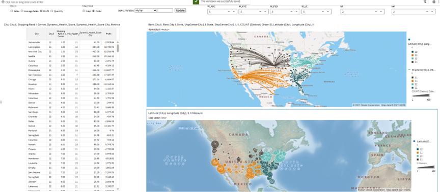
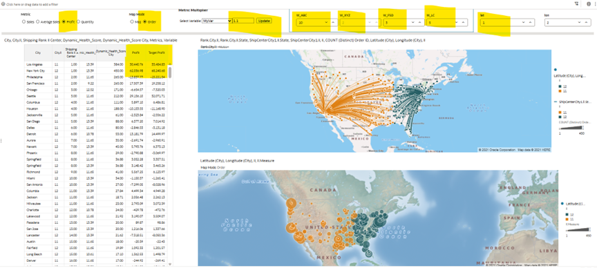
[ Deep Dive: Dynamic City Scorecard & Spatial Network Simulation ]
- From Product to City Scorecard: Once the dynamic Health Scorecard is generated for individual products, the system automatically aggregates these metrics geographically to calculate a comprehensive City-Level Risk Scorecard. This reveals the exact locations where our highest-value, highest-volatility, or most dormant inventory is concentrated.
- Custom Shipping Center Routing: Within the Shipping Center Optimization module, executives are empowered with an interactive Gravity Model. By manually adjusting the Latitude and Longitude parameters, users can dynamically drop and simulate new transportation hubs or distribution centers directly on the map.
- Multi-Variable Stress Testing: The true power of this simulator lies in its multi-variable interactivity. Users can seamlessly adjust the strategic Weight Proportions (ABC, XYZ, FSD, LC) alongside the Metric Multiplier (e.g., simulating a 1.2x scale in target sales). As these variables shift, the map instantly recalculates and re-routes, visually demonstrating how future business scenarios or changing risk appetites will impact the efficiency and load distribution of the selected shipping centers.
- Which dataset did you use?
Superstore Sales dataset and Chessboard Dataset. - How did you analyze or prepare the data?
In Oracle Analytics Cloud, I transformed raw data into advanced business models using custom calculations. I built an RFM model for customer segmentation, and ABC-XYZ & FSD (Fast, Slow, Dead) matrices for inventory diagnostics. Finally, I mapped these models to the A.T. Kearney Purchasing Chessboard and used Canvas Data Actions to enable end-to-end interactivity across different datasets. - Who is the intended audience for your visualization?
C-Level Executives (CMO, CPO, COO)Supply Chain & Procurement ManagersSales & Marketing Leadership - What is your visualization about, and what question or problem does it address?
This dashboard breaks down departmental silos by integrating Frontend Marketing (RFM), Inventory Diagnostics (ABC/XYZ/FSD/PLC), and Backend Procurement (A.T. Kearney's Chessboard) into a single, interactive What-If Simulation Engine. - Did you use any Oracle Analytics AI features when building your visualization (ex. AI Assistant)? If so, please describe how they were used.
Yes. Explain / Auto Insights: Used to quickly identify key drivers behind demand.AI Assistant: Used to quickly explore the 4-year data distribution (e.g., "average order frequency by product"). This helped dynamically set the optimal mathematical thresholds for the FSD (Fast, Slow, Dead) inventory classification rather than relying on static, textbook rules. - Did you upload your visualization image and dva file?
Attached.
Video instruction:


