Categories
- All Categories
- Oracle Analytics and AI Learning Hub
- 54 Oracle Analytics and AI Sharing Center
- 26 Oracle Analytics and AI Lounge
- 311 Oracle Analytics and AI News
- 57 Oracle Analytics and AI Videos
- 16.4K Oracle Analytics and AI Forums
- 6.7K Oracle Analytics and AI Labs
- Oracle Analytics and AI User Groups
- 117 Oracle Analytics and AI Trainings
- 24 Oracle Analytics and AI Challenge
- Find Partners
- For Partners
Welcome to the Oracle Analytics Community: Please complete your User Profile and upload your Profile Picture
In OAC charts, how do I dictate the colors in visualisations?

Chethana Kumari-Oracle
Rank 6 - Analytics & AI Lead
Summary
In OAC charts, I want to dictate colors in visualizations, as per my requirements.
Content
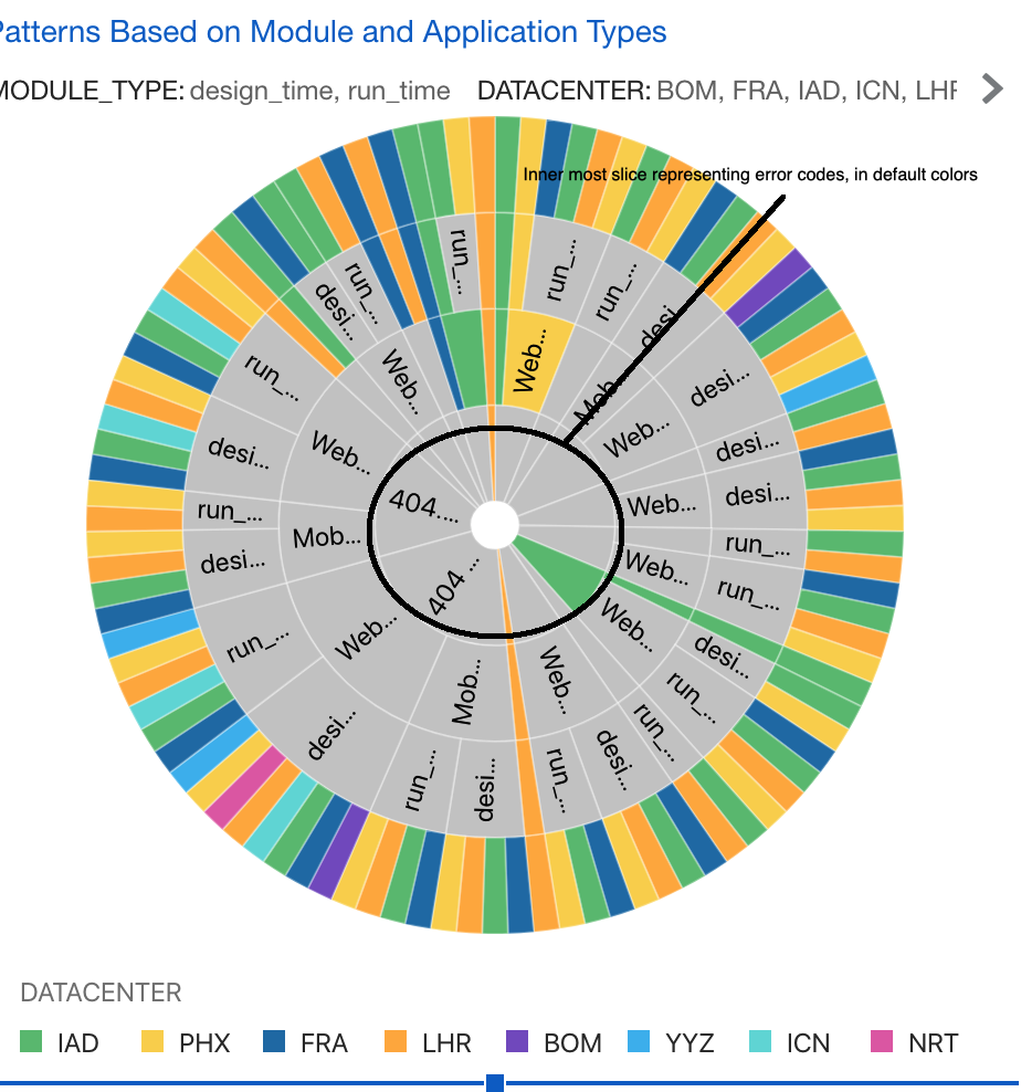
In OAC charts how do I dictate the colors in visualisations?
For ex, I am using sunburst chart to represent some hierarchical data. The inner most slice in my sunburst chart represents different error codes. Currently, I have represented “Error code" as the inner most Category (Slice) and it is as shown in the screenshot. Is there a way to show this entire slice in red color? This is because, I want to represent each of the error code with red color.
Thanks in advance,
Chethana
0
Answers
-
Have you taken a look at the Manage Color Assignments option in Oracle Analytics?
https://docs.oracle.com/en/cloud/paas/analytics-cloud/acubi/apply-color-visualizations.html
0 -
Thank you!
0
