Categories
- All Categories
- Oracle Analytics and AI Learning Hub
- 41 Oracle Analytics and AI Sharing Center
- 20 Oracle Analytics and AI Lounge
- 277 Oracle Analytics and AI News
- 50 Oracle Analytics and AI Videos
- 16.2K Oracle Analytics and AI Forums
- 6.4K Oracle Analytics and AI Idea Labs
- Oracle Analytics and AI User Groups
- 103 Oracle Analytics and AI Trainings
- 18 Oracle Analytics and AI Challenge
- Find Partners
- For Partners
Pareto Chart/ Map/ Navigation

Summary
Issues regarding Pareto Chart/Map and Navigation
Content
Hello,
We have encountered few issues while creating Pareto chart, Map and when creating Navigation.
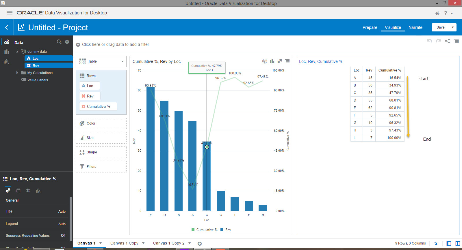
I have tried to create Pareto chart and the issue that we are facing is cumulative % line. As per rule the cumulative % line should start from low to high and bars from high to low. When we sort by (revenue) it disturbs cumulative % line. The cumulative % line should follow the follow for example 16.54%, 34.93%, 47.79%, ......, ends at 100%. In our case it starts from lowest cumulative % i.e 16.54% but it get disturb instead of showing 34.93% it shows 47.79% then 100% and then rest. There is no issue with calculation.
While creating Map every time when we select state from filter bar we have to zoom in to look for Data points. For navigation, I have noticed when we navigate from current canvas to target canvas it creates extra filter on the target canvas. Is there anyway we can avoid this?
Thanks
Answers
-
Hello! I came across this issue today while trying to design a Pareto Chart in DV Desktop. Fortunately could figure out the snag and come up with a workaround.
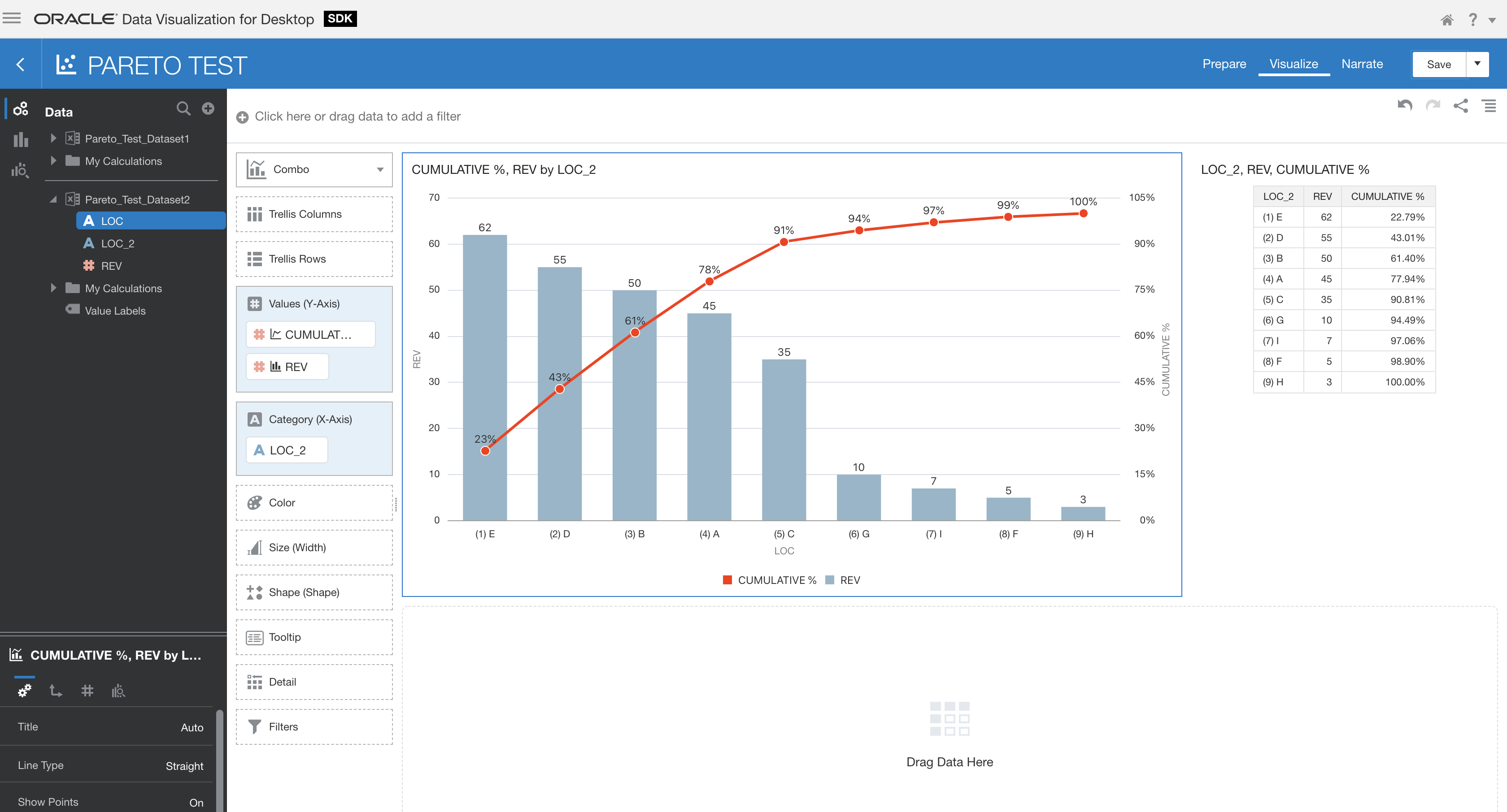
I assume that the measure "Cumulative %" has been calculated using a running aggregate function (likely RSUM). As you know, your Pareto distribution needs to be sorted by "Rev" in descendent ordering (giving this Loc order : E,D,B,A,C,G,I,F,H on the chart). However DV Desktop likely sorts the Data Set by "Loc" in ascendent ordering prior to perform RSUM aggregation. So the "Cumulative %" measure follows the wrong sorting order in the Pareto perspective. Notice on the Table visualization that you have the right "Cumulative %" column ordering when "Loc" column is sorted in descendent ordering. If you sorts the table on column "Rev", values in "Cumulative %" column get messed around. That's exactly what happens on the Pareto chart visualization as well.
As a workaround, you should generate a new Data Set natively holding the "Cumulative %" column using a Data Flow by taking care to perform the right sorting in the appropriate step. Then use this new data set to design your Pareto chart. Alternatively, you could create a new calculated attribute by prepending numbers to the "Loc" column values so as to force this column ascending ordering to reflect the "Rev" column descending ordering as Pareto requires. Then you should use this new attribute column on the X axis of your Pareto chart visualization. The later solution is illustrated on the attached image. It's a bit ugly but it has the merit of getting the job done easily for very short Data Sets.
 0
0