Oracle Analytics Cloud and Server

Welcome to the Oracle Analytics Community: Please complete your User Profile and upload your Profile Picture

Graph type to show distribution of a measure against time period

Received Response
83
Views
3
Comments

Summary

does OAC has a graph type to show Distribution of a measure against a dimensional attribute like date

Content

hello,

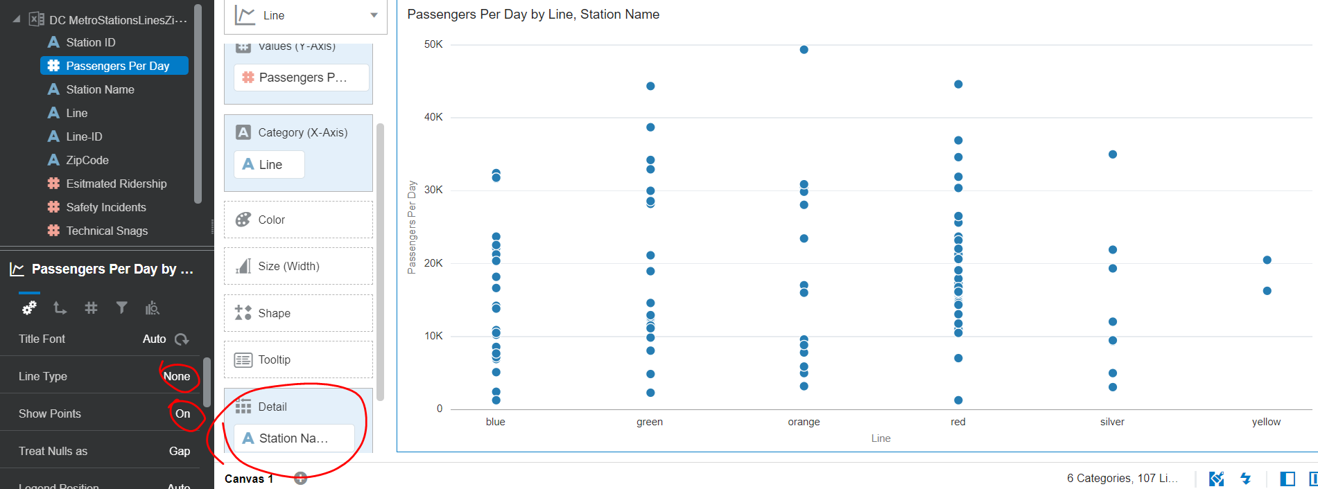
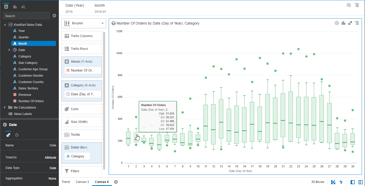
I'm looking for a graph type on OAC DV or Classic that I can use to show the distribution of a measure against a dimension attribute like Day. e.g I want to see the day as on X-axis and multiple dots along the Y-axis in a single line or that day, that will show different runtimes of multiple jobs. If I use a line graph, it expects an aggregated measure on the Y axis, which sums up all the runtime of all jobs and displays it as s single data point for that day. In brief, I'm looking for functionality similar to strip plot in Excel or dot Strip plot in tableau.

Thanks!

Answers

  • Neeti Choksi-Oracle
    Neeti Choksi-Oracle Rank 5 - Community Champion

    Hi,

    • If you are looking for a dimension on X-axis and measure on Y-axis, you can use normal line chart and add another dimension in details or color section.
    • If you are looking to keep dimensions on both axis, you can try a heatmap without measure.

    Please see attached images for your reference.

    Regards,

    Neeti

    Detailed Line.PNG

  • The Boxplot would also be a good option


    BoxPlot.png

  • vkm
    vkm Rank 5 - Community Champion

    Thank you very much! I used the line chart.