Oracle Analytics Cloud and Server Idea Lab

Welcome to the Oracle Analytics Community: Please complete your User Profile and upload your Profile Picture

Sort 100% stacked bar chart by category and highlight category (OAC Classic)

Needs Votes
31
Views
6
Comments

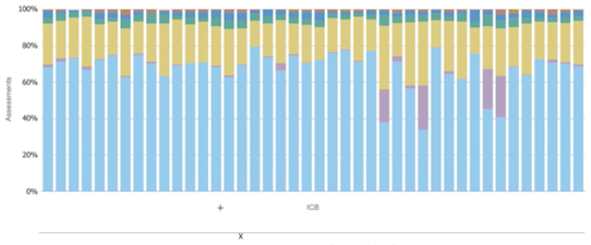
Currently in Oracle Analytics Cloud, stacked 100% bar charts aren't able to be sorted by category, for example, if the percentage of apples and oranges by distributor was being reported on and we were more interested in the percentage of orange we would want to sort oranges high to low. We might also want to highlight a particular distributor which isn't currently possible.

Please can it be looked into:

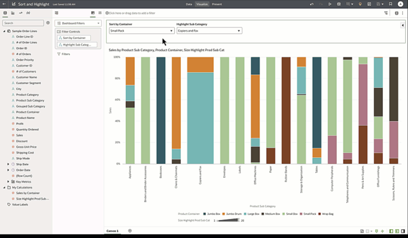
  1. The ability to so sort a stacked 100% bar chart by category
  2. The ability to highlight a particular category to a user to draw their attention and pull focus

And example of the chart type is attached - ideally we would like to either highlight where the x is (a separate chart was created to create the x and add this), and sort by the blue category high to low:

image.png
Tagged:
5
5 votes

Needs Votes · Last Updated

Comments

  • in order to sort by category, you can create a My Calc that is filtered by the specific category that you want to sort by (i.e. FILTER(Revenue USING Product = 'Apples') ) and then sort you X-axis attribute by the new calc that you created. Note that since it is a 100% stack chart and the calc is in actual numbers and not percentages, the visual outcome might not seem to be sorted as the large actual number does not necessarily mean the largest portion compared to other categories. To do that, you will need to create a more complex calc that calculates the portion out of the total of each bar and then the percentage of oranges.

    As for highlights, I would recommend using a reference line for now. We are working on attribute-based conditional formatting, which might be a better solution soon.

  • Thanks Gabby, we'll try this out on our end

  • Hi Gabby, the filter option has been trialed which sorts the table but not the graph, which remains fixed by category in A-Z order. What do you mean by Reference Line? Please guidance be provided? Thanks


  • My bad. Disregard the reference line for now. Currently, we can parameterize it only if the category is of a Date data type, but in your case, it is not. Sort should work if you set it up correctly, and I also have an idea for you for the highlight. Here is the example I built. I'm using two selectors to change the sort value (based on containers, which are my colors) and the highlighted sub-category (which is my X-axis category).

    SortAndHighlight.gif

    Here is the DVA for you to look around

    It is not very polished, e.g., I would remove the legend and use a separate legend control to show only the containers, but I think it's a possible example to what you are trying to do.

  • Hi Gabby, thanks for your reply. This example is in DV, please can we have one in Classic?

  • Making a note to track this issue. This was previously raised with our Oracle contacts and closed as it is not an accessibility issue (which we are primarily working on). This has been re-raised with the Oracle team on 26th February 2025.