Oracle Analytics Data Visualization Gallery

Welcome to the Oracle Analytics Community: Please complete your User Profile and upload your Profile Picture

BMW Sales and Model Insights

Data Visualization
242
Views
6
Comments
ManikSethi
ManikSethi Rank 4 - Community Specialist
Discussion thumbnail

1. Which dataset did you use?

BMW Global Sales Dataset (2010-2024) available at Kaggle. https://www.kaggle.com/datasets/ayeshaseherr/bmw-dataset

2. How did you analyze or prepare the data?

I used Auto-Insights features available in OAC.

3. Who is the intended audience for your visualization?

Automobile Sales manager.

4. What is your visualization about, and what question or problem does it address?

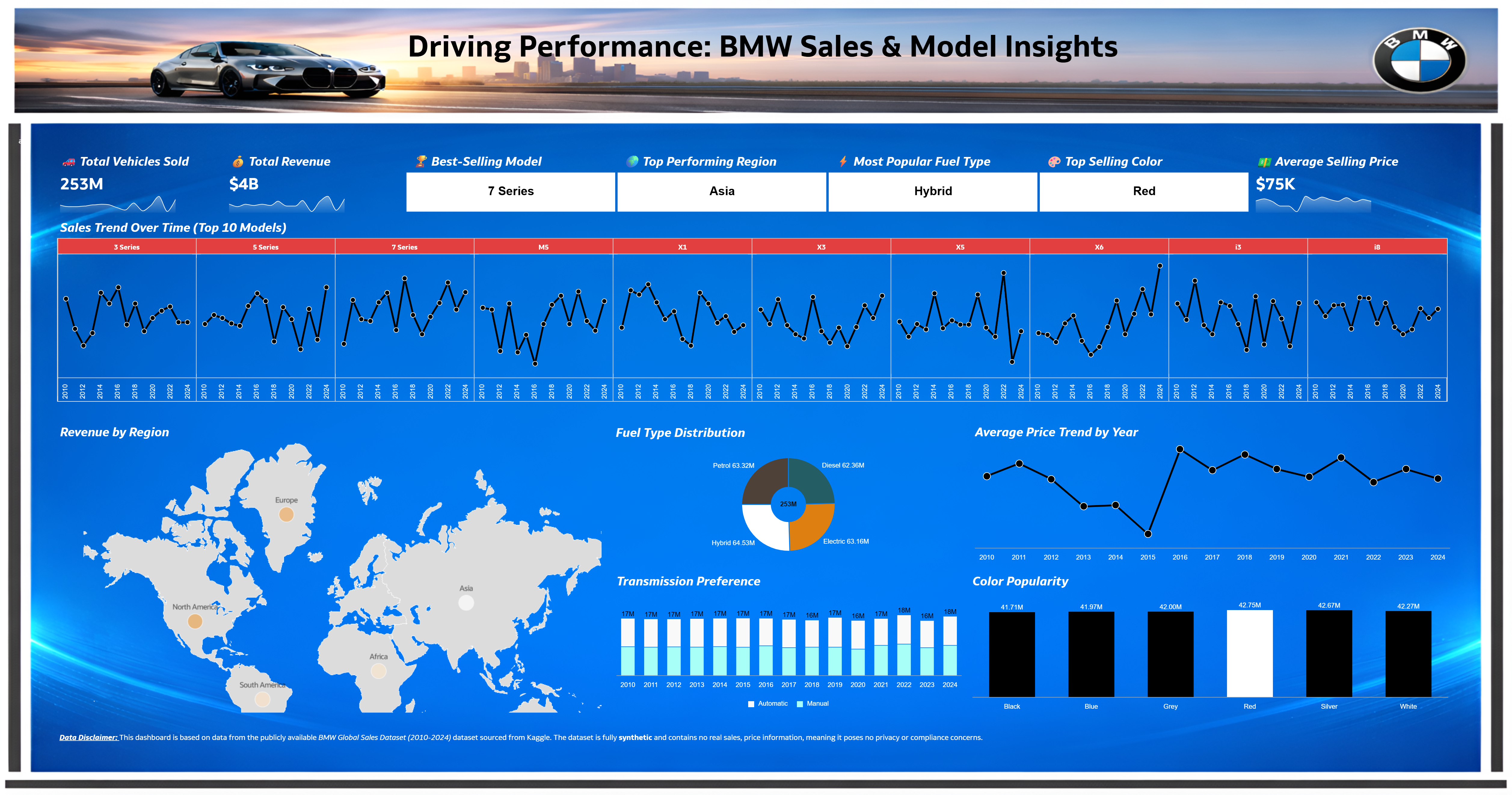
This visualization provides a comprehensive overview of BMW’s sales performance, customer preferences, and model trends across different regions and years. Manager can analyze overall sales volume and revenue, identify top-performing models and regions, and track year-over-year growth. The visualization also highlights evolving customer preferences such as fuel type adoption, transmission trends, popular vehicle colors. Regional comparisons and model-level analysis make it easy to identify market strengths, emerging trends, and opportunities for growth. Regional comparisons and model-level analysis make it easy to identify market strengths, emerging trends, and opportunities for growth.

5. Did you use any Oracle Analytics AI features when building your visualization (ex. AI Assistant)? If so, please describe how they were used

Yes, I asked few questions to the AI Assistant, example giving me the top 10 Models by sales and I used the same for one of the visual.

6. Did you upload your visualization image and dva file?

Completed!

BMW Sales v3.png
8
8 votes

Data Visualization · Last Updated

Default status for visualizations

Comments

  • Rishi Gupta-200064
    Rishi Gupta-200064 Rank 2 - Community Beginner
    edited Feb 16, 2026 6:01AM

    Good visual storytelling: The design has a good visual storytelling effect. The reader can quickly understand the business story.

    Effective KPIs: The top band has effectively highlighted key executive metrics such as volume, revenue, best model, region, fuel, color, and ASP. Effective dashboard structure: The proper use of space, alignment, and segmentation has created a sense of order rather than chaos. Effective interlocking visual elements: The use of interlocking visual elements such as trend lines, regional view, distribution view, category view, etc., has created a better storytelling effect without repeating information multiple times.

    Effective use of branding and themes: The BMW theme has been used properly. The BMW branding elements such as colors, images, headers, etc., are consistent with a production-ready feel. Effective readability: The proper use of labels, titles, panel separation has created a sense of ease in understanding the charts by non-technical people.

    Effective business value: The dashboard has answered all business questions such as what’s selling, where it’s selling, what fuel/color it’s selling, etc. The dashboard has been created with business value rather than just looking good.

    Effective finishing touches: The disclaimer and data explanation are given properly. The headline has been used properly.

  • Benjamin Arnulf-Oracle
    edited Feb 4, 2026 3:11PM

    I like it! A little tweak would be to have the header picture in the right proportion or resolution. But overall good work! Thank you for participating to the Analytics and AI Challenge.

  • Bhaskar Konar
    Bhaskar Konar Rank 8 - Analytics & AI Strategist

    Beautiful presentation and the viz.

    Thanks for sharing @ManikSethi!

  • @ManikSethi , very impressive, nice going. Keep it up!

  • Ambili
    Ambili Rank 6 - Analytics & AI Lead

    Looking great, @ManikSethi !

  • ManikSethi
    ManikSethi Rank 4 - Community Specialist

    Hi Benjamin,

    Thanks for the feedback. I worked on your suggestion to get the header picture in right proportion.