Categories
- All Categories
- Oracle Analytics and AI Learning Hub
- 54 Oracle Analytics and AI Sharing Center
- 26 Oracle Analytics and AI Lounge
- 312 Oracle Analytics and AI News
- 57 Oracle Analytics and AI Videos
- 16.4K Oracle Analytics and AI Forums
- 6.7K Oracle Analytics and AI Labs
- Oracle Analytics and AI User Groups
- 117 Oracle Analytics and AI Trainings
- 24 Oracle Analytics and AI Challenge
- Find Partners
- For Partners
FIFA Men's World Cup Trends and Forecast

1.Which dataset did you use?
I used multiple publicly available datasets curated from Kaggle:
- FIFA World Cup Historical Dataset:
- FIFA 23 Official Player Dataset (Cleaned Data):
These datasets provided historical World Cup statistics, match results, host information, and detailed player-level attributes such as performance metrics and market value.
2. How did you analyze or prepare the data?
The raw datasets were first cleaned and pre-processed using Python (Pandas). This included handling missing values, correcting inconsistent columns, standardizing country and team names, and removing redundant records.
After cleaning, the datasets were imported into Oracle Analytics Cloud (OAC), where they were joined and modeled appropriately to ensure accurate relationships between World Cup history, country rankings, and player statistics.
I also used OAC Auto-Insights to identify trends and patterns within historical performance data.
3. Who is the intended audience for your visualization?
The primary audience includes:
- Sports Team Managers
- Coaches
- Football Associations and Authorities
- Performance Analysts
The dashboard provides insights into:
- A country’s FIFA ranking and projected performance
- Key performance metrics such as passing, dribbling, shooting, pace, and overall team health
- Player-level attributes that can influence team selection and tactical decisions
This can support better squad building, player positioning decisions, match preparation strategies, and long-term performance planning. At the same time, the visualization is designed to be intuitive and engaging enough for a broader audience. Major sporting events like the FIFA World Cup bring together fans across the globe, so the dashboard also caters to anyone interested in understanding football from a data-driven perspective.
4. What is your visualization about, and what question or problem does it address?
This visualization brings together historical World Cup performance, current FIFA rankings, player-level attributes, and predictive analytics into a single interactive dashboard. It addresses questions such as:
- Which countries have historically dominated the World Cup?
- How does a host nation typically perform — do they win, reach the top three, or fall short?
- How do current team performance metrics align with historical success?
- What does the future performance trajectory look like for a selected country?
- How do individual player attributes contribute to overall team strength?
Instead of looking at historical data, player data, and rankings in isolation, this dashboard connects them. It helps users understand the past, evaluate the present, and anticipate the future — all within one analytical view.
5.Did you use any Oracle Analytics AI features when building your visualization (ex. AI Assistant)? If so, please describe how they were used
Yes, I have leveraged the following features :
- AI Insights for analysis
- AI Assistant for assistance
- Forecasting ARIMA model for forecasting trend
6. Did you upload your visualization image and dva file?
Yes I did.
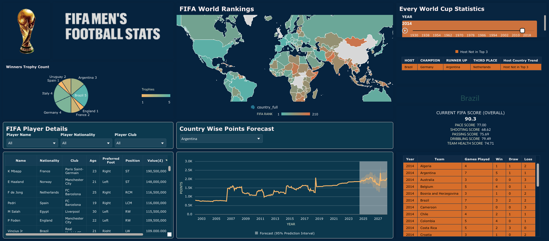
⚽️ FIFA Men’s Football Dashboard – Oracle Analytics Cloud
This dashboard is a complete visual story of FIFA Men’s World Cup history and current football performance trends, built entirely in Oracle Analytics Cloud using the Redwood theme.
The idea behind this project was to bring historical achievements, current team strength, and predictive insights together in one interactive experience.
We begin on the left with a trophy distribution pie chart that instantly shows World Cup dominance over the years. Brazil leads the chart, followed by Italy and Germany, then Argentina and others. It gives a quick snapshot of the trophy count legacy at a glance.
Below that, the FIFA Player Details section allows users to explore individual players using interactive filters like player name, nationality, and club. Once selected, detailed information such as age, preferred foot, playing position, and market value is displayed. This section adds a player-level perspective to complement the country-level insights.
At the center, the global map visualizes current FIFA world rankings. Users can hover over any country to see its latest ranking, making it easy to compare global performance geographically.
One of the key features of this dashboard is the Country-wise Points Forecast. Using OAC’s built-in machine learning forecasting, users can select a country and view projected FIFA points along with prediction intervals. This adds a forward-looking dimension to the dashboard, moving beyond historical reporting into predictive analytics (upto 2028).
On the right side, an entire World Cup year slider (1930–2022) controls the entire tournament analysis. As the year changes, the dashboard dynamically updates to show:
• Host country
• Champion, runner-up, and third-place teams
• A visual indicator showing whether the host won (green), reached top three (blue), or did not make top three (orange)
In addition, the selected host nation’s current FIFA score is broken down into pace, shooting, passing, dribbling, and overall team health metrics. Below that, detailed match statistics for that specific World Cup year display games played, wins, draws, and losses for each team.
Overall, this dashboard combines historical analysis, player insights, geographical visualization, and predictive modeling into one unified view. By integrating AI-driven forecasting and interactive controls within Oracle Analytics Cloud, it transforms static football data into an engaging and exploratory analytics experience
Comments
-
Great job Manjari! I really like the clean layout
2 -
Thanks a lot!
0 -
Similar data I did in last Analytics Challenge, Good to see something new change Great Job @Manjari Nandi Majumdar-Oracle
1 -
Excellent Work
1 -
Nice one Manjari. Appreciate your attention to detail.
1 -
I see. Thanks.
0 -
Thanks
0 -
Thank You
0 -
Beautiful & very informative.
Great work and Thanks for sharing @Manjari Nandi Majumdar-Oracle!
1 -
Thanks a lot !
0


