Organization Name
Vlamis Software Solutions
Description
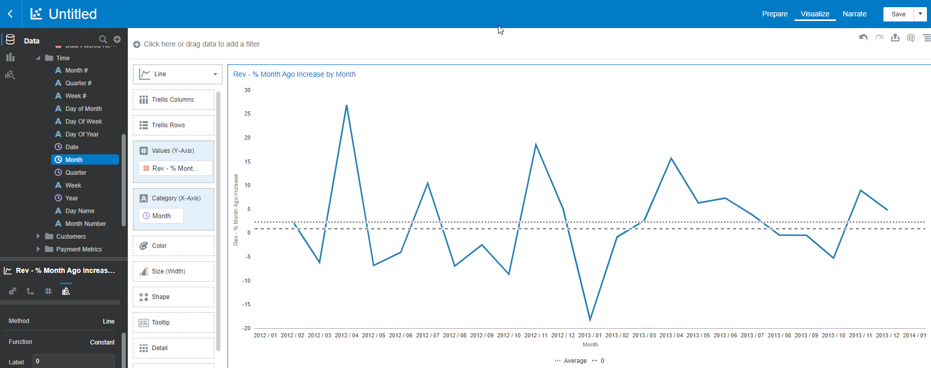
Please provide the ability to change the style of reference lines that are added to a graph in data visualization. Currently, they always appear as thick dashed lines. It's considered a best practice to eliminate horizontal and vertical "grid lines" in graphs and only include lines that provide specific meaning. For example, we often want to include a "zero line" for reference in graphs, particularly with ascending and descending bars, but we only have the option to show a thick, dashed line. We would like to be able to choose the pixel thickness and the color for the line. That way, we can also differentiate when multiple reference lines are included (say, zero and average).
Use Case and Business Need
Reference Lines provide important context within graphs. The current choice of having only one style of line in the data visualization interface makes it difficult to use. Sometimes we are forced to go back to the classic interface where we have more granular control of graphs.
Original Idea Number: 7319d45aae