Ability to insert visualizations inside the data tooltip
There should be option to insert visualization inside the data tooltip like Map and Bar chart in tooltip.
Original Idea Number: aed775c63e
Do you envision just a sparkline or a larger chart in a tooltip ? If so, what are the minimum dimensions you would expect ?
Any thoughts how you would like that to work/render on mobile ?
J
This would be great. I know other BI tools allow this type of functionality. It would allow for conservation of space as well on the canvases by allowing more visuals available to users without actually having them displayed fulltime.
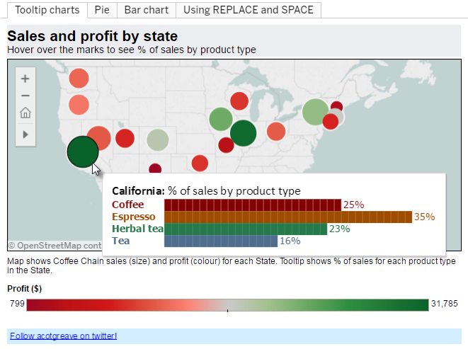
PFA the image, I am expecting this kind of functionality which is available in other BI tools.
Not thought about it on Mobile yet.
This is indeed a great addition to improve the flexibility in designing content.
Yes, like Power BI has.
Any Update from Oracle if we can incorporate this functionality.