Categories
- All Categories
- Oracle Analytics and AI Learning Hub
- 54 Oracle Analytics and AI Sharing Center
- 26 Oracle Analytics and AI Lounge
- 317 Oracle Analytics and AI News
- 57 Oracle Analytics and AI Videos
- 16.4K Oracle Analytics and AI Forums
- 6.7K Oracle Analytics and AI Labs
- Oracle Analytics and AI User Groups
- 121 Oracle Analytics and AI Trainings
- 24 Oracle Analytics and AI Challenge
- Find Partners
- For Partners
Fixing the graph data colour to a specific data category in BI Publisher Template

Organization Name
Deloitte
Description
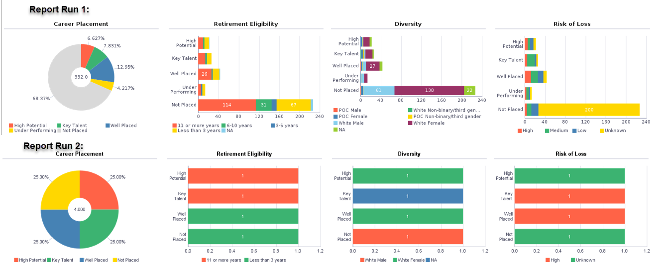
For BIP Charts in templates, we required more flexibility in the colour scheme of the different types of charts available. This idea is to provide a feature within BIP Charts, where we can fix colours to the specific data category at all times. This would mean that, even if one or more of the categories are not fetched in the report, the colours should not get dynamically assigned to the fetched data and it should be fixed even when some categories are missing. This feature should be available for all types of graphs.
For example:
Consider, there are 3 data categories (A, B, C) displayed in the pie graph. When all the data categories are present, A is denoted using Red, B using Green and C using Blue. In a certain report run, data points are not present for the category 'A'. Currently, the graph will show categories B (in Red) and C(in Green). Here, the graph should be displaying B(in Green) and C(in Blue). The aim of this idea is to provide a functionality where we can fix data A as Red, B as Green and C as Blue at all times.
Use Case and Business Need
In the BIP Report we are developing, we have a requirement of displaying data in the form of Ring Charts and Horizontal Stacked Bar Graphs. We are following a specific colour theme across multiple reports(See attachment) and we require each of the data categories to have fixed colour at all times. But as we are running report for various parameters, some of the data categories may not be fetched in the output. In this scenario, the graph colour scheme changes with the data categories. For example: In the attachment(Report Run 1) - All categories of data are present in the report output. But, when comparing to the second attachment(Report Run 2), since some of the data categories are missing, the colours are getting rearranged with the data.('Not Placed' changes from Grey to Yellow; ' Less than 3 years' changes from Yellow to Green; 'White Male' from Blue to Red and so on). We are trying to fix the colour to the specific data category at all times.
Original Idea Number: f66a70e3fa