Categories
- All Categories
- Oracle Analytics Learning Hub
- 18 Oracle Analytics Sharing Center
- 18 Oracle Analytics Lounge
- 228 Oracle Analytics News
- 44 Oracle Analytics Videos
- 15.8K Oracle Analytics Forums
- 6.2K Oracle Analytics Idea Labs
- Oracle Analytics User Groups
- 85 Oracle Analytics Trainings
- 15 Oracle Analytics Data Visualizations Challenge
- Find Partners
- For Partners
How to properly format a scheduled workbook email as a PDF?

I am having trouble with the output size/scaling/orientation of emailed pdfs via the scheduler in Oracle Analytics cloud.
There seem to be limited options when selecting the output size and neither seem to work in the way I anticipate.
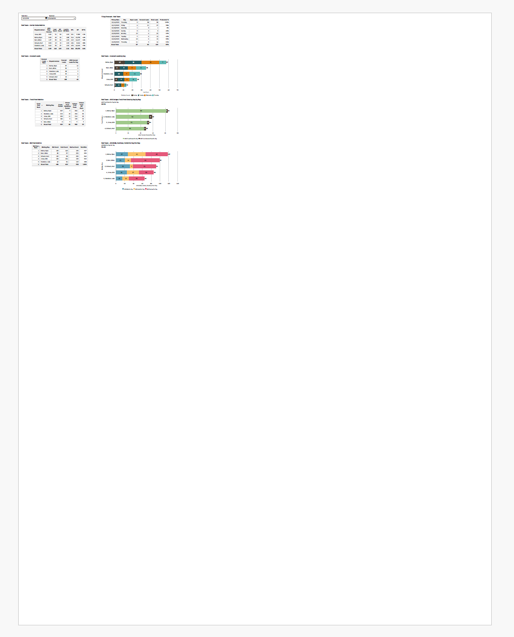
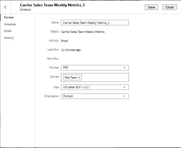
When selecting "US Letter" the canvas visualization appears small and in the top left corner of the pdf:
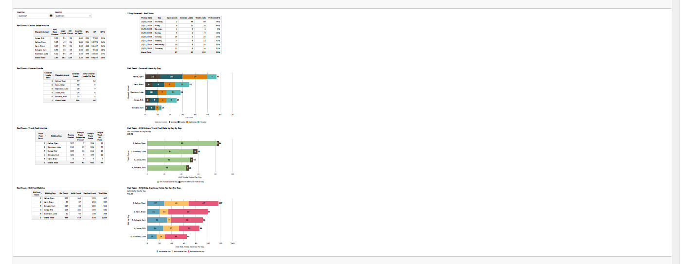
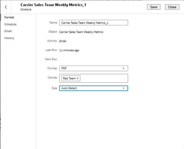
When selecting "Auto Detect" it places the visualization on the left with a lot of space to the right:
What am I missing here? I have tried all the options in the canvas editor to no avail. How can I get the output to be the size of just the content without blank space?
When I export to PDF, the output is fine.
Thanks in advance,
Ryan
Answers
-
Resize your canvas to closely match the US Letter paper size and minimize margins or padding so your visualization content fills more of the PDF when scheduled for email. Also, adjust your element sizes and choose portrait or landscape orientation based on your content layout to reduce excess blank space and improve output appearance.
Hope this helps!0 -
Not sure if it will work for you but try by making your canvas dimensions match this aspect ratio as closely as possible.
- try setting canvas width = 816px and height = 1056px for US Letter.
- If you want landscape orientation, flip the values (width = 1056px, height = 816px).
0